
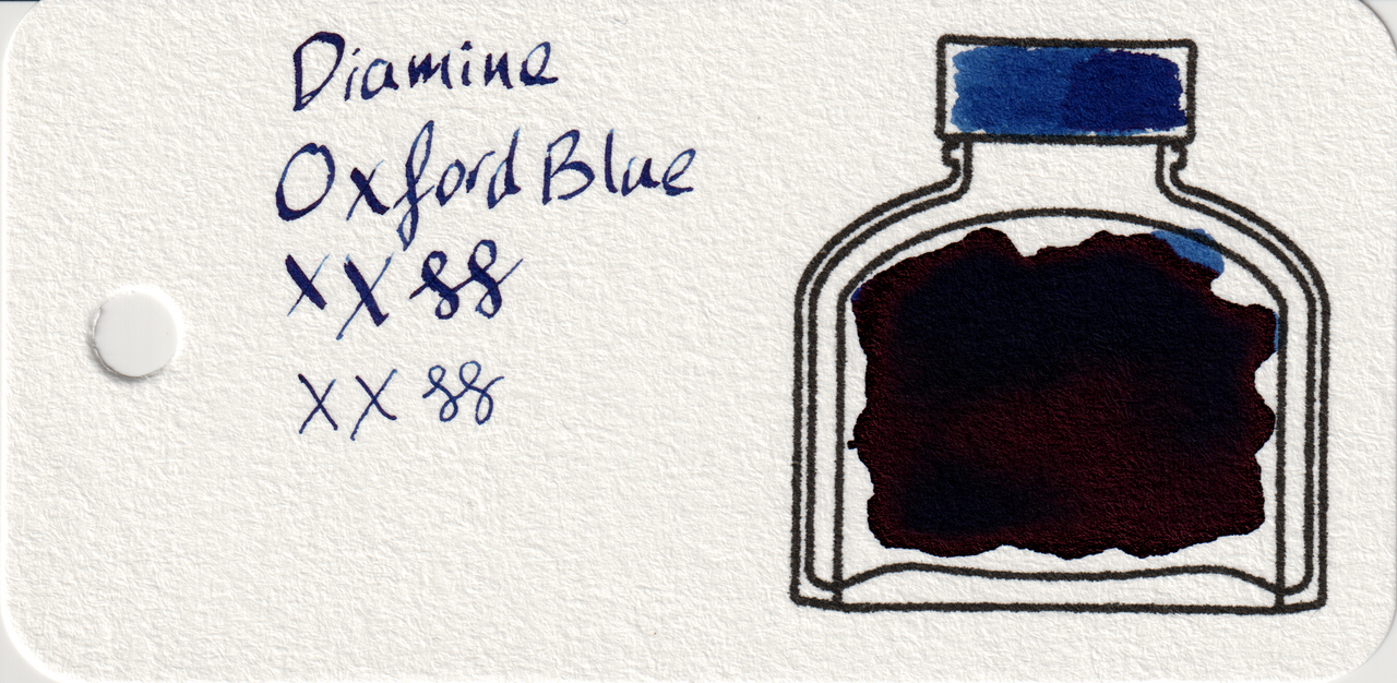
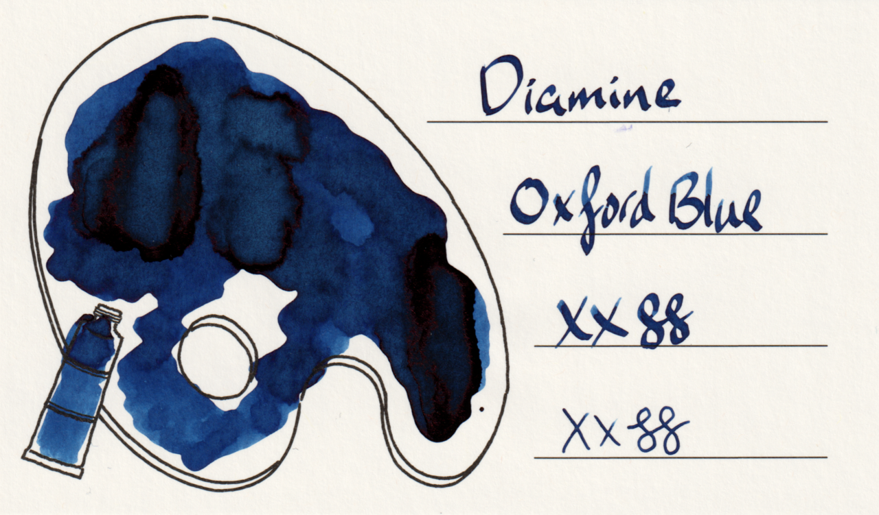
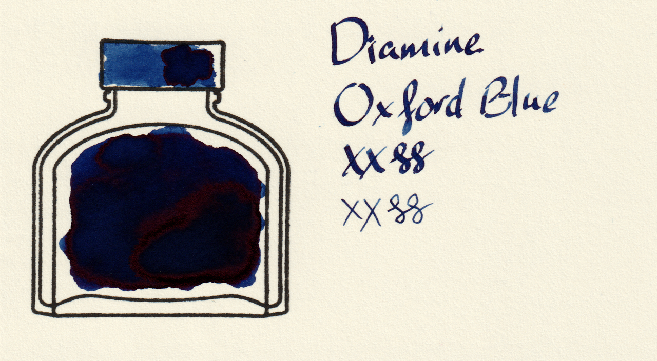
Diamine Oxford Blue is an extraordinarily dark blue with a little shading and significant, but not overpowering, red sheen. It’s so dark it’s easily mistaken for black depending on the paper and lighting, but it’s all blue.
Scans
Even in the scans the sheen interferes a bit with the large swatches on col-o-ring and MD, but the writing is a better indication of how it looks. As usual, it’s a little darker on col-o-ring, lighter on Iroful, and in between on MD. There is a bit more shading on Iroful than MD, too.
Photos
The sheen is extremely prominent on the large swatches.
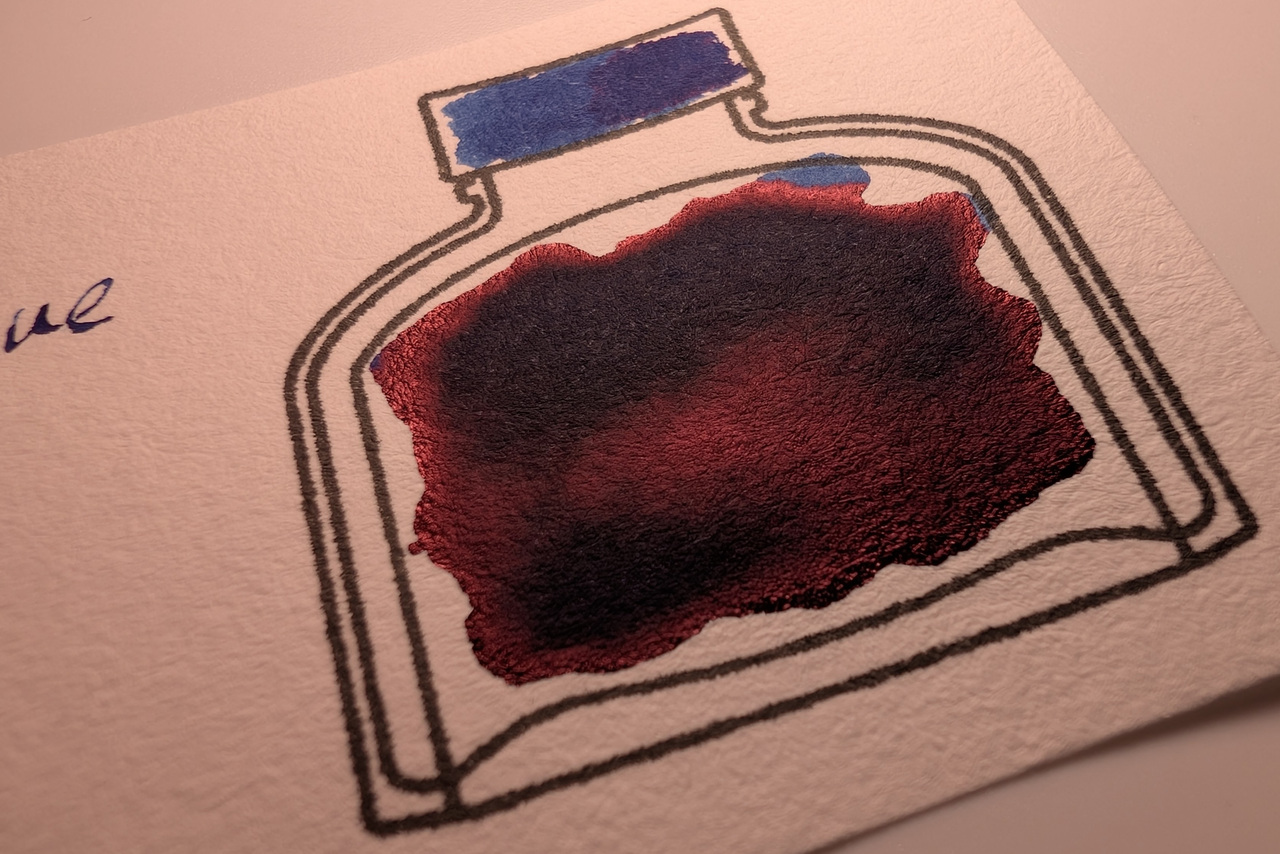
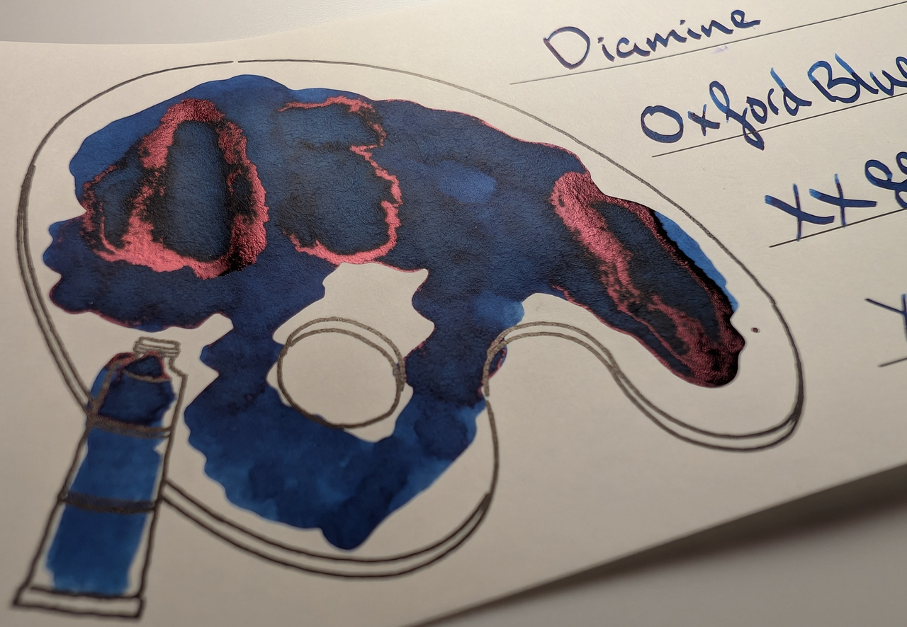
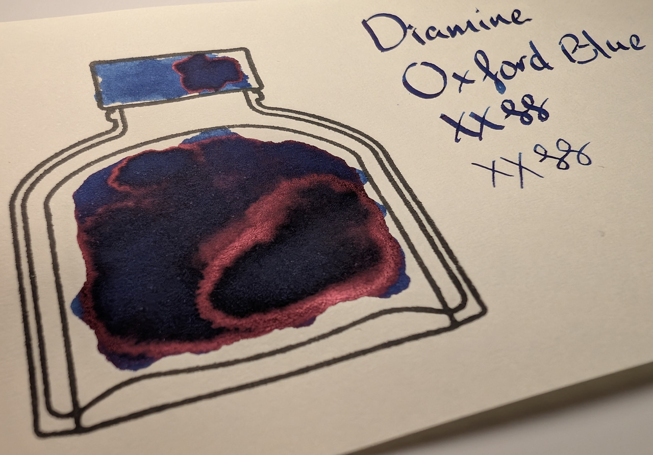
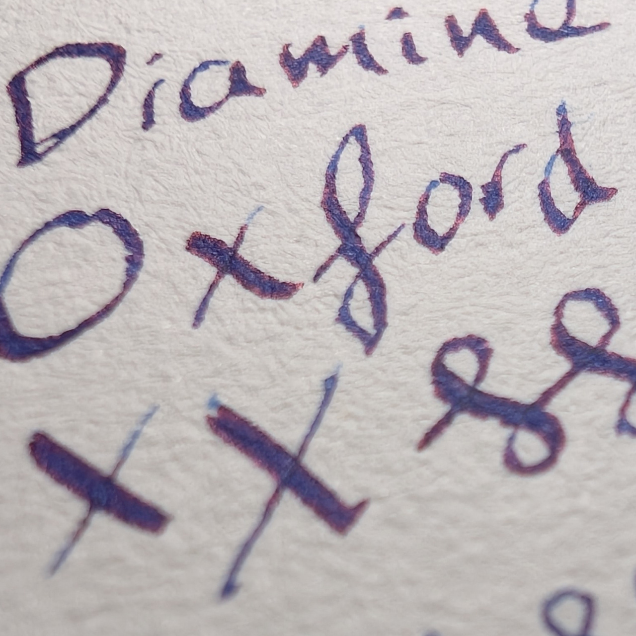
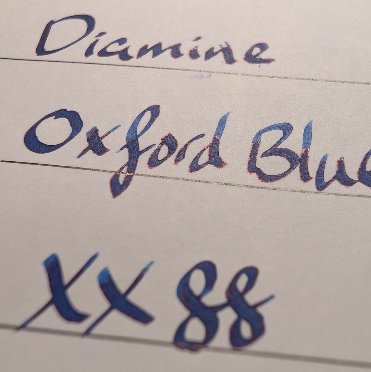
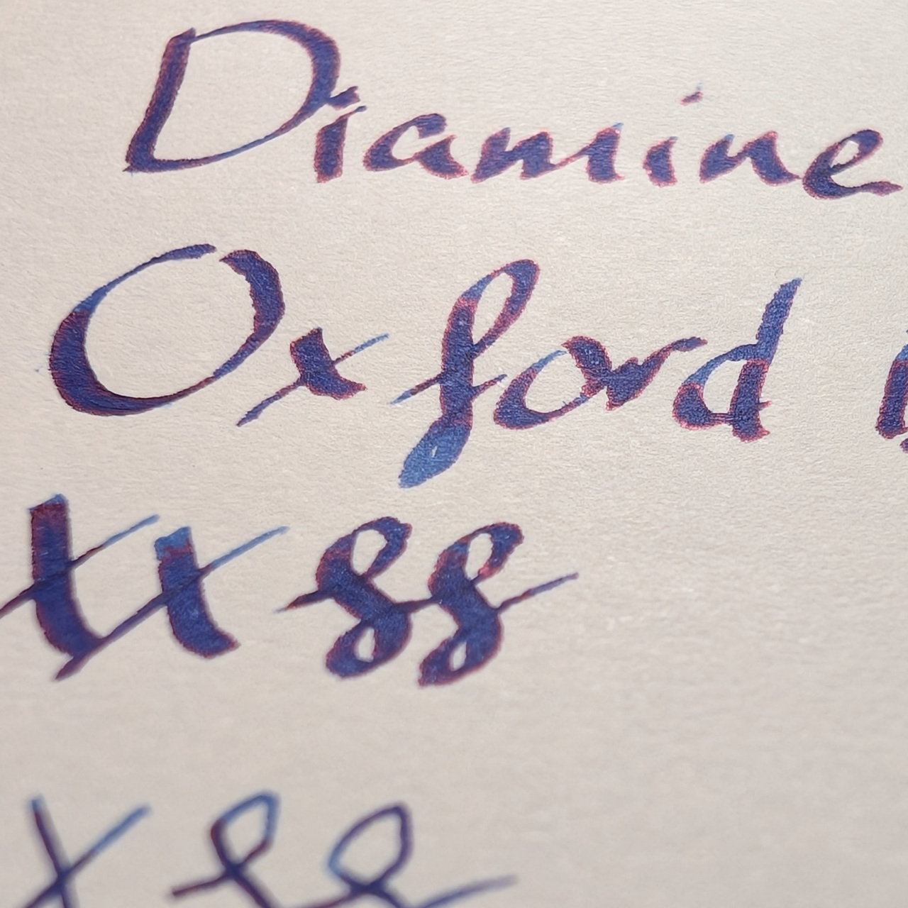
The sheen is thick around the edges of letters and shading, too, though it doesn’t completely overpower the ink.
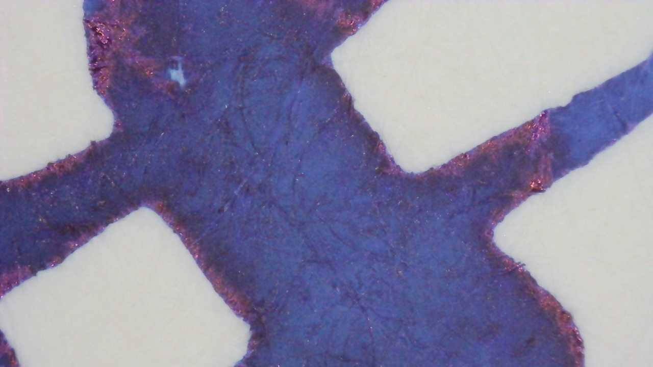
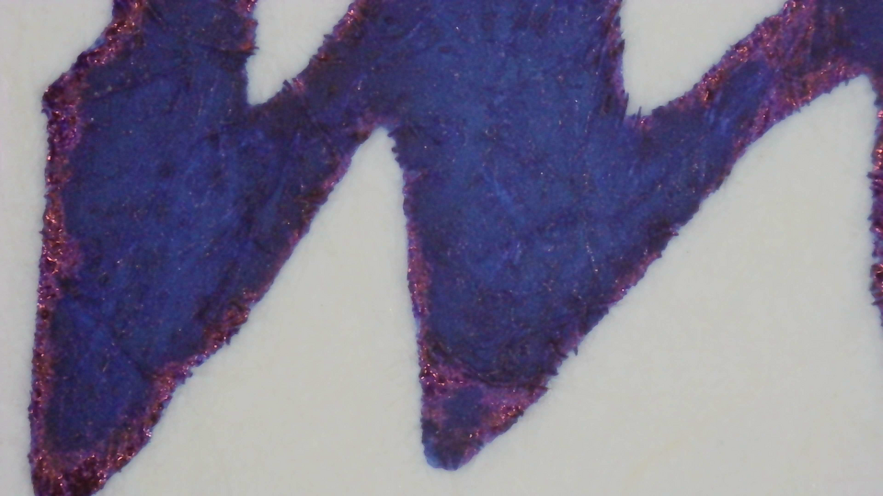
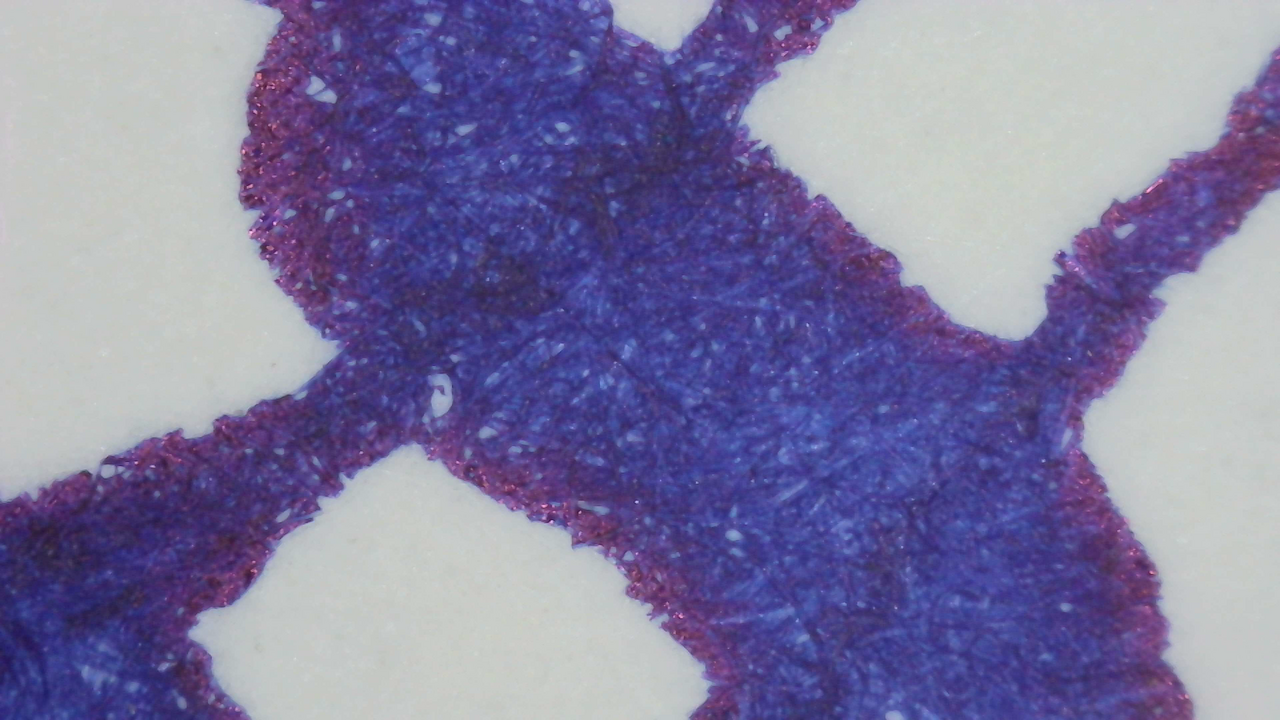
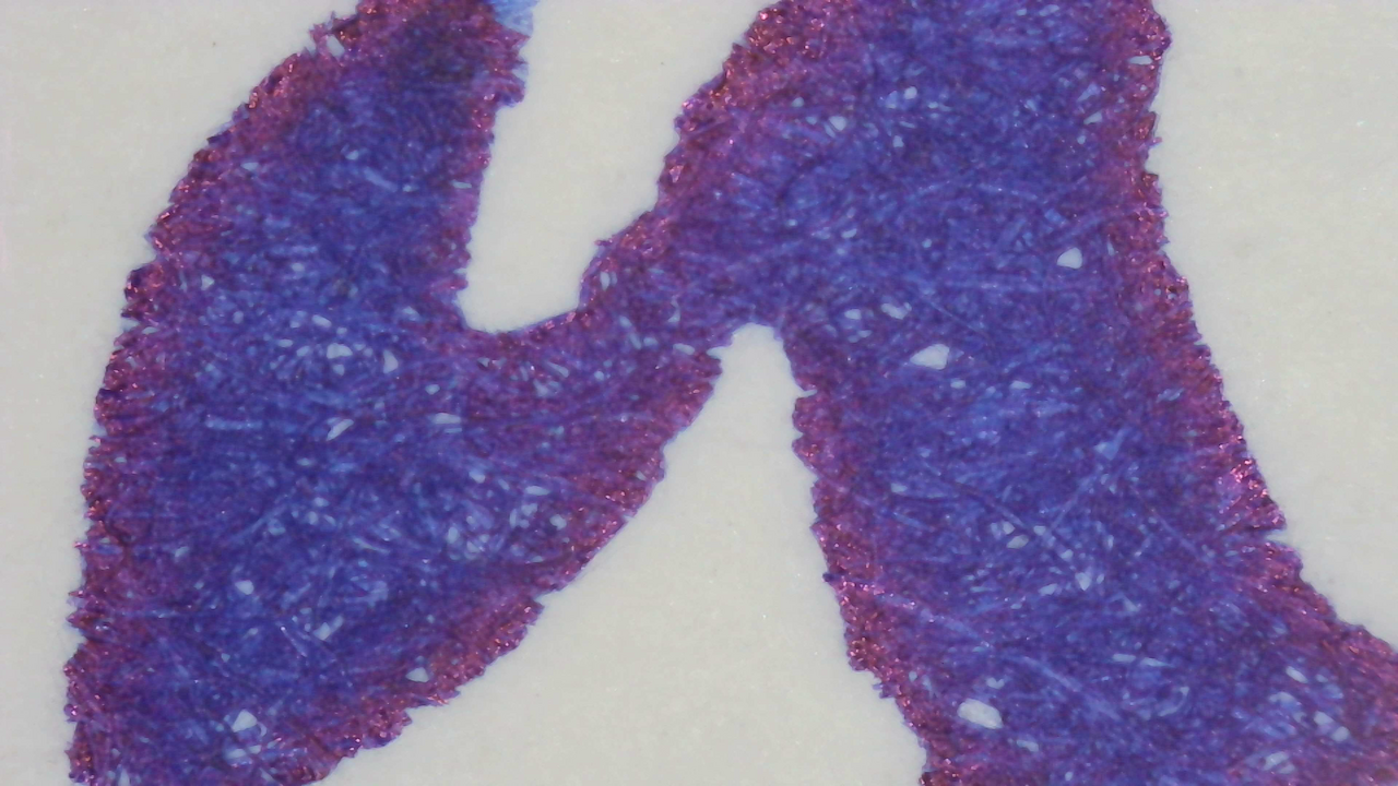
Microscope
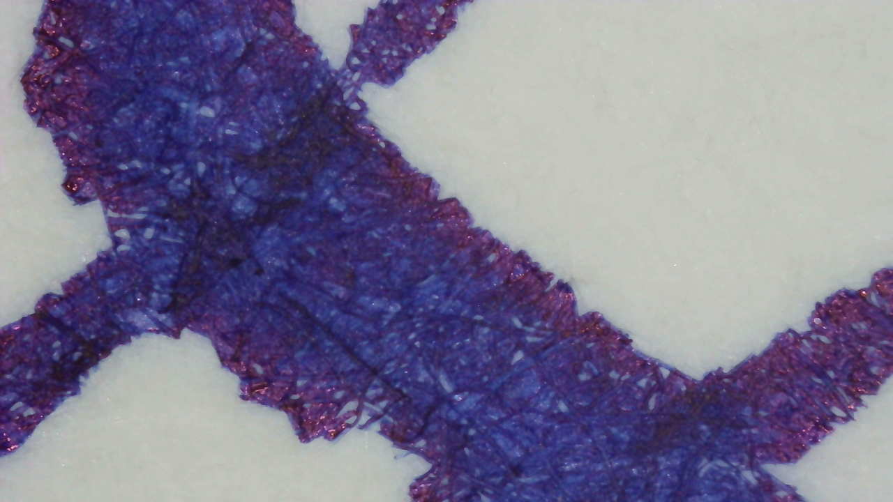
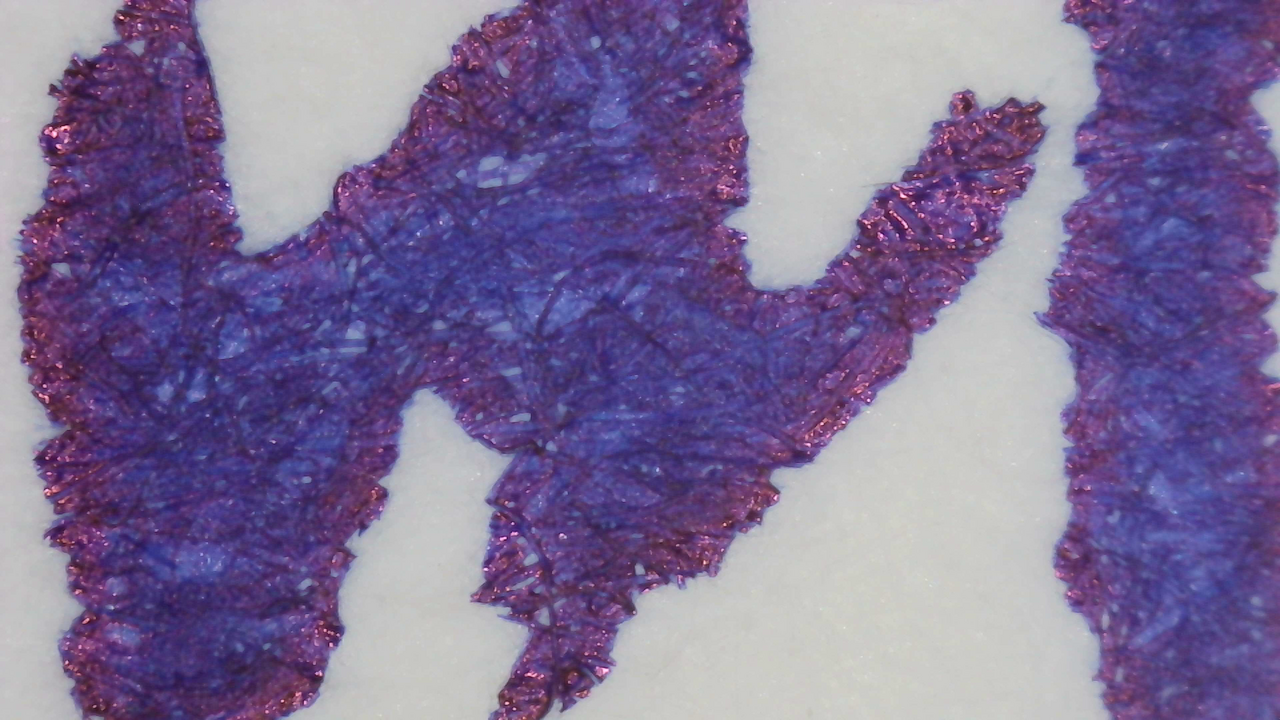
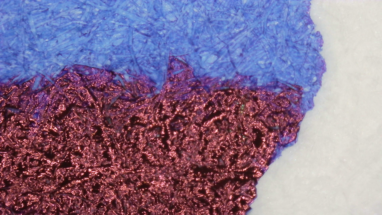
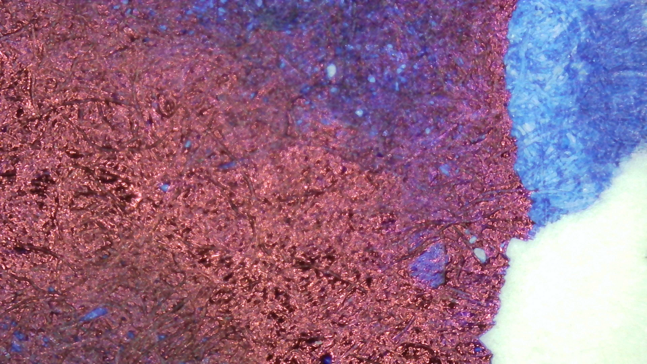
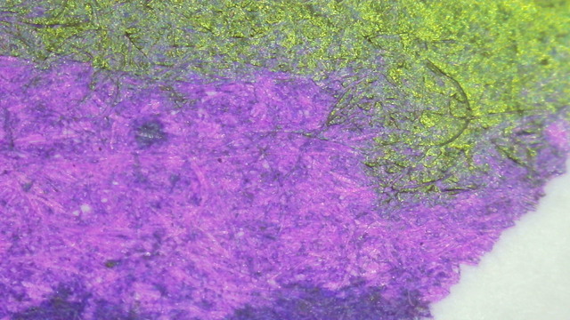
Under magnification the sheen is more noticeable, but in writing it stays at the edges of lines and boundaries between heavy and light ink.

Chromatography

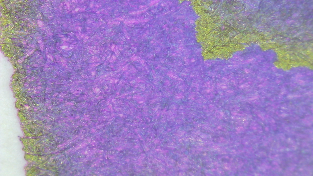
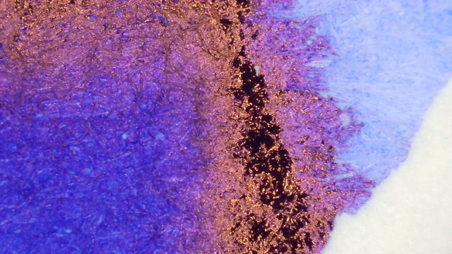
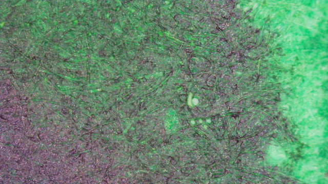
The chromatography starts gray, then very light cyan, then very light magenta, an open area, then darker magenta and dark blue.

The magenta near the leading edge glows brightly but it didn’t show in the swatches.
Verdict
This ink feels very “luxe”, or fancy. I enjoy blue inks much more than black, so this is a good alternative for when I want something very dark. I have used it several times in pocket pens and it’s been trouble-free.
Questions or comments? Contact me on Mastodon