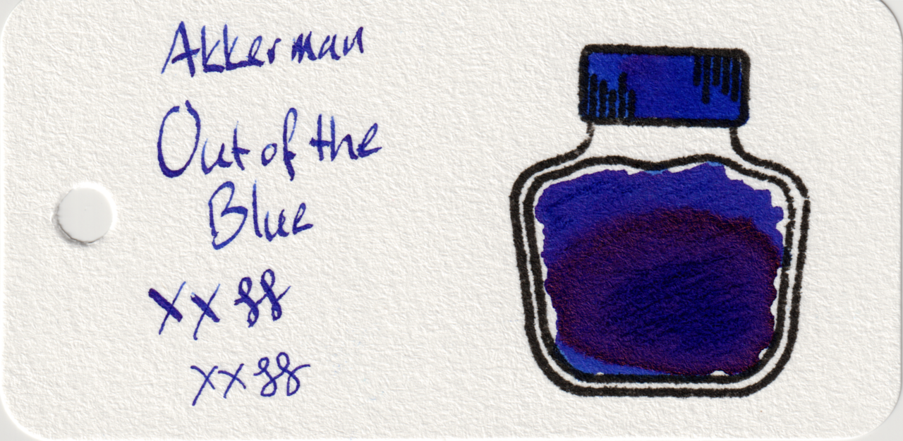
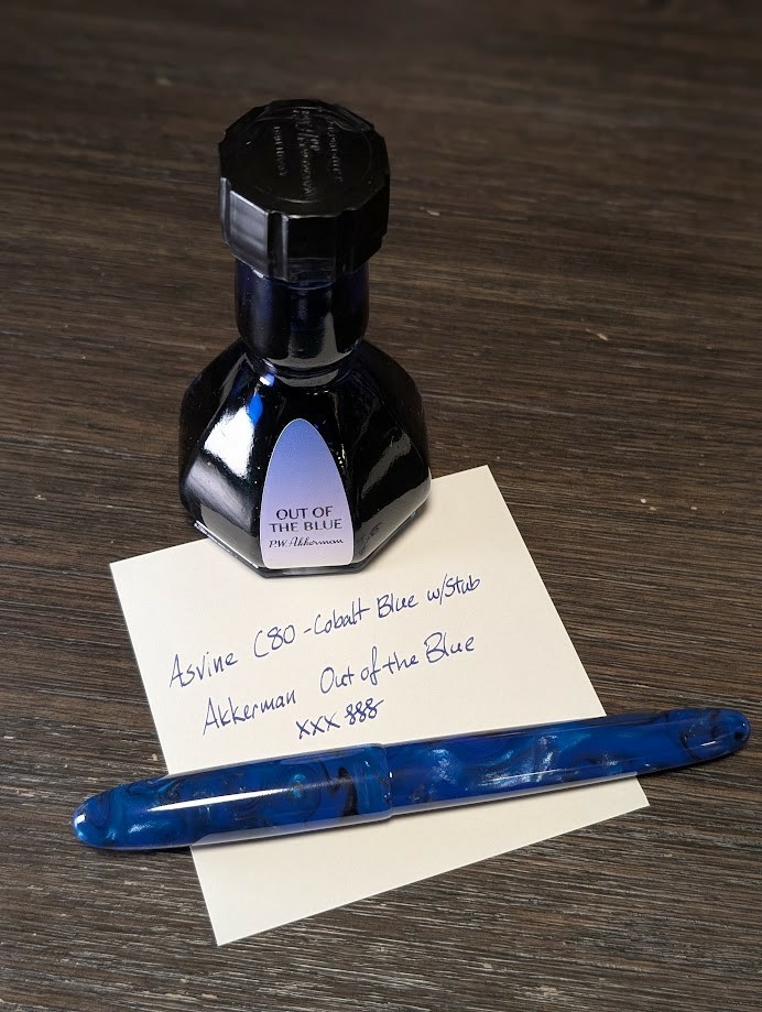
Here is one of my first PW Akkerman inks: Out of the Blue. Akkerman bottles are fun and useful with their inkwell/marble neck, only downside is size as they are quite tall.
Just when you think you have enough “blue with red sheen” inks, along comes an even better shade of blurple. On Iroful the blue is particularly pleasant. On col-o-ring it’s appears much more purple, and Midori is a nice balance.
The sheen doesn’t come out much in writing except on Iroful.
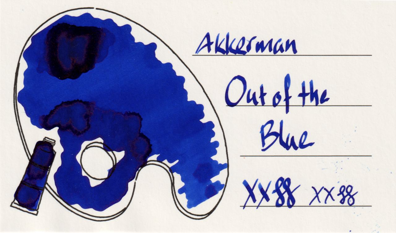
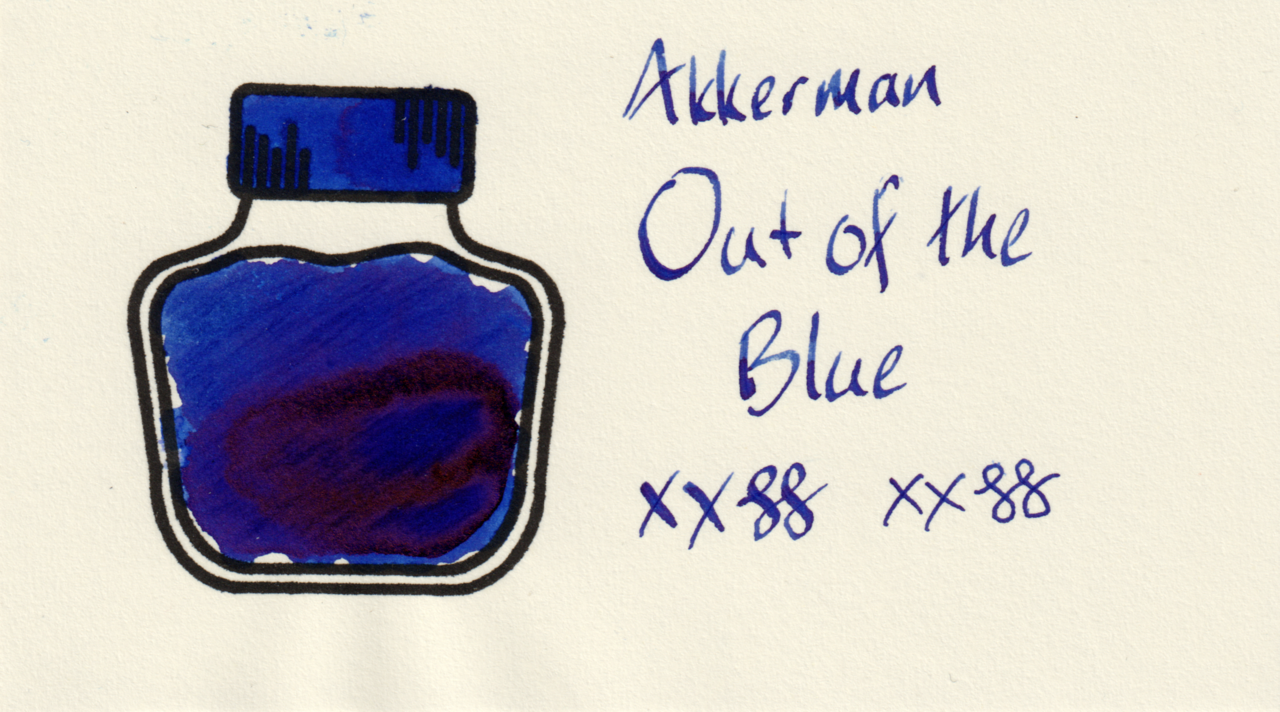
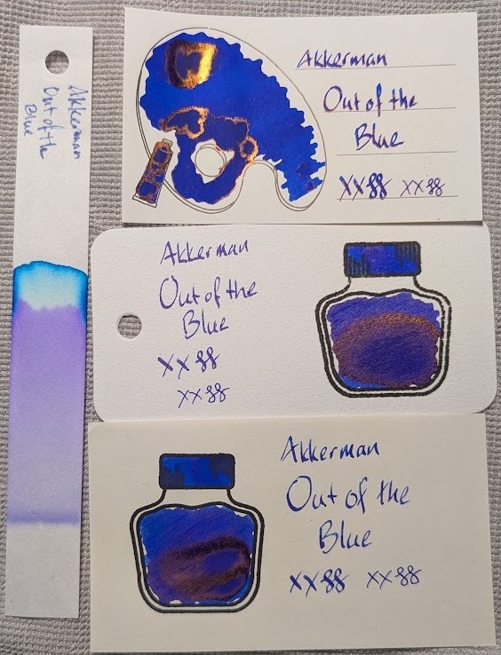
Scans
The swatch card scans don’t show much of the sheen, but they do show subtle differences in color on different paper.
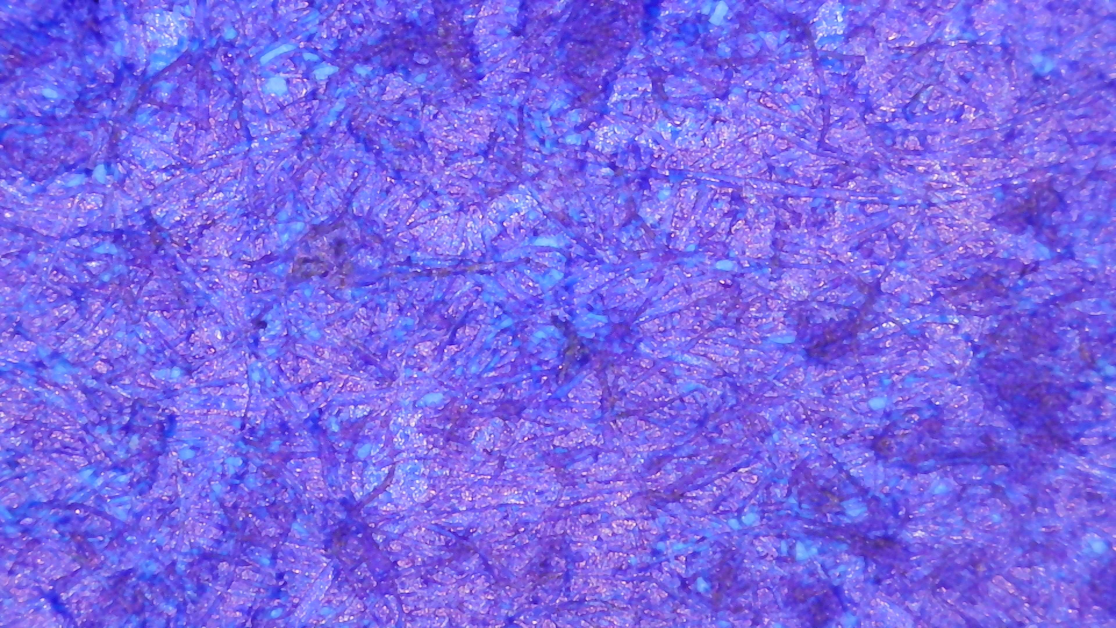
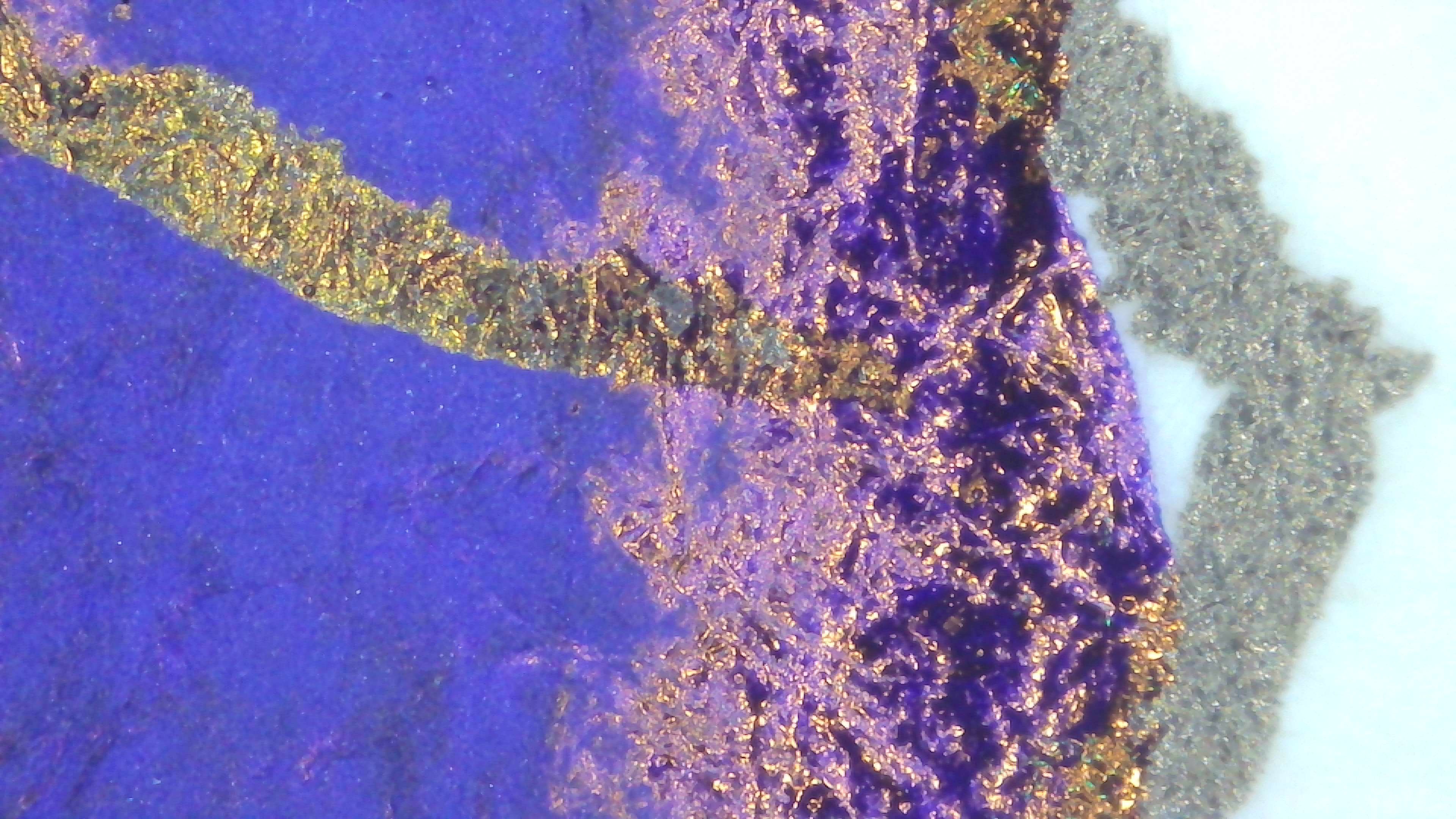
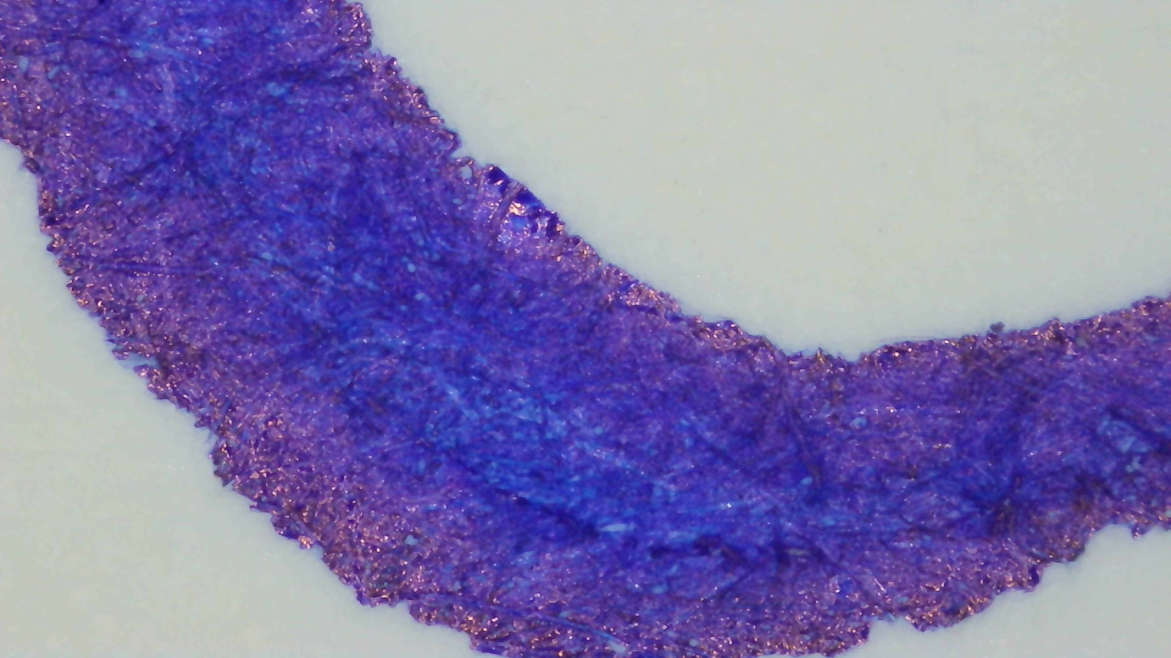
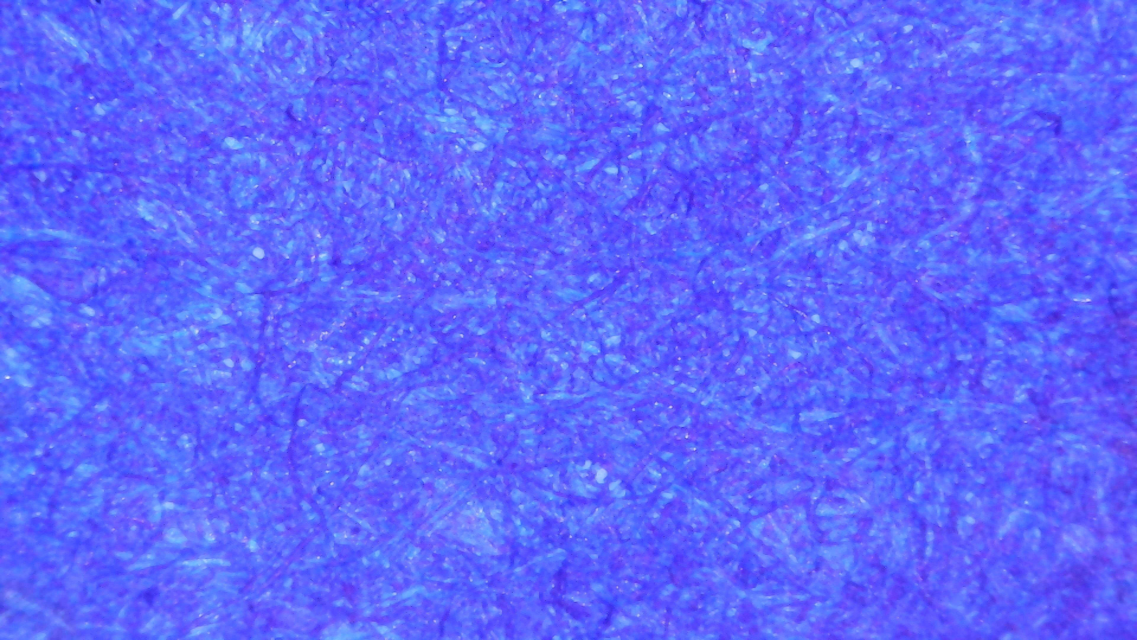
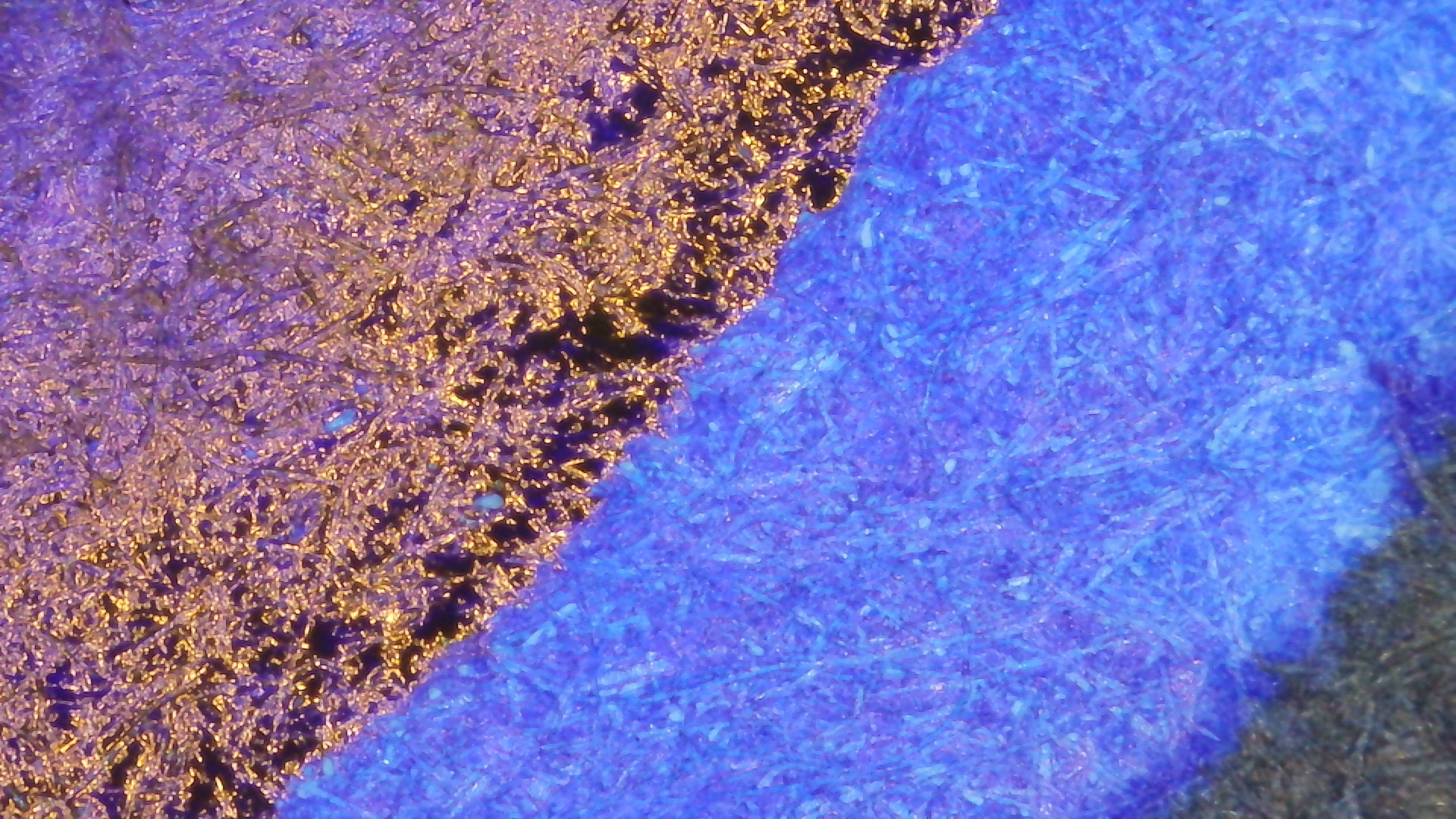
Microscope
Col-o-ring looks much more purple overall but the sheen still shows in some areas, though more evenly and not as pronounced as on Iroful.
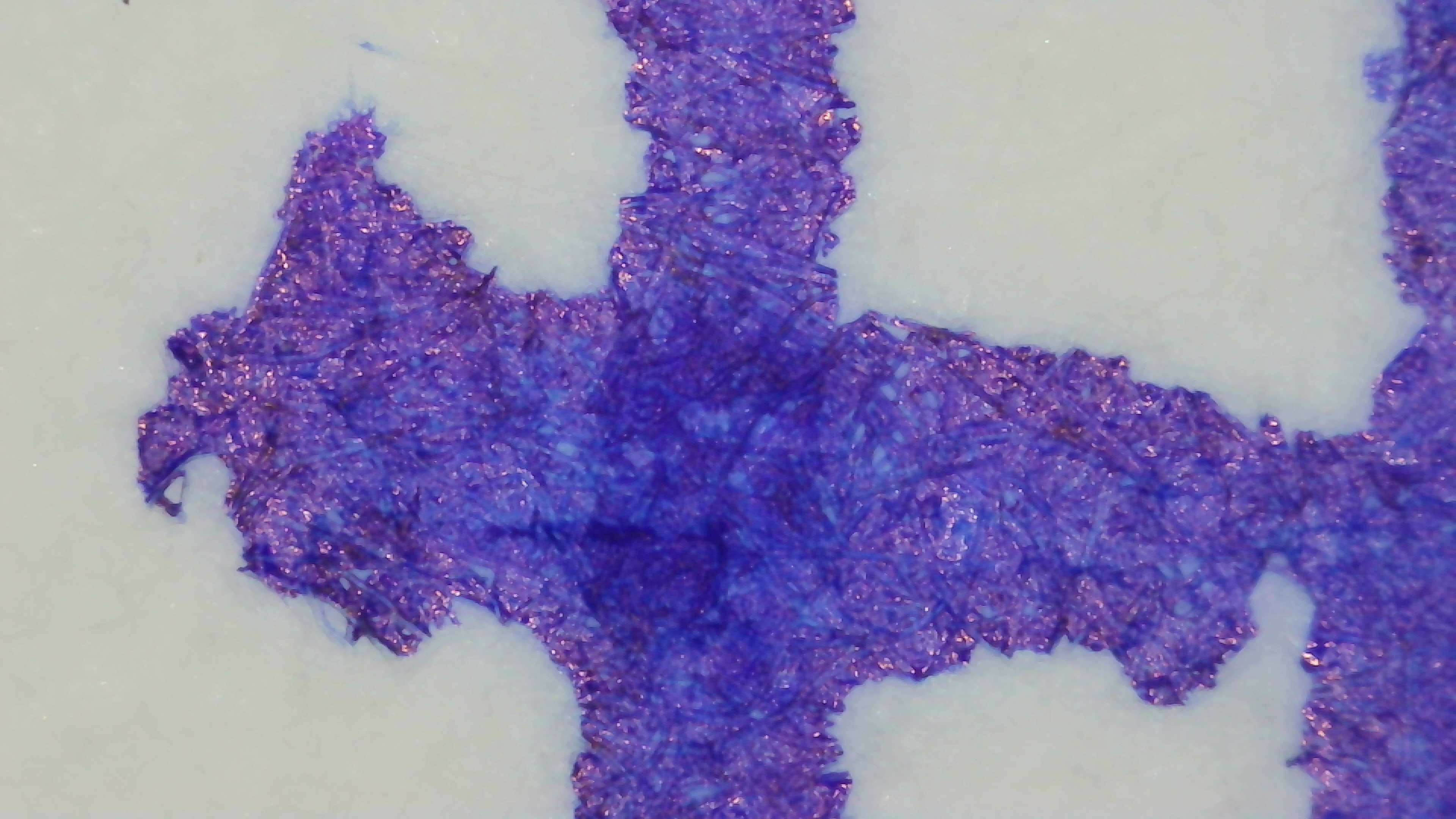
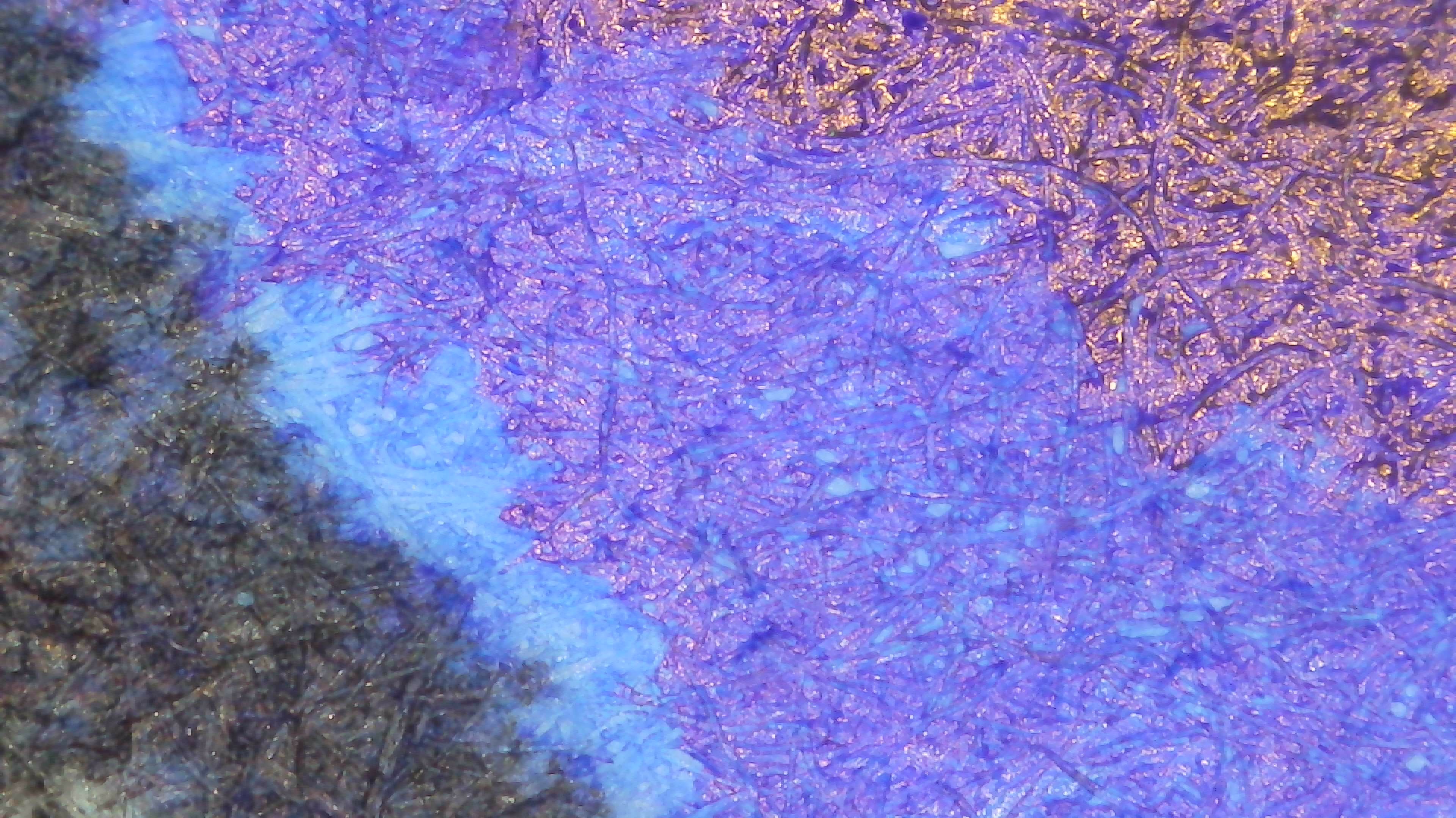
Iroful seems to concentrate the sheen in smaller areas and it becomes more pronounced and this also shows off the blue of the ink more. Still not sure what they do to that paper that makes it work that way.
Midori seems to be in between the extremes of Iroful and Col-o-ring. You do see sheen in regular writing with enough light at just the right angle, but it isn’t as prominent.
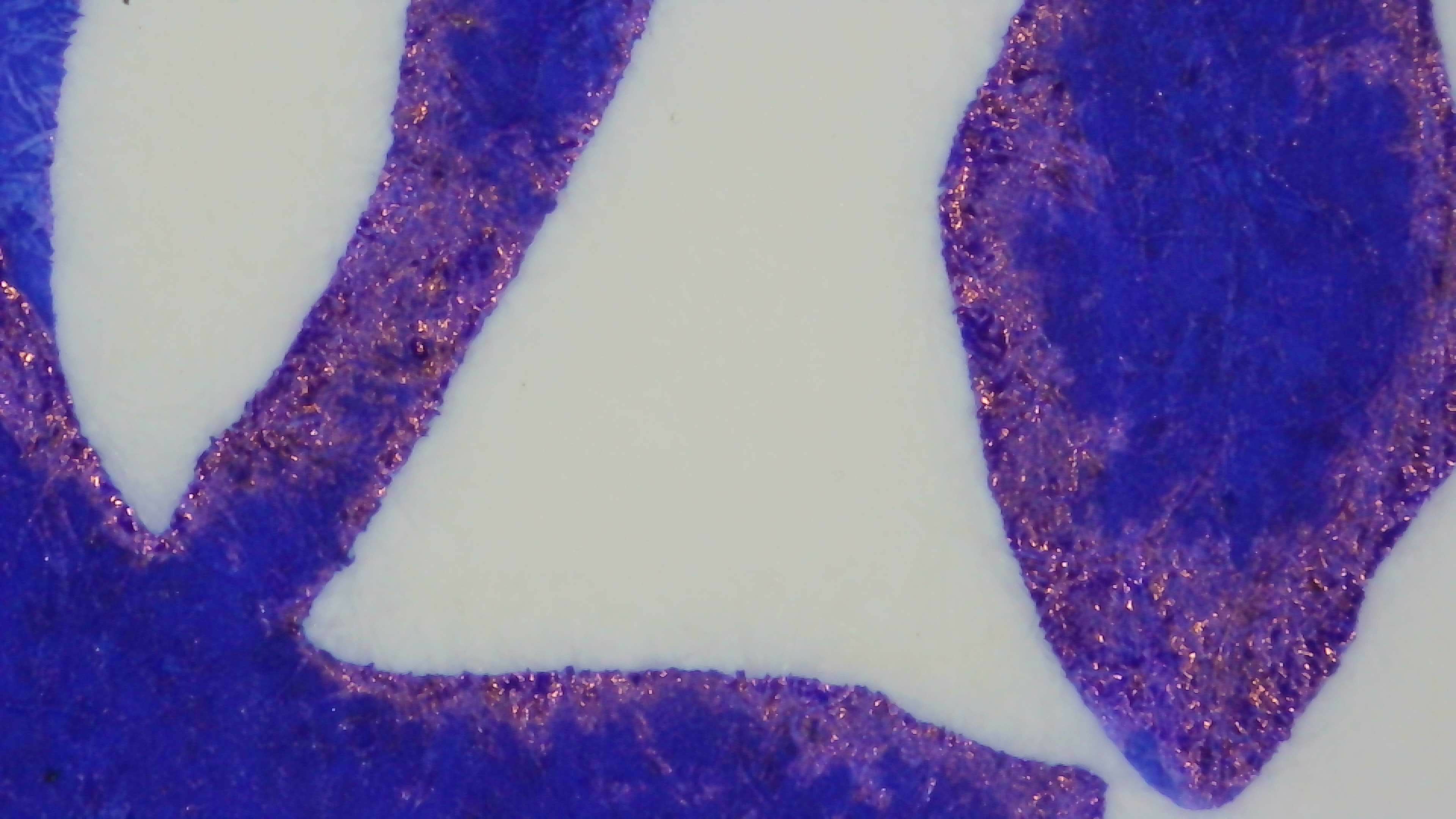
Chromatography
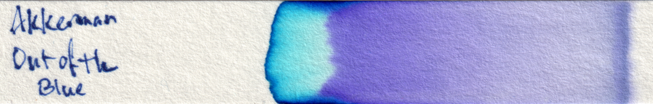
It separates out into purple and blue, with the blue sticking mostly to the edges.
Other Photos
This photo is a little blurry, but shows off the sheen in the large swatch areas.
And here is a writing sample alongside the ink bottle and an Asvine C80.
Questions or comments? Contact me on Mastodon