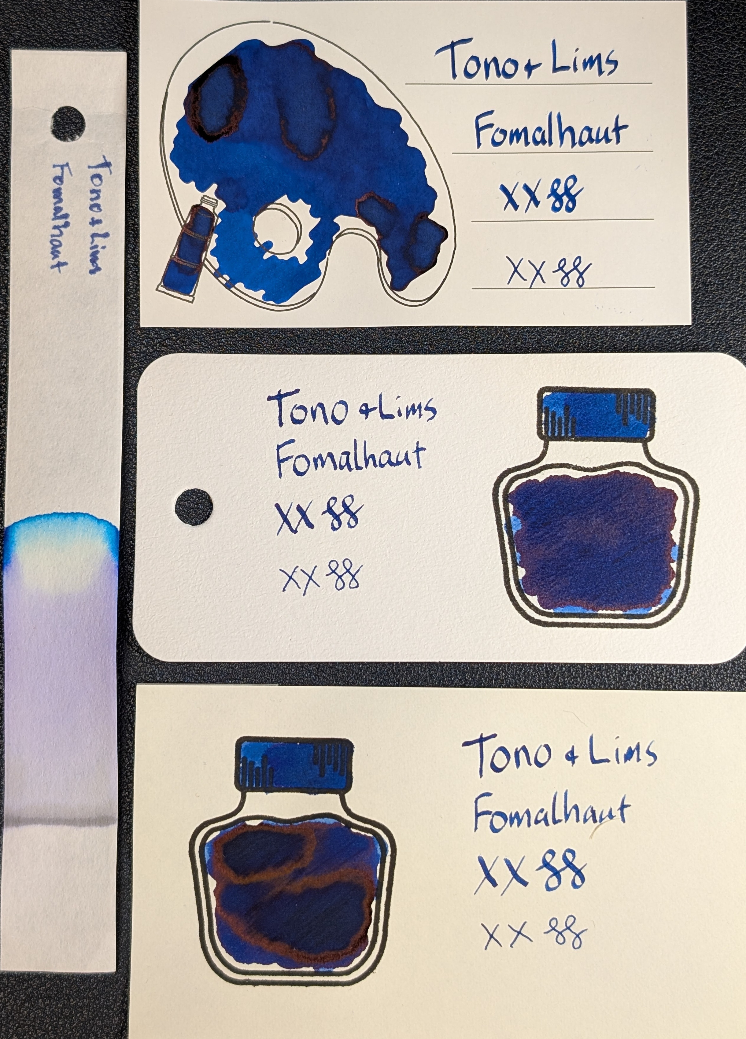
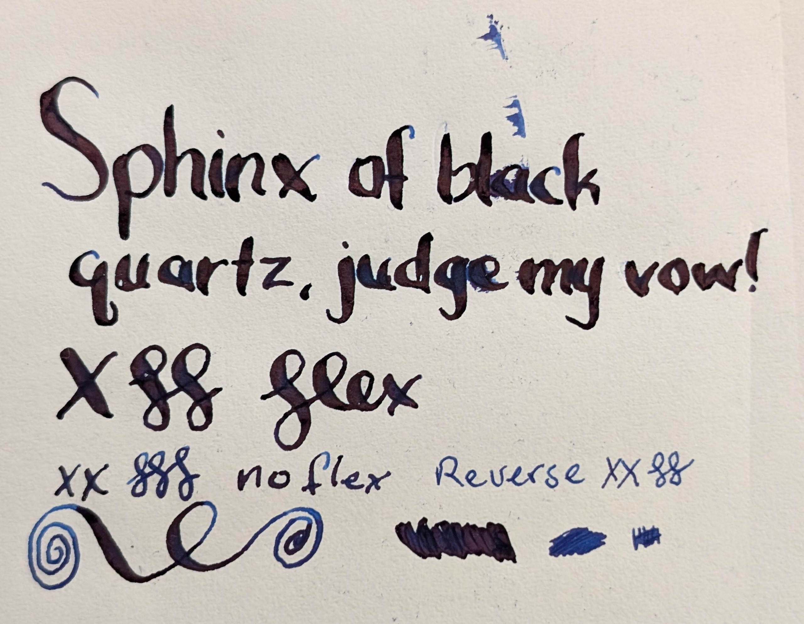
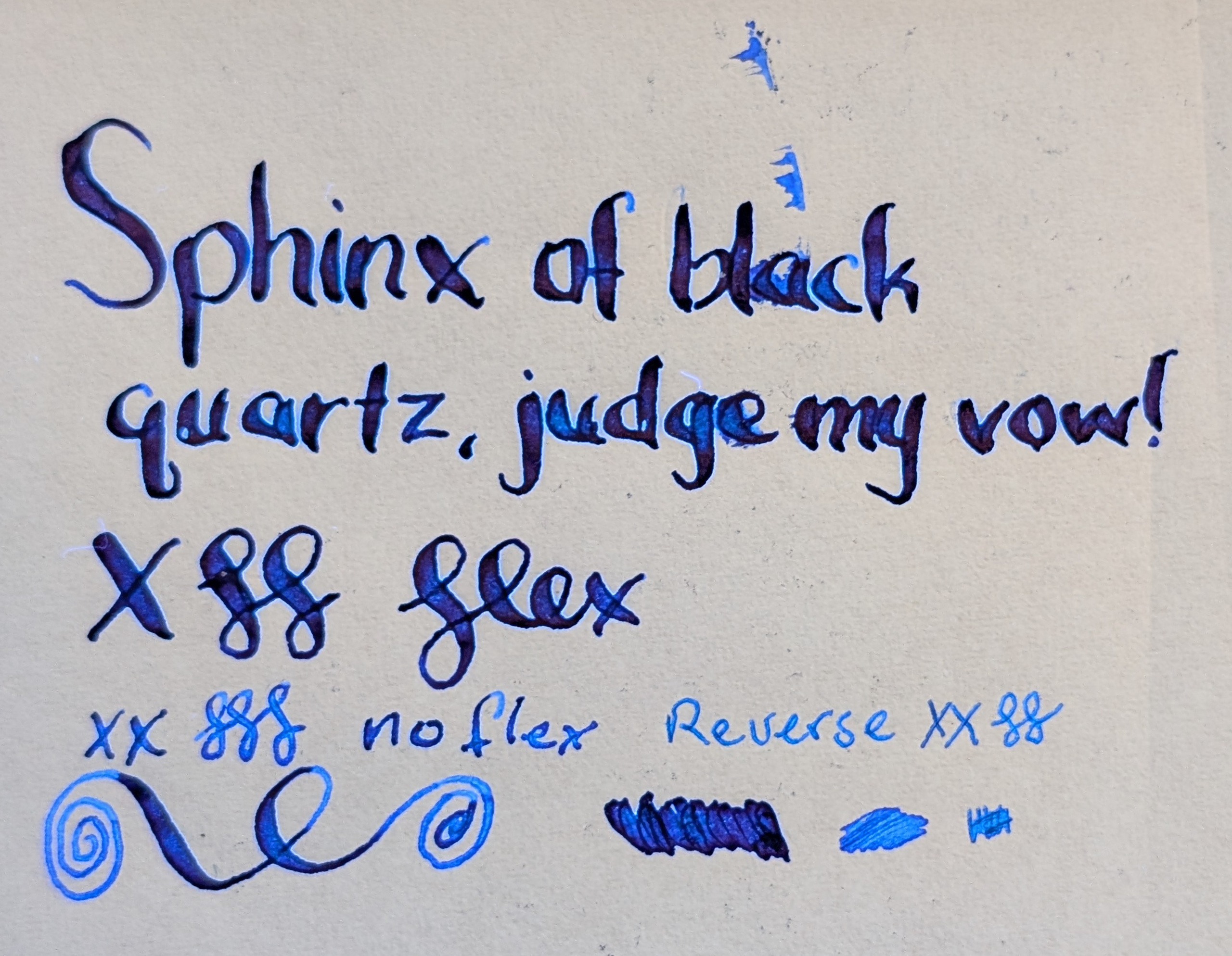
Another ink in the Tono + Lims Star Light Series: Fomalhaut

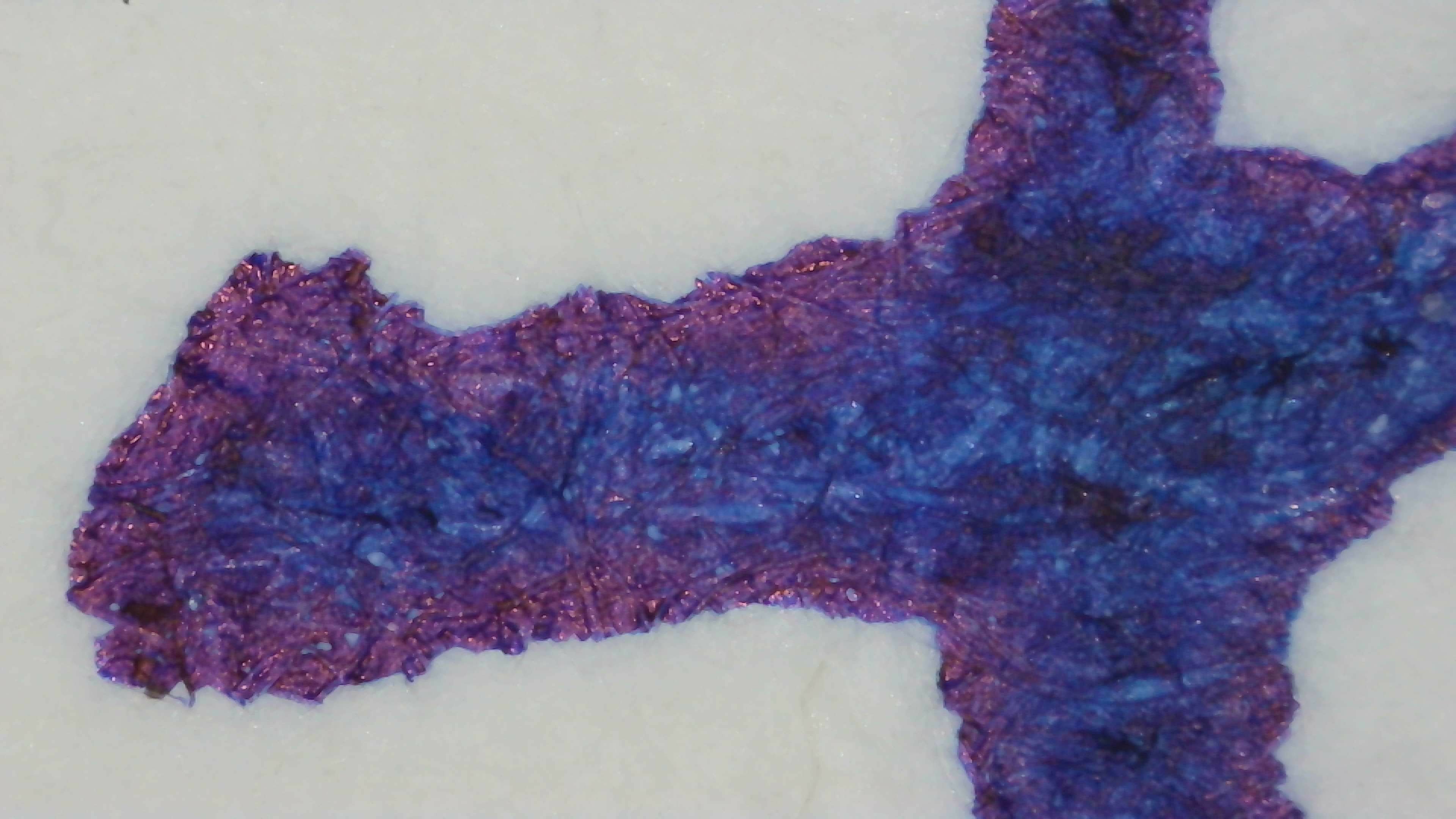
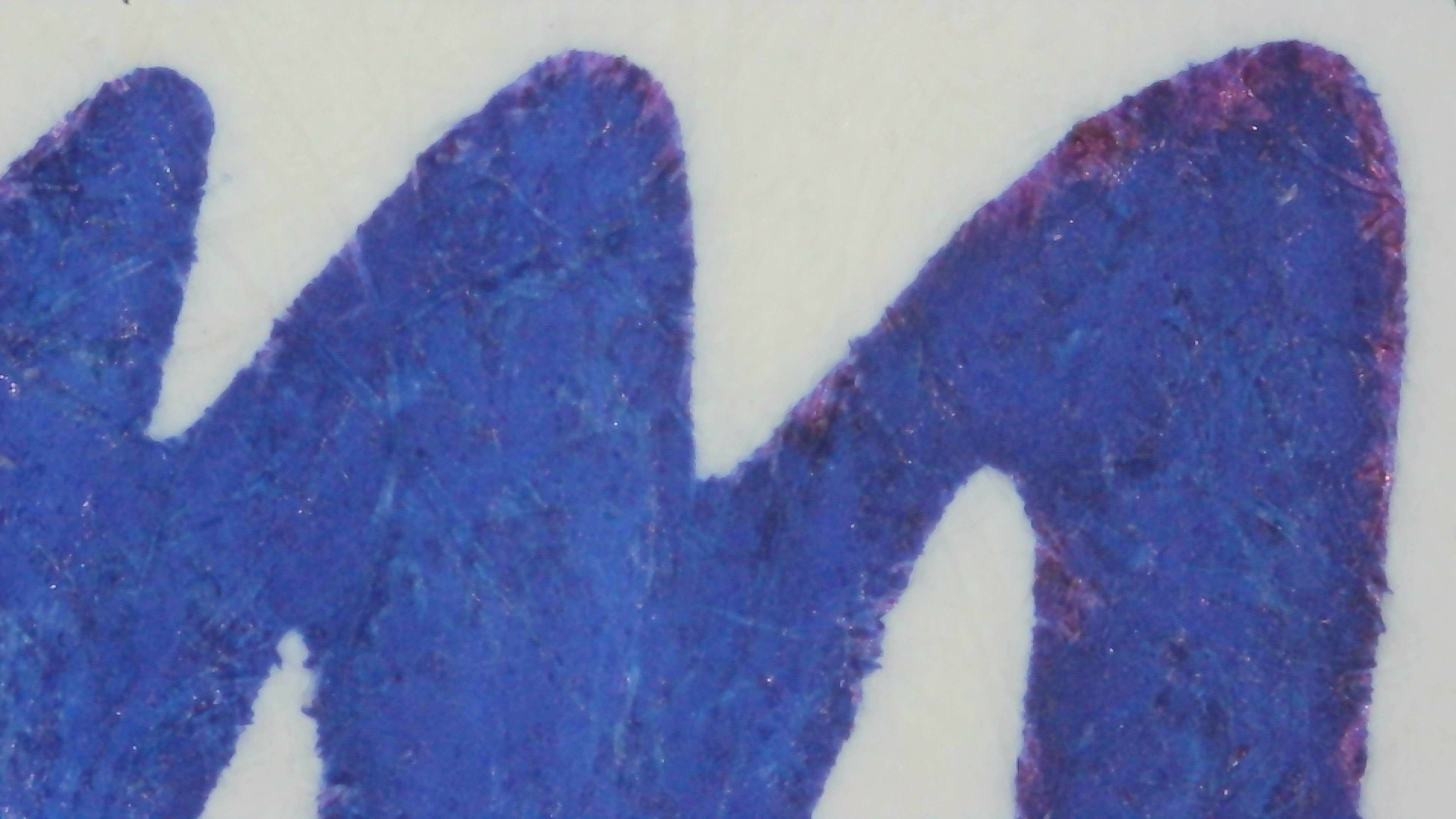
Dark blue, red sheen, dark blue fluorescent glow. Another home run for me! It would be good even if it weren't fluorescent. It seems to behave very well across each paper type, even lines and not much variation in color, minimal shading.

It's not as bright as the others, but still glows enough to stand out.

Photo of 3 ink swatches & chromatography strip for {ink name} which is a dark blue colored ink with red sheen.  Each swatch contains the ink name followed by "XX" 2 curlicues in both stub and EF widths.  Swatch 1: Iroful swatch card with an outline of a paint palette and tube. The palette is mostly filled in with swirls of ink, some areas are a darker blue shade outlined in rings of red sheen. There is an outline of a paint tube which is swabbed and looks similar, but with no visible sheen. The writing is dark blue and very even with almost no visible shading.  Swatch 2: Col-o-ring swatch card with a stamped outline of an ink bottle. The outlined area is mostly full of an ink blob which is very dark blue, with a couple small protrusions around the edge that are lighter blue. Red sheen is somewhat evenly spread on the darkest area. Swab across "cap" starts lighter blue then goes darker. The writing sample is dark blue and fairly even with rough edges.  Swatch 3: Midori MD swatch card with a stamped outline of an ink bottle. The outlined area is mostly full of an ink blob which is dark blue, some areas even darker outlined in red sheen. A couple areas around the edge are a lighter blue. Swab across "cap" is lighter blue on the left and darker on the right. Text is dark blue and even with a little visible shading.  Chromatography starts with a gray line then changes to lavender for a large portion, then a small area of clear and then the leading edge is blue.
Same as the first image, but under UV light.  The Iroful card paper is glowing dark blue, the ink is glowing dark blue with a hint of green.  The col-o-ring card paper is glowing bright blue, the ink is glowing dark blue.  The Midori card paper is not glowing, the ink is glowing dark blue in the writing and lighter areas of the swatch. The darkest area is glowing a very dark blue.  The chromatography strip starts glowing dark blue then changes to a light blue near the leading edge.
Photo of ink on Col-o-ring paper under magnification and natural light. The lines are very dark blue with some spots of lighter blue between fibers. The edges of the lines have a wide band that is red and shiny. The edges of the lines are also extremely rough.
Photo of ink on Iroful paper under magnification and natural light. The lines are very dark blue with some spots of lighter blue between fibers. The edges of the lines have a thin band that is red and shiny. The edges of the lines are also extremely smooth.

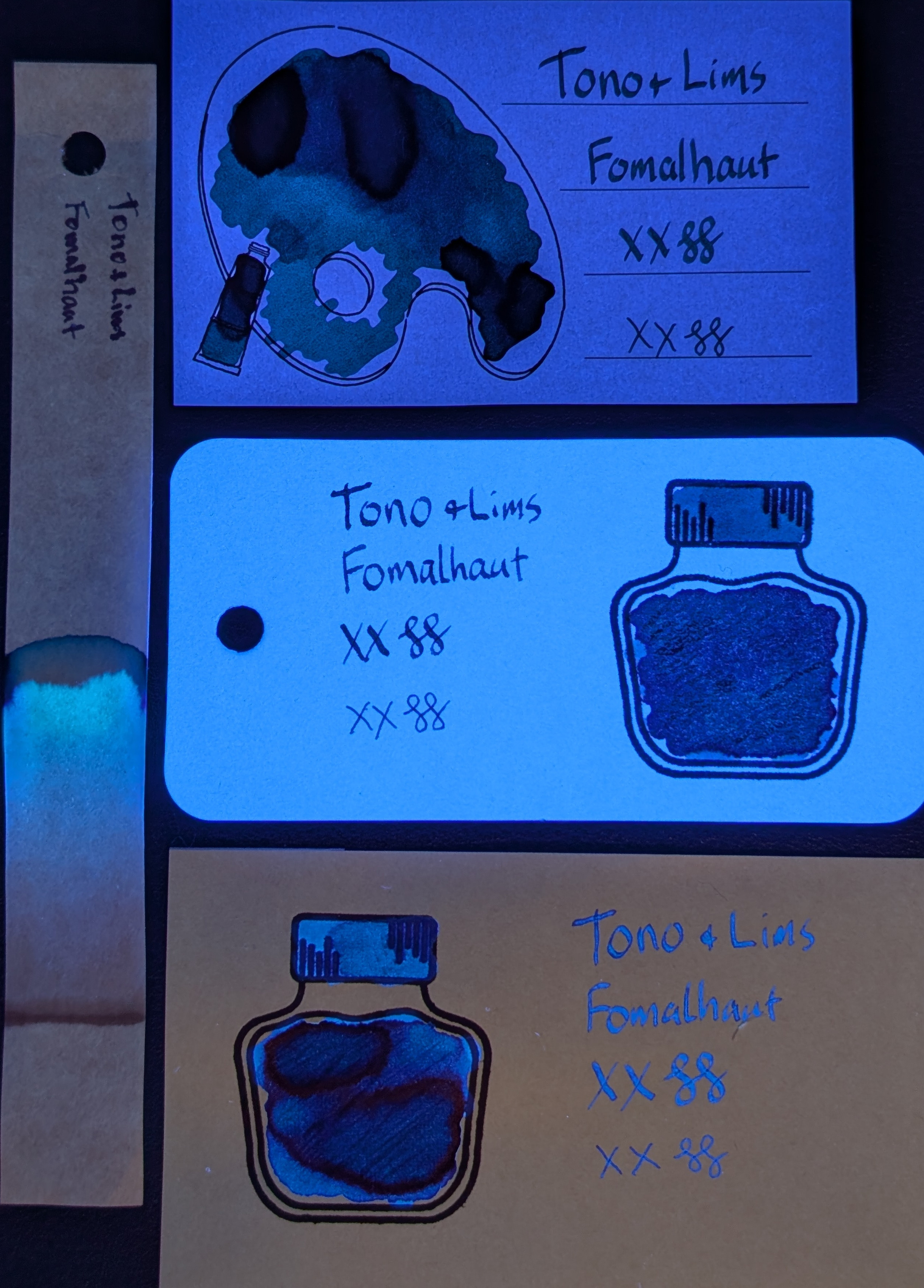
Midori shows it off well, as usual. The glow is very "deep" blue. It shows better in writing and a mix of UV and natural light.

There is one more ink in this set to post after this and then a wrap-up of sorts.

Photo of ink on Midori paper under magnification and natural light. The ink is dark blue overall. On the left, part of the line has a thin somewhat smooth edge of red sheen. On the right, the sheen is much thicker and more pronounced, and the blue slightly darker.
Same as the first photo but under UV light. The ink is glowing dark blue on the left and even darker on the right.
Photo of ink on Midori paper under magnification and natural light. The ink is dark blue overall. There is a line of even darker blue down the center. A thick band of red sheen is around the edges.
Same as the third photo, but under UV light. The ink is glowing a dark blue, with an area near the center being even darker.

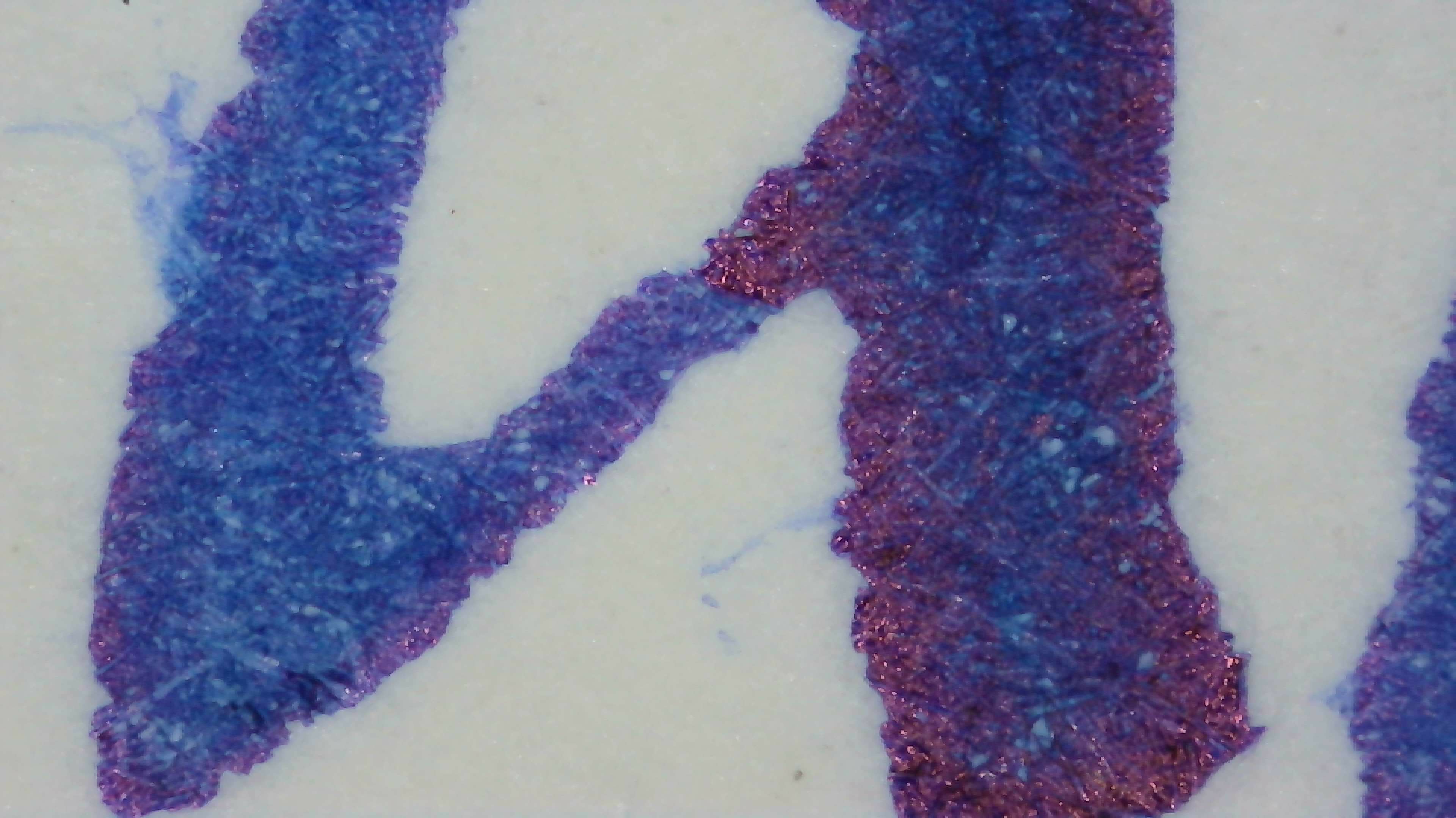
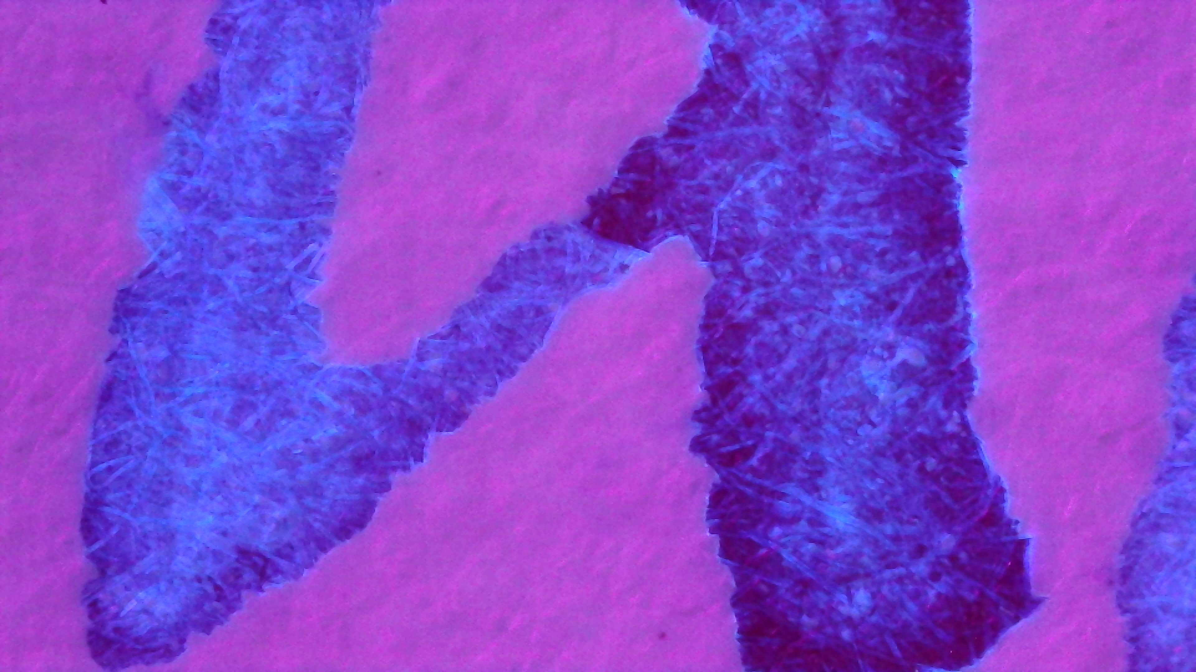
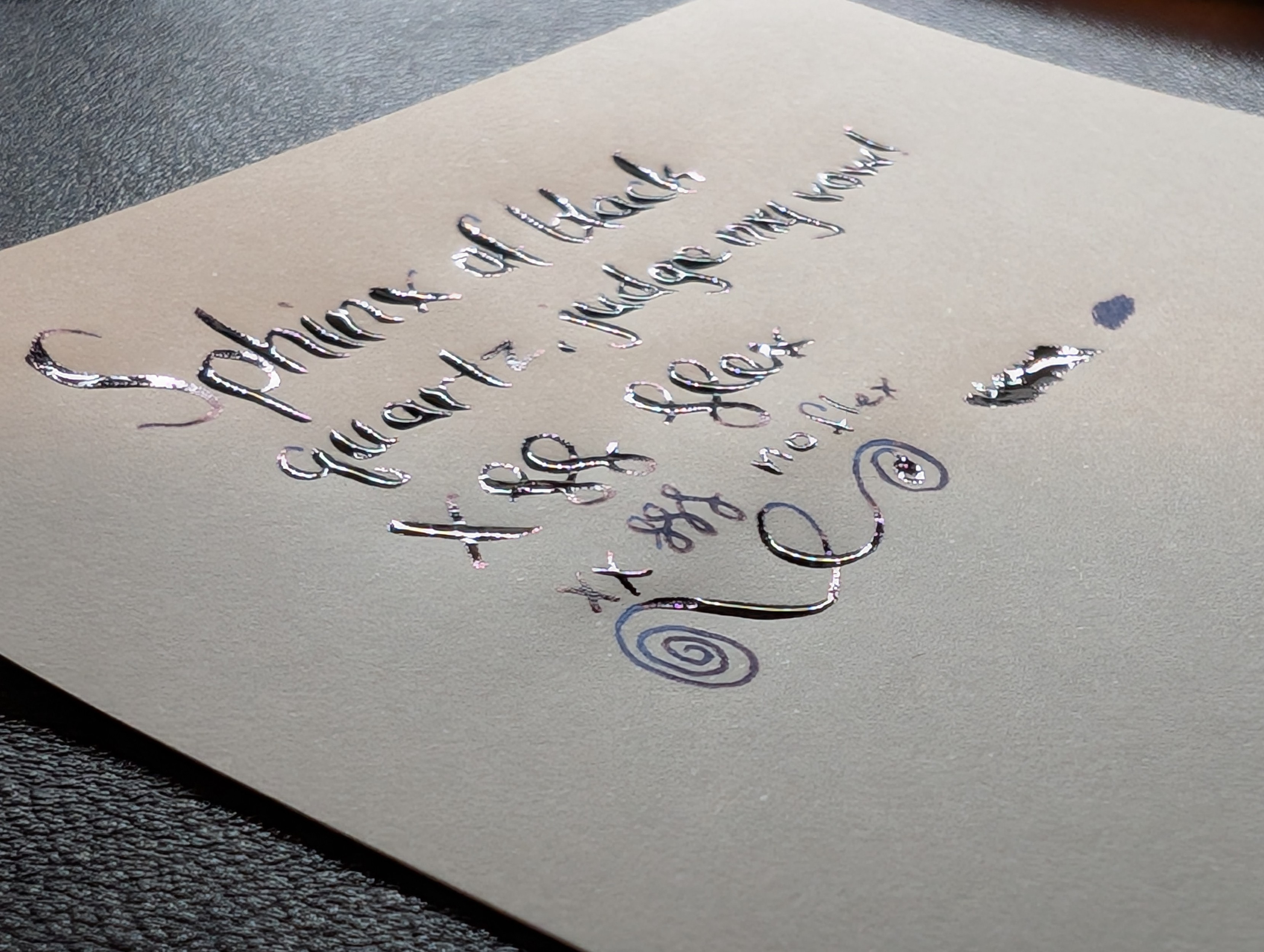
I was curious how Fomalhaut would do with more/less coverage so I put it in an FPR Jaipur v2 with an EF UltraFlex nib.

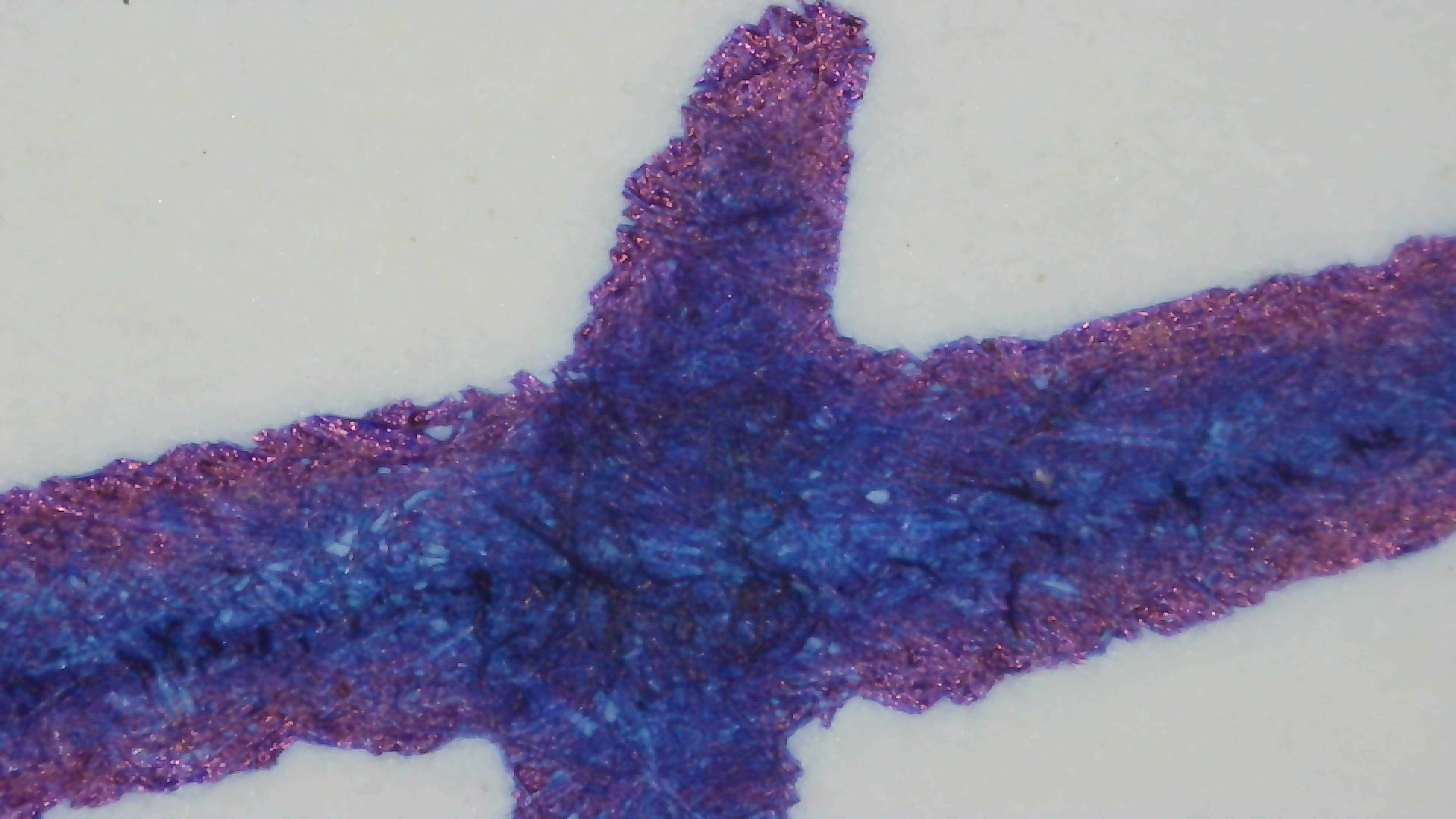
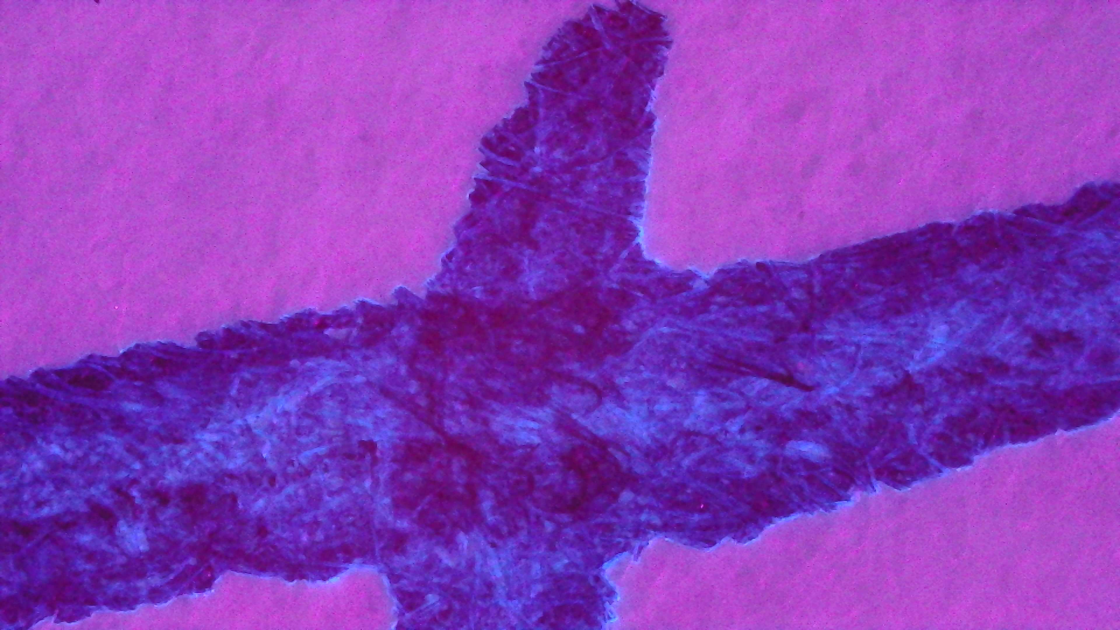
It went down extraordinarily heavy when flexing on Midori MD paper (see the first image for how much it puddled), but when it did that, the sheen took over a bit too much after it dried so it was counter-productive. This one glows much better when writing thinner, either without flex or especially when reversed. So this may be going in an EF pen for me once I run this out.

Photo of ink writing on paper taken at a low angle, the specific words are hard to make out, but there is a lot of wet ink collected on the lines reflecting light
Top-down photo of ink writing and scribbles on Midori MD paper. The ink is a dark blue with dark red sheen.  At the top large words were made with a flex nib and reads "Sphinx of black quartz, judge my vow!" followed by an "X" and curlicues and then the word "flex" in cursive.  Under that is "XX" and three curlicues in a much narrower line that says "no flex".  Next to that is one that says "Reverse" then "XX" and two curlicues, this appears much lighter blue.  Under that are a large looping line and three different scribble puddles (flex, no flex, and reverse)
The same top-down photo but under a mix of UV and visible light.  The flex writing at the top is glowing dark blue and some lighter blue around its edges and in areas inside.  The no flex writing is glowing a bit brighter and more evenly  The reverse writing is glowing very brightly and evenly.

Imported from Mastodon

Updated:


Questions or comments? Contact me on Mastodon