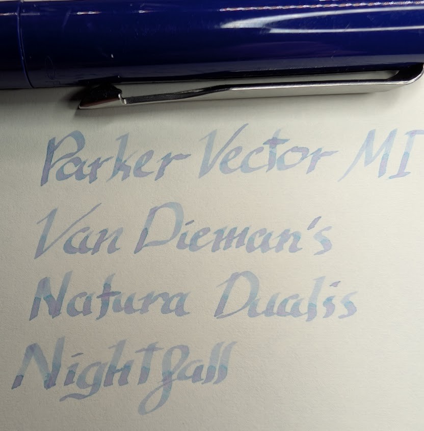
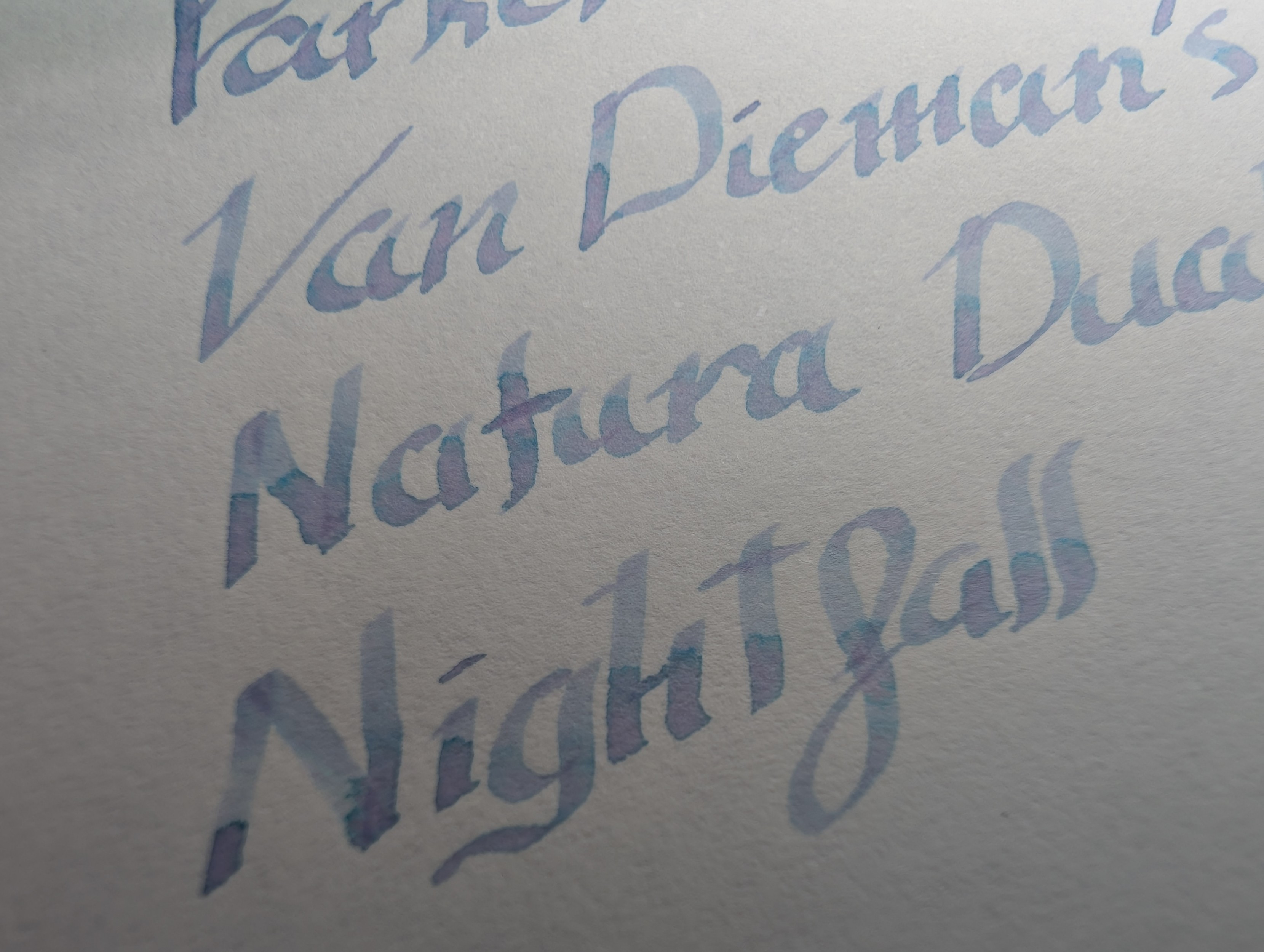
Since I got a Stainless Steel Vector and moved my FI nib to it, I put a medium italic nib in the Vector I was using. As this is a fairly wide nib it seemed like a good chance to try out Van Dieman's Natura Dualis Nightfall.
Me likey! It's one of the few chromashading inks I've had actually work like it should, but that may be the nib more than the ink. It's a tad on the pale side like most of these, but still very readable.
I'll have to swatch this one soon!
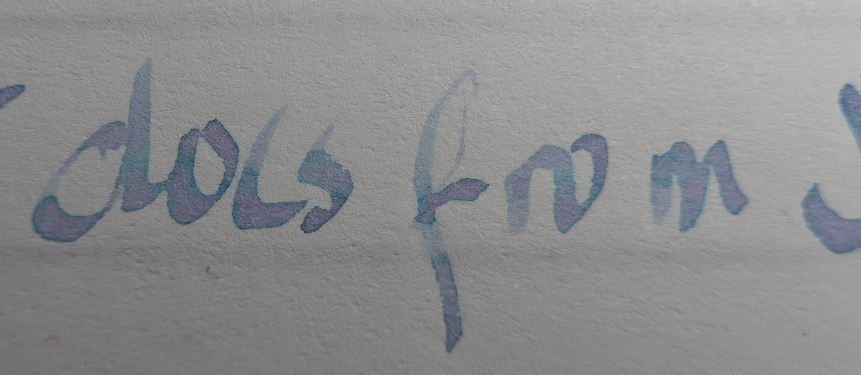
Nightfall also looks nice on Tomoe River S Kanso (Sanzen). The previous sample was on Midori MD.
Don't mind the flow issue in the middle, my hand was at an awkward angle at the bottom of the pad where my palm usually rests, and that Parker MI nib can be very picky about angles.
I may have to clean out a TWSBI and load this up in one of those.
Questions or comments? Contact me on Mastodon