
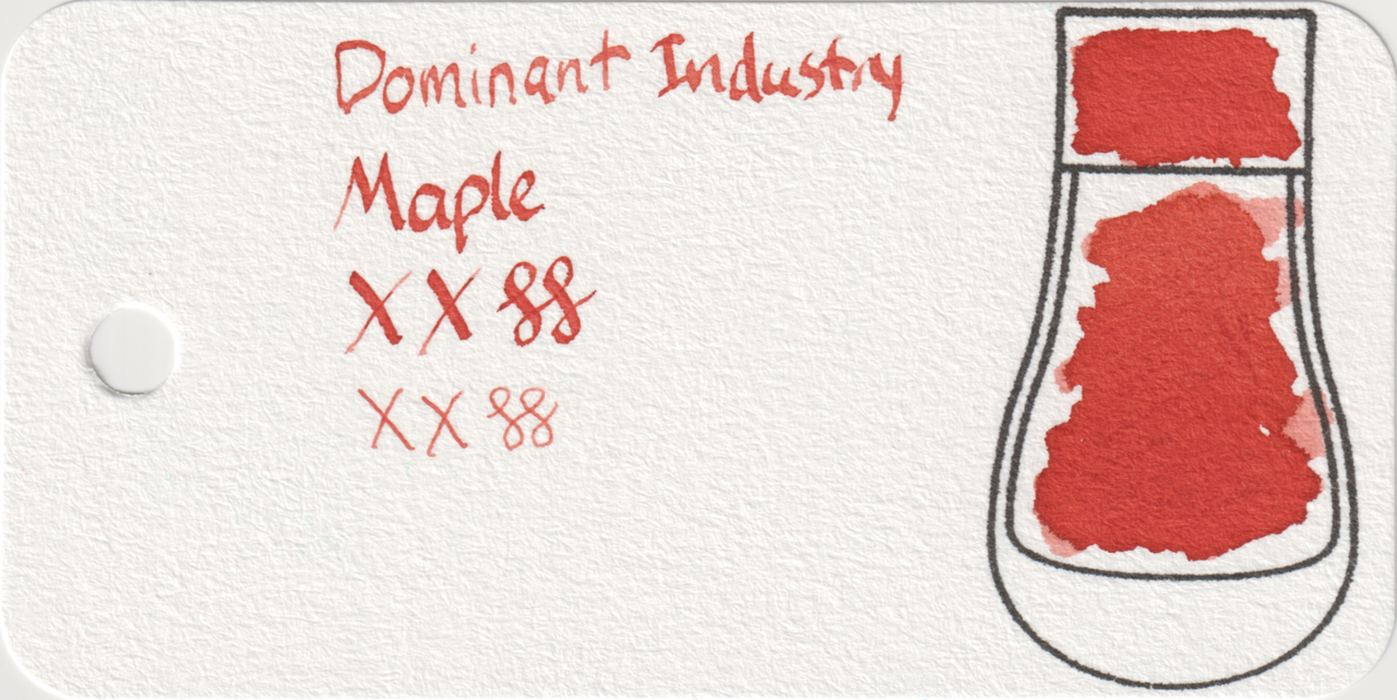
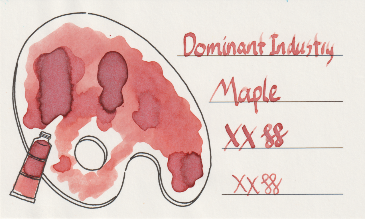
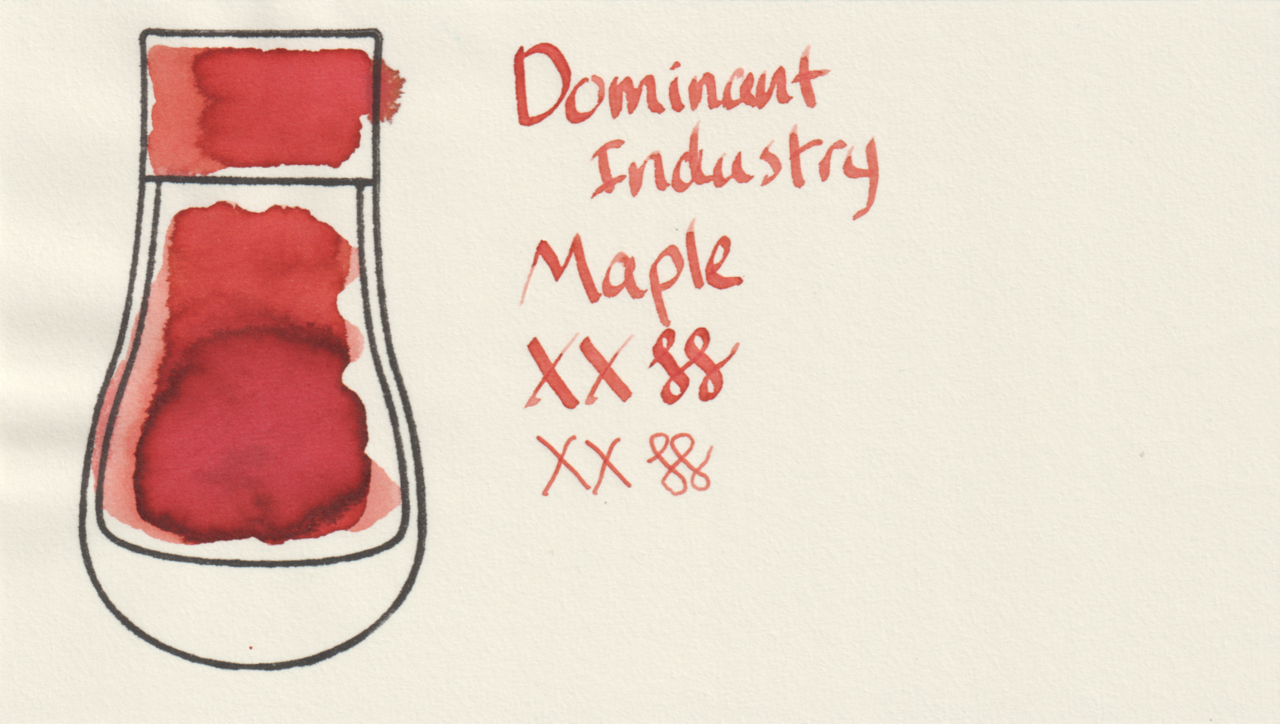
Dominant Industry Maple is a dark “burnt” orange or red-orange ink, I’ve also seen it called “terracotta”. It has some shading as well, and a tiny bit of coppery sheen.
Scans
It looks slightly different on each paper. Lighter and heavier shading on Iroful, darker with shading on MD, and very even and medium on col-o-ring. In the heavy areas on Iroful it almost looks like some blue is showing through.
Photos
The coppery sheen is visible in the large swatches on Iroful and MD. It’s very shiny on Iroful, but it’s thin.
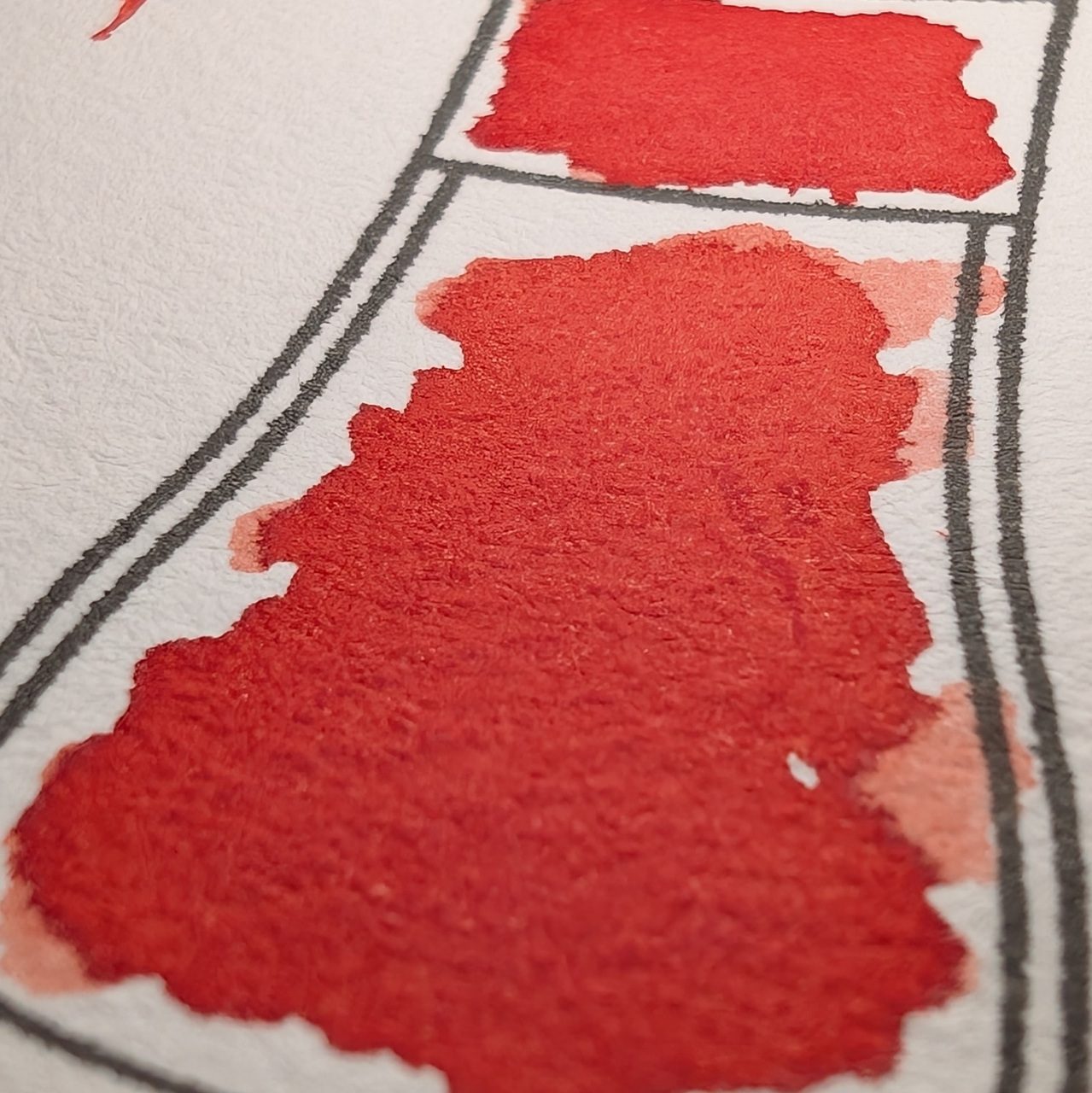
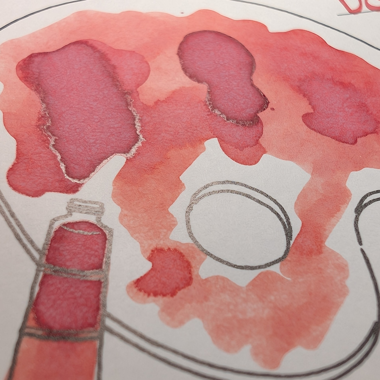
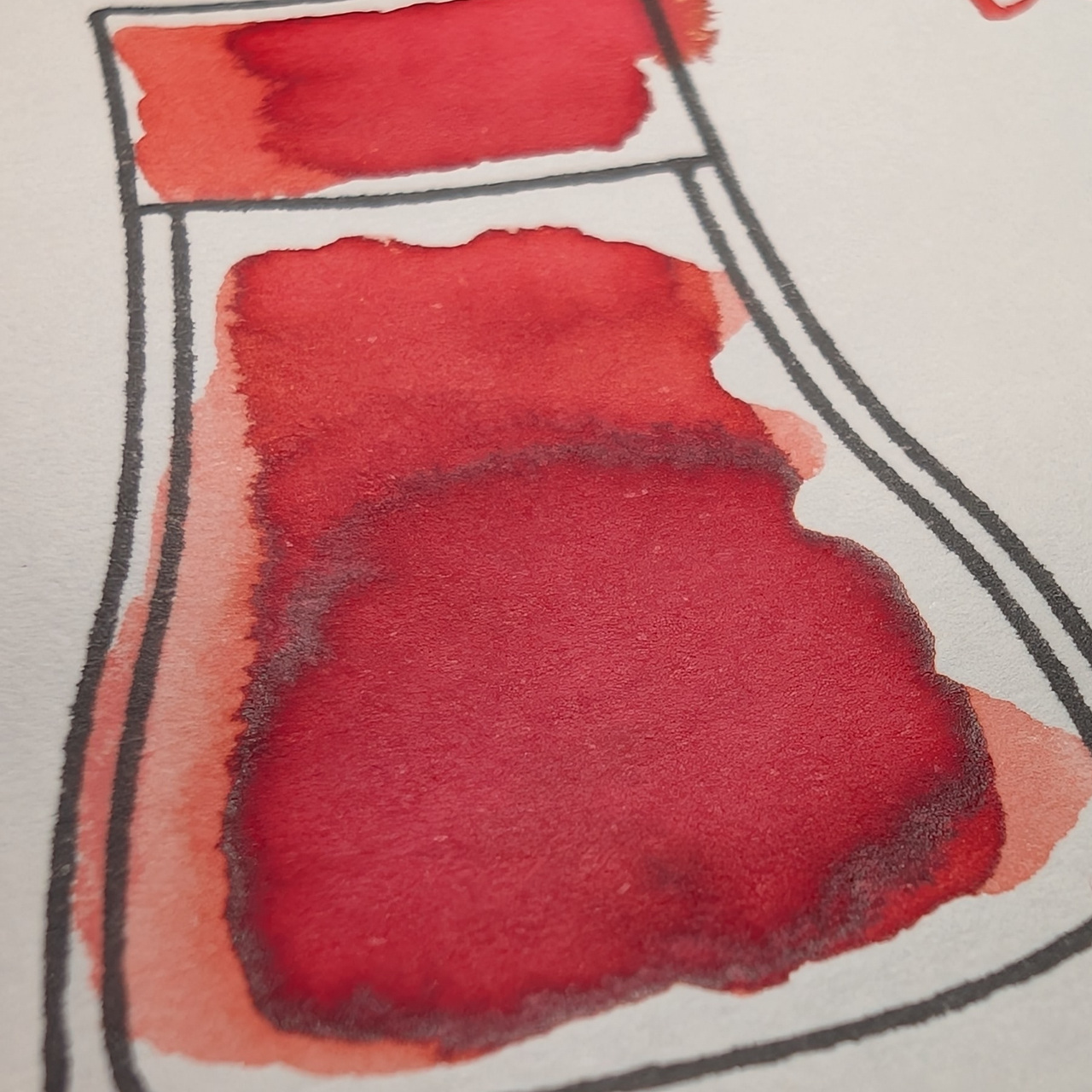
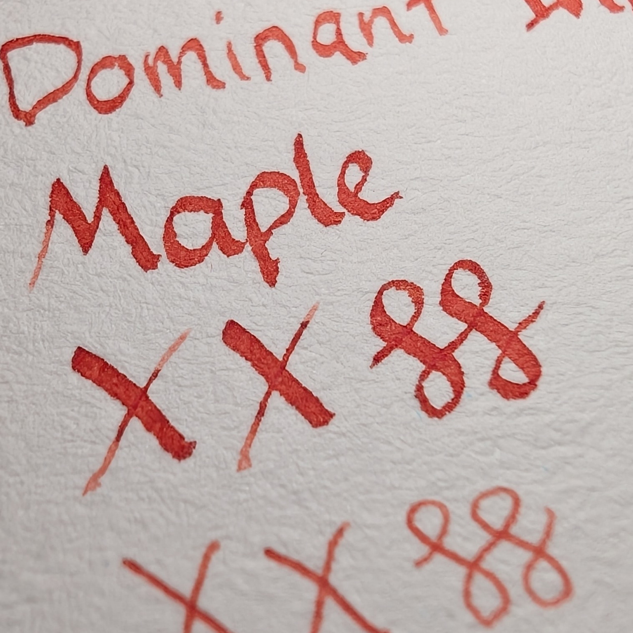
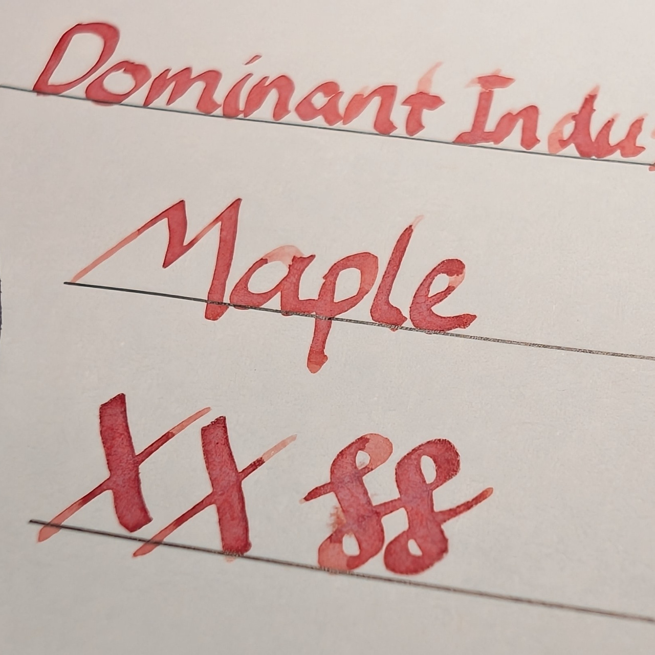
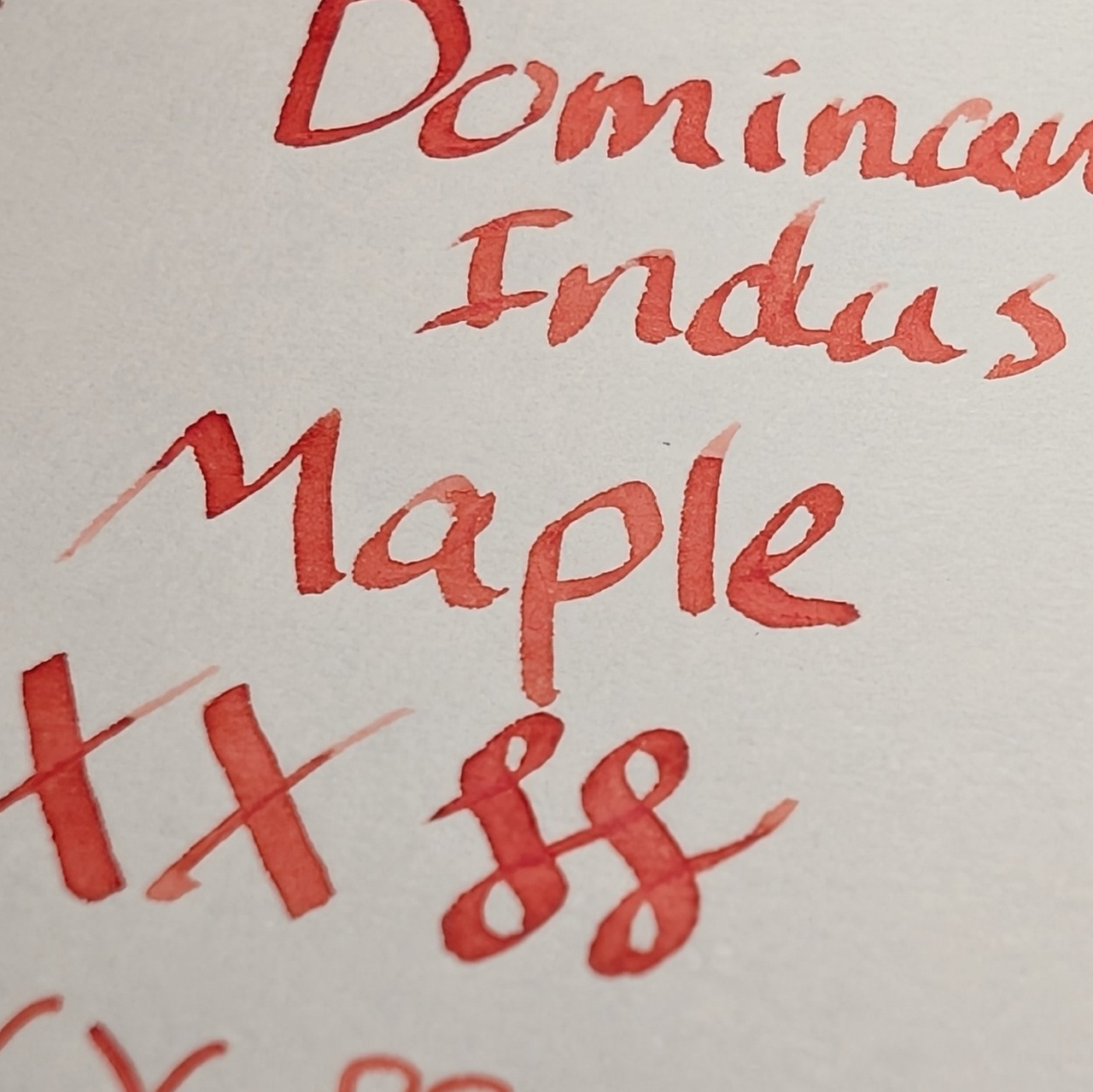
No sign of the sheen in the writing.
Microscope
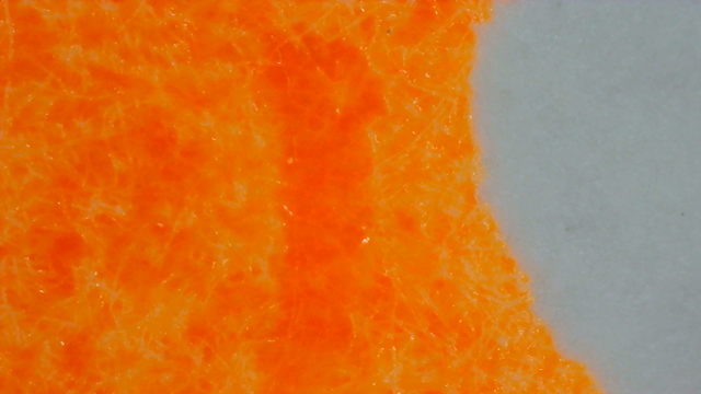
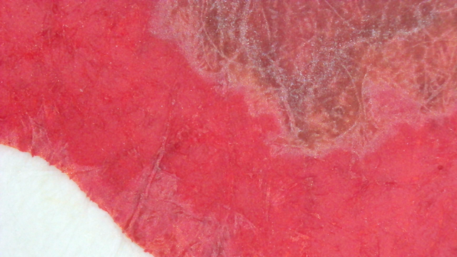
Under the microscope the color is similar to the scans.
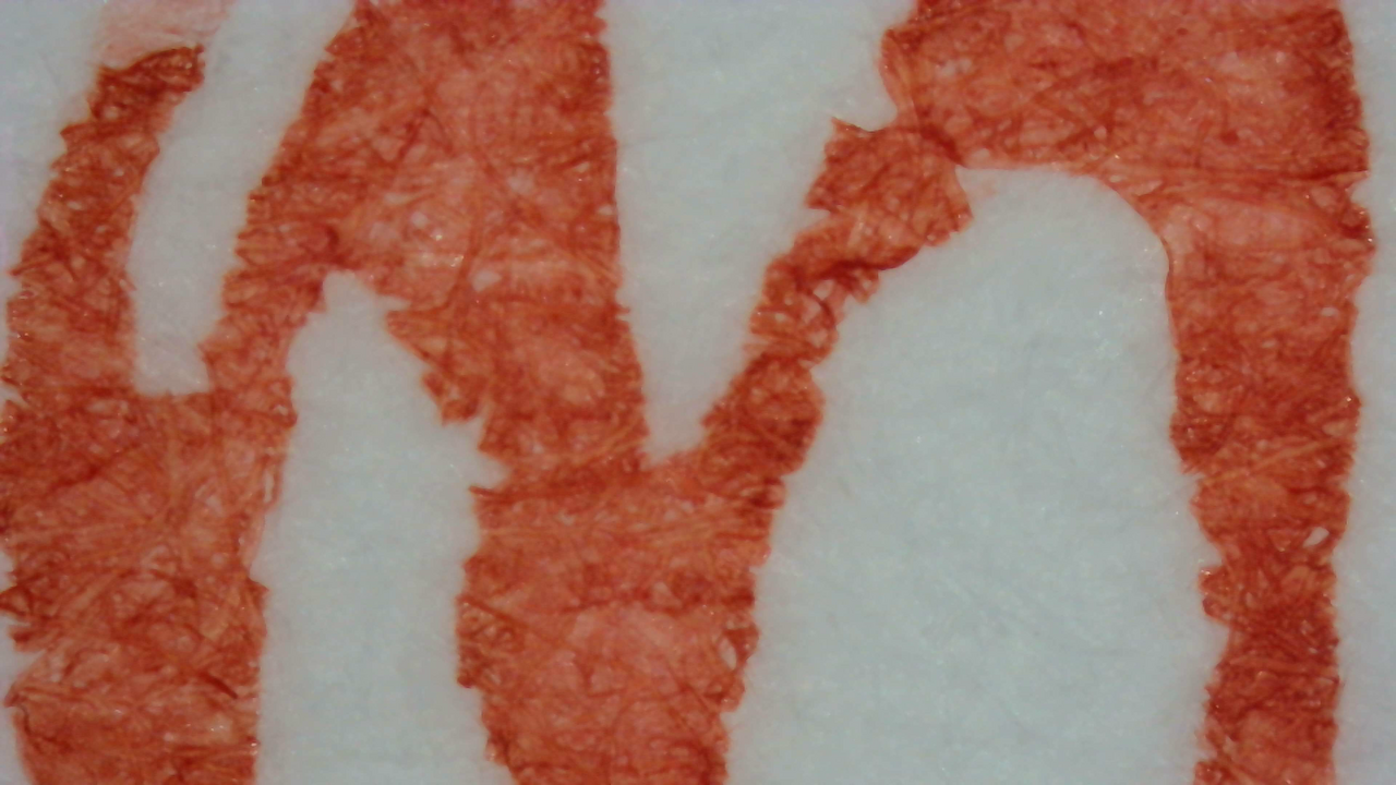
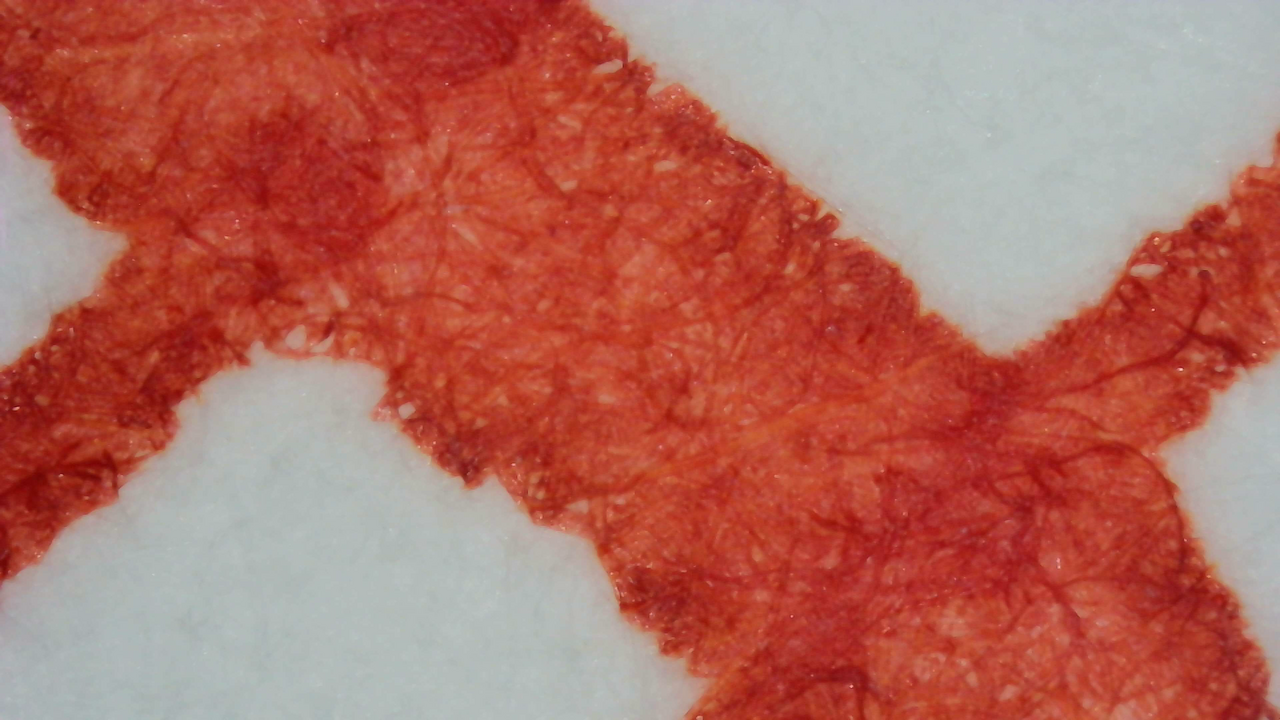
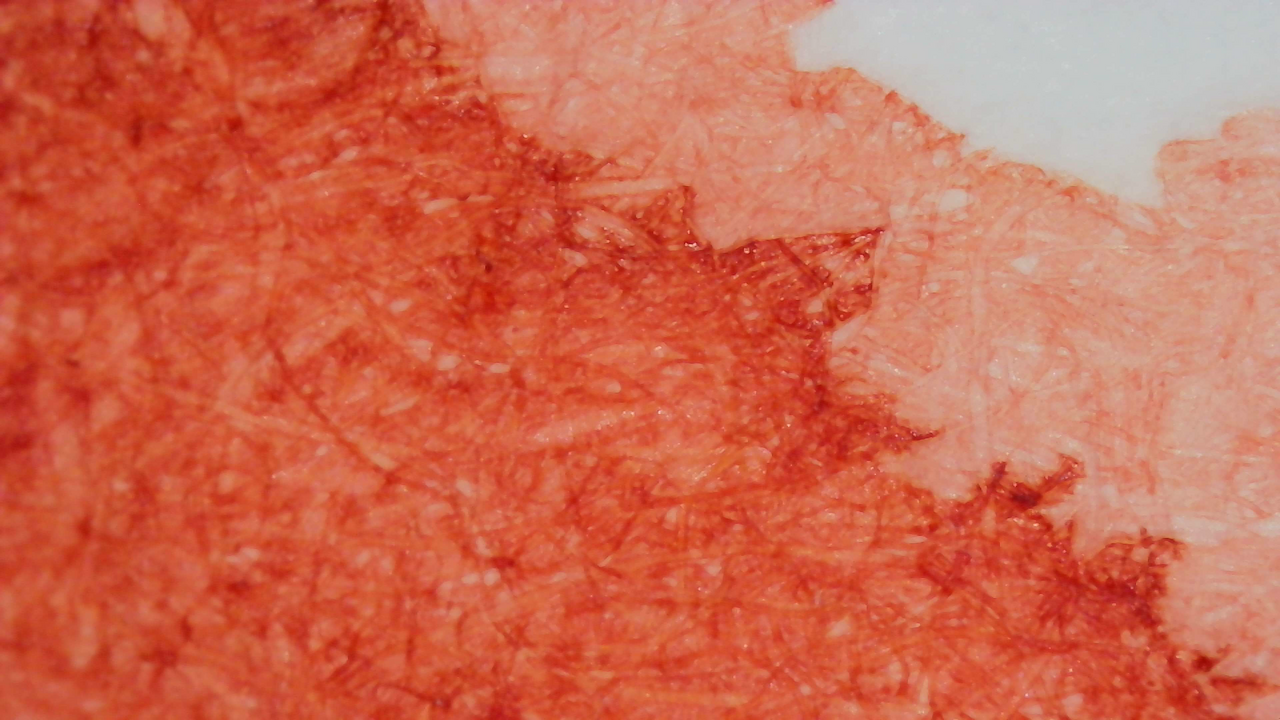
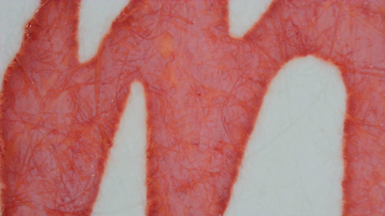
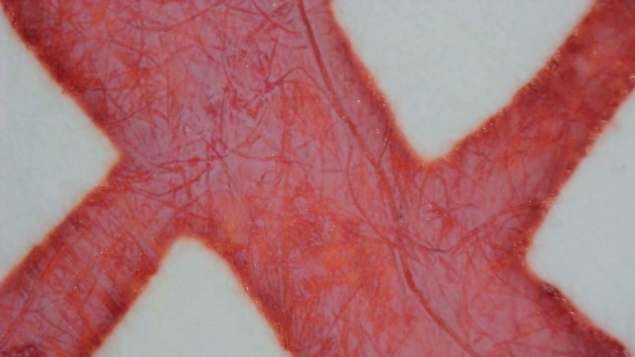
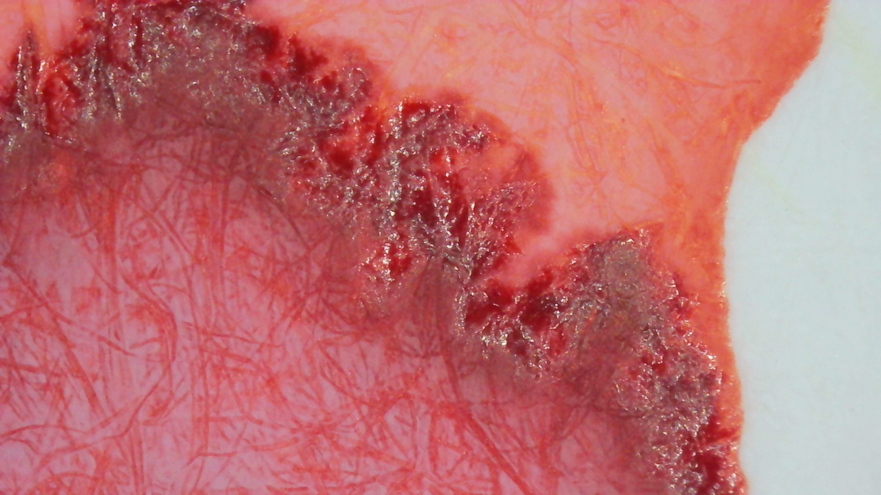
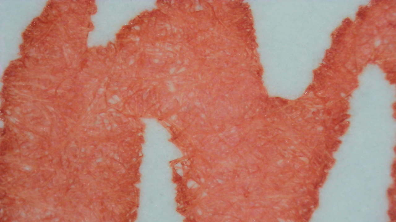
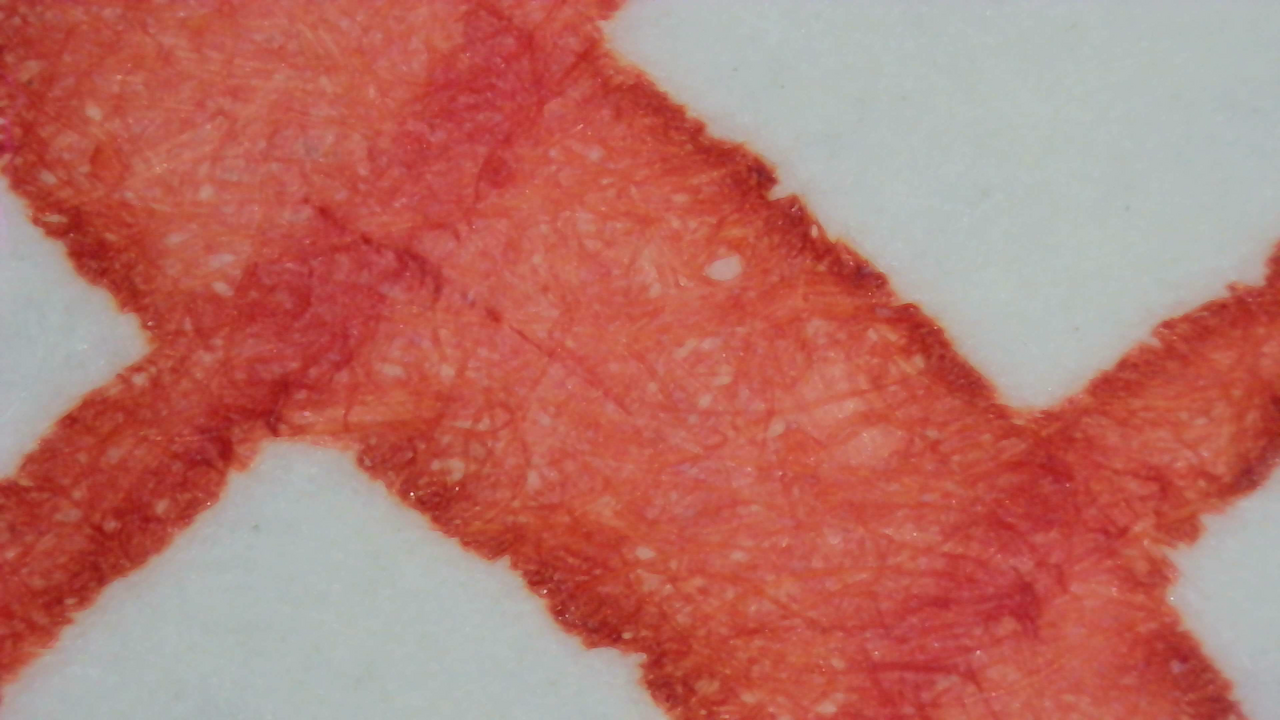
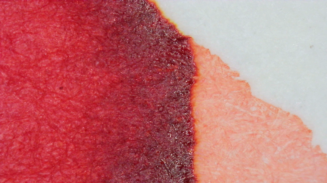
The color I was seeing on Iroful isn’t blue, but a light “dusty” red-gray tone.
Chromatography

Chromatography starts magenta and continues evenly for some time, ending with a band of yellow.

There is a faint glow from the yellow and some blue just beyond that, but nothing was noticeable in the swatches.
Verdict
I really like this color. To me, it looks like one of the colors maple leaves turn in the fall. I have a sugar maple tree next to my house that turns all sorts of great colors when the leaves come down, and this is very close to some of those colors.
I have not used it heavily yet as this is one of my more recent inks. I have used it in Jinhao 20 over the last few months and it’s worked well there.
Questions or comments? Contact me on Mastodon