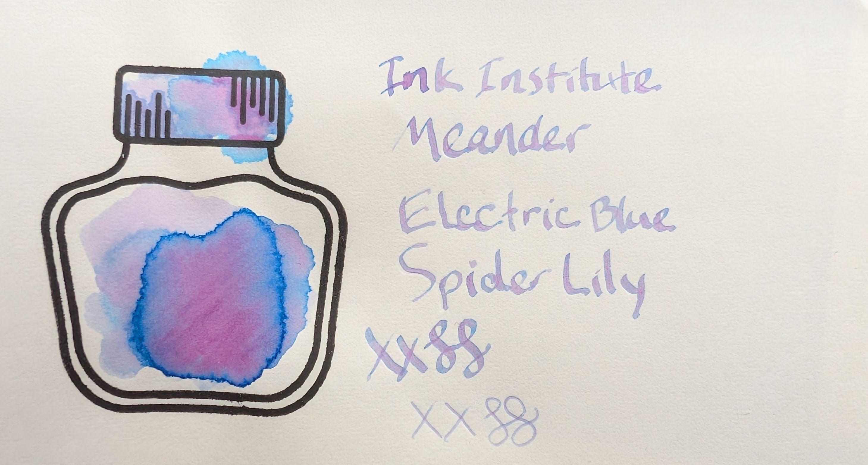
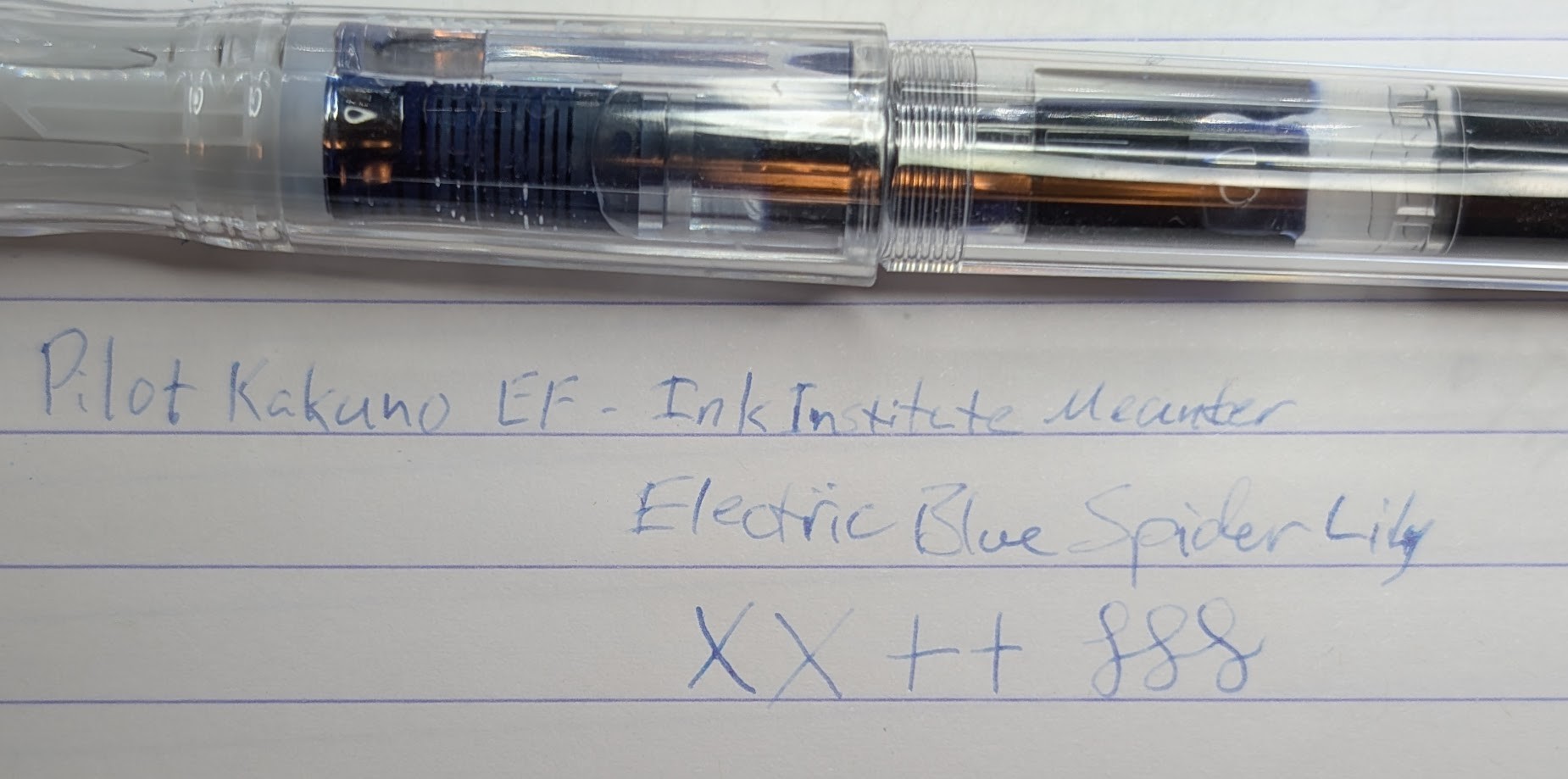
Here’s a fun multi-shader: Ink Institute Meander Electric Blue Spider Lily.
It’s a bit light on the page for small nibs but looks good with the stub dip pen. You can really see the multi-shading between blue and pink in some of the letters that had more ink after dipping the pen.
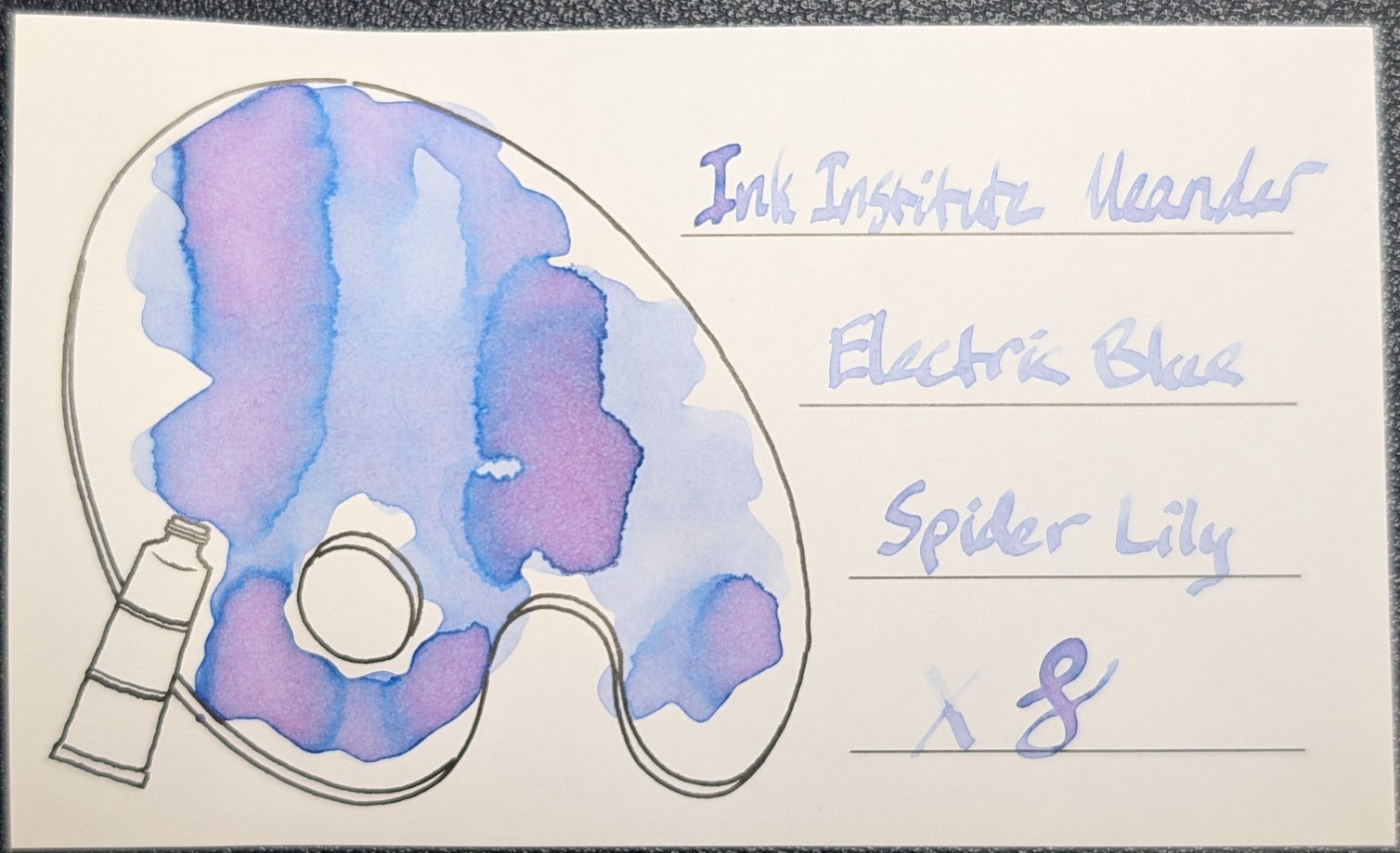
MD Paper
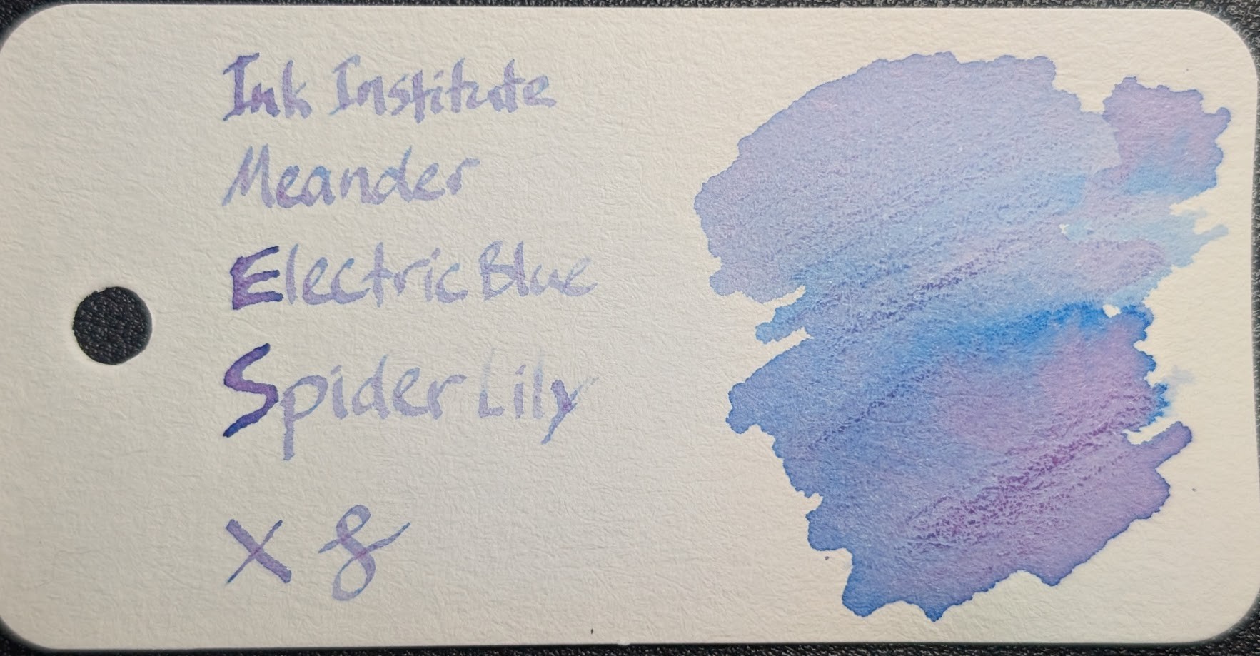
Iroful Paper
Col-o-Ring Paper
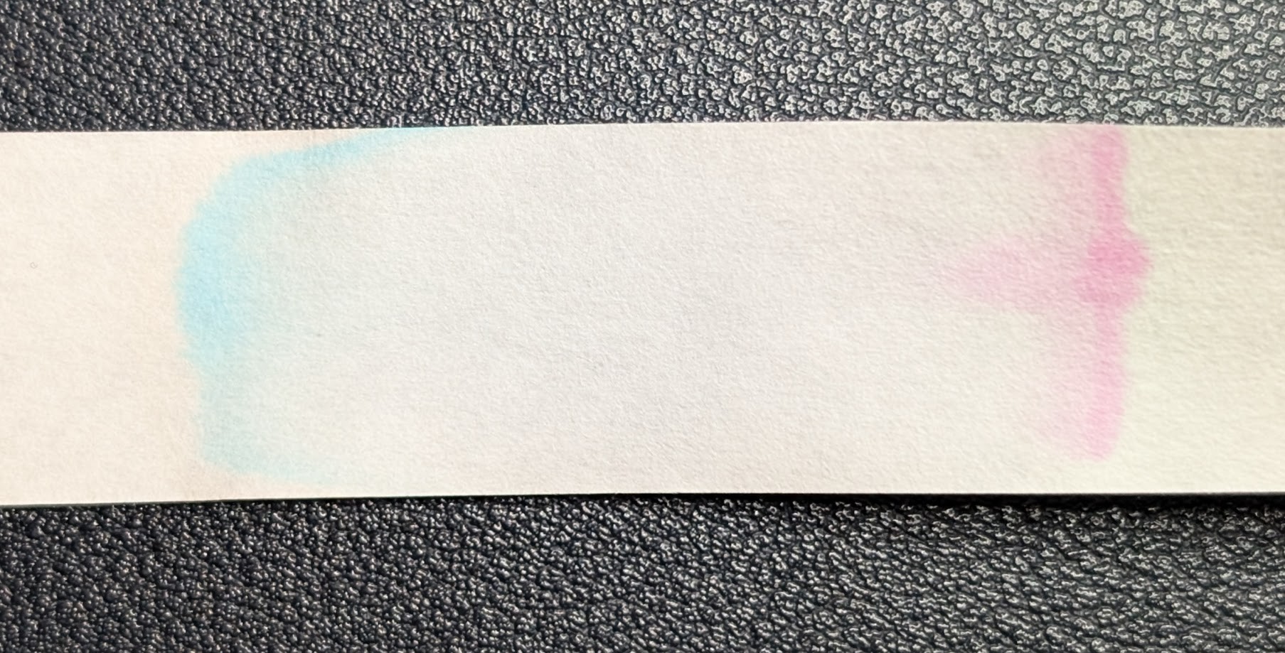
Chromatography
Difficulties
I only have a 5ml sample and it is almost gone and I have never, not once, got it to work in any pen with any nib size. Only dip pens. Wonderful chromashading colors, but difficult to work with.
I tried it in an EF Kakuno and the results were not good. I tried it in an FPR Jaipur v2 but it would not flow at all. Other attempts were equally fruitless.
It worked OK with dip pens, but it is a bit watery, so it doesn’t stick too well to the pen. If you have a Sailor Hocoro dip pen with a reservoir that worked the best.
As an alternative, consider Van Dieman’s Natura Dualis Nightfall. I haven’t done a full swatch of it yet, but it’s close and writes decently. I prefer the tints in Electric Blue Spider Lily, but I can live with Nightfall and being able to actually use the ink reliably in pens.
Questions or comments? Contact me on Mastodon