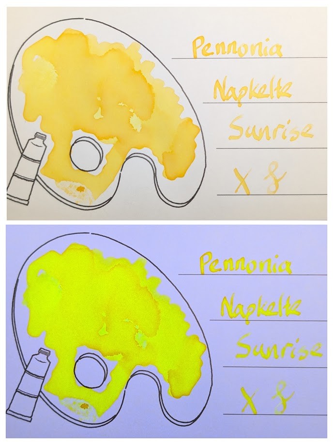
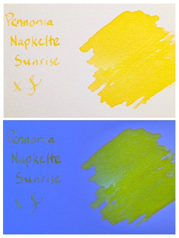
This sample is Pennonia Napkelte Sunrise, which is a bit disappointing. I had high expectations after liking Napnyugta Sunset so much. Napkelte Sunrise is yellow, but too pale under regular light to be much use. Under UV it’s OK, but the text is even harder to read the way it glows. This one would really only be good for highlighting and drawing.
Glad I only have a sample vial of this one.
MD Paper


Iroful Paper
Col-o-Ring Paper
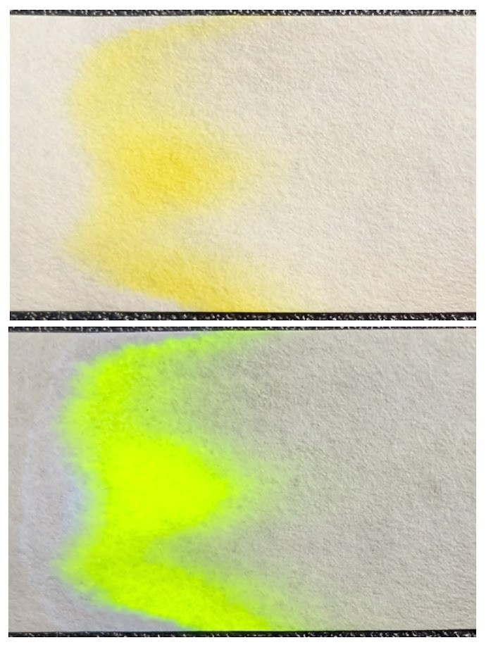
Chromatography Strip
Questions or comments? Contact me on Mastodon