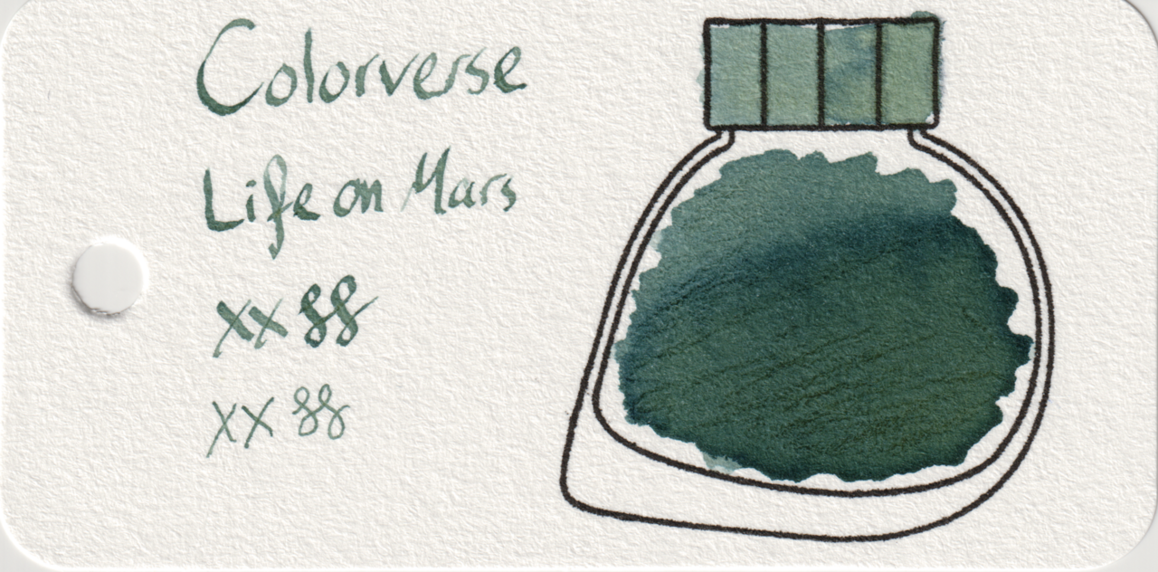
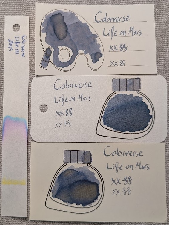
Colorverse Life on Mars is primarily a “dusty” blue ink with chromashading and a hint of red sheen.
The color changes quite a bit depending on the shading, the paper, and how much ink is present. Yellow, green, and even pink can all show through.
I like this one overall, but I only have a 5ml sample bottle. I’m not sure I like it enough to buy a whole bottle, though.
Scans
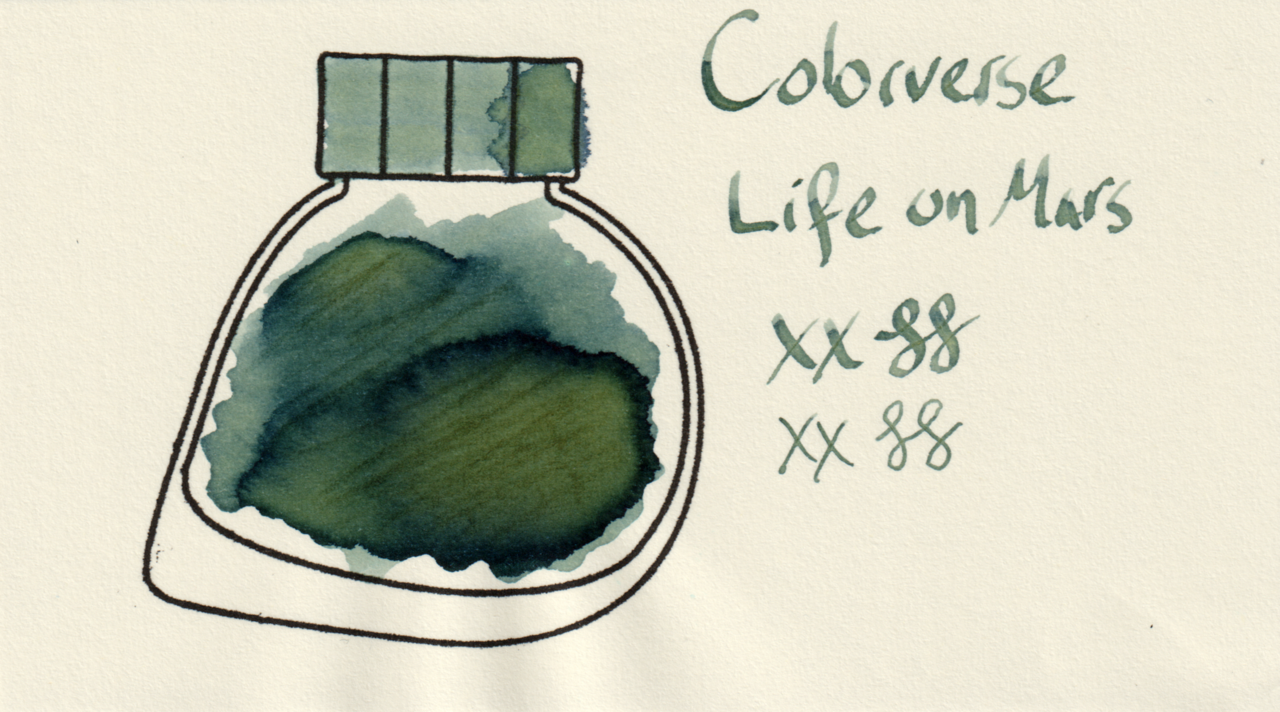
The scans make the ink appear more blue-green than it does under natural light. I’m not sure if that’s from the light in the scanner or the yellow aspects of the ink being more prominent when scanned at high resolution.
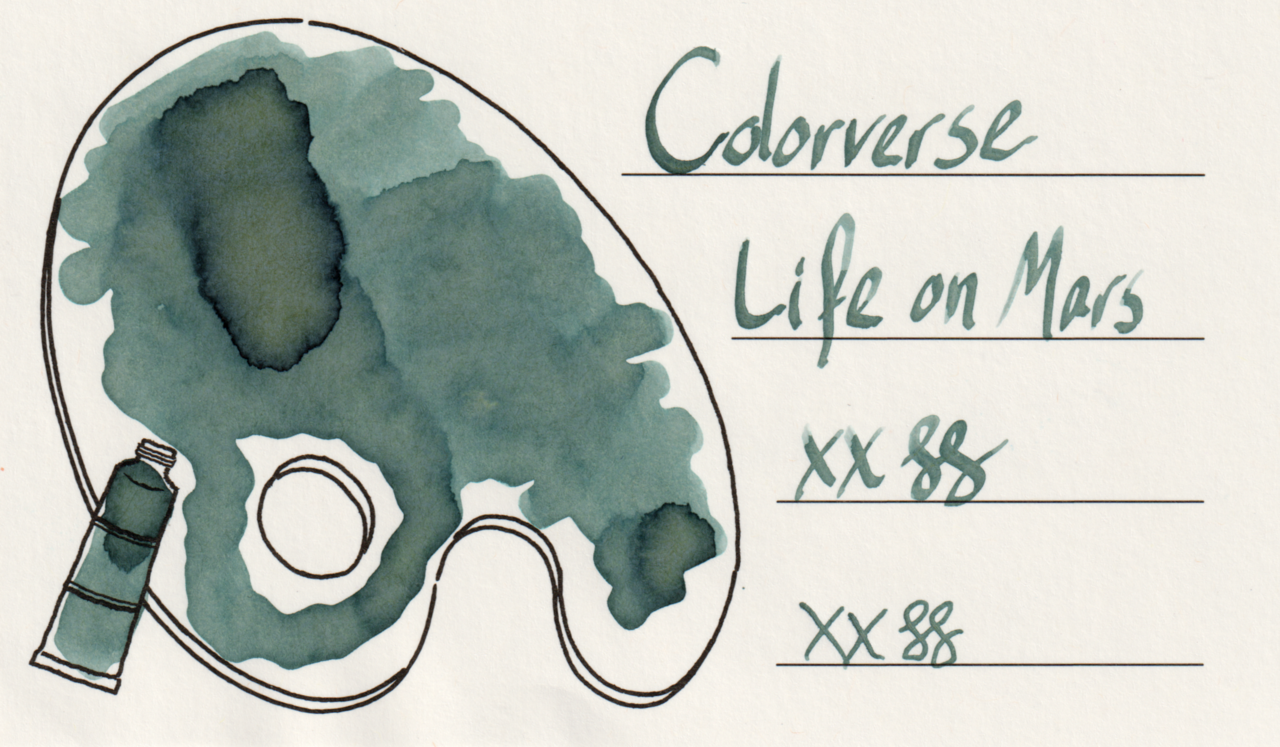
The yellow is especially evident on MD paper, and somewhat so on Iroful
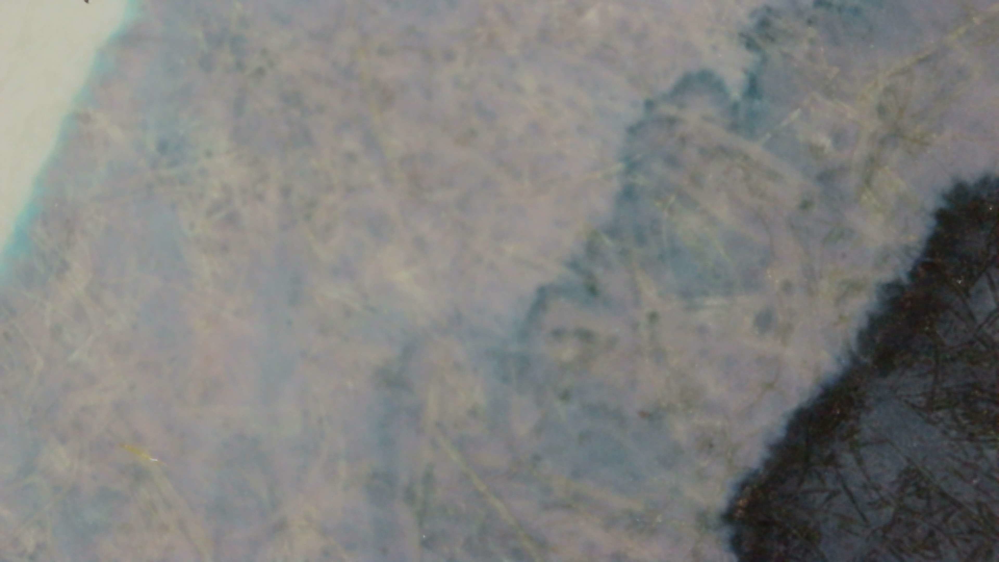
Microscope
With this one I tried to get a similar shot of each paper (Col-o-ring, Iroful, Midori) for more direct comparisons in chromashading. In most of these it appears more blue, though the yellow and green are still visible in areas.
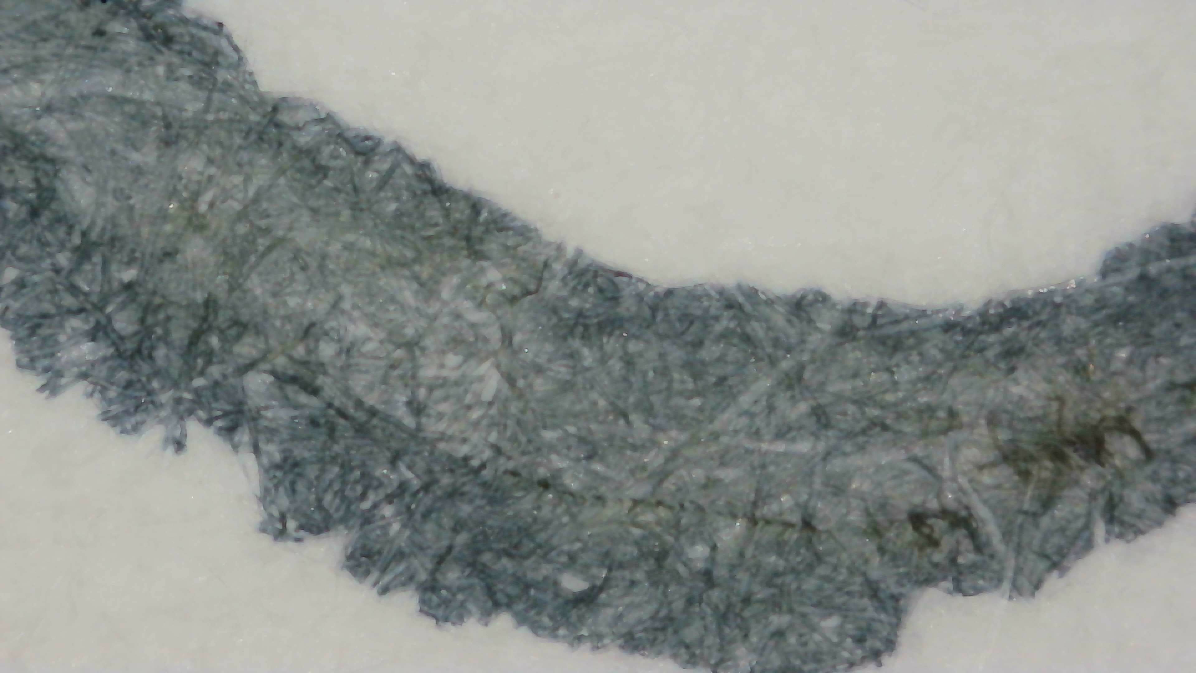
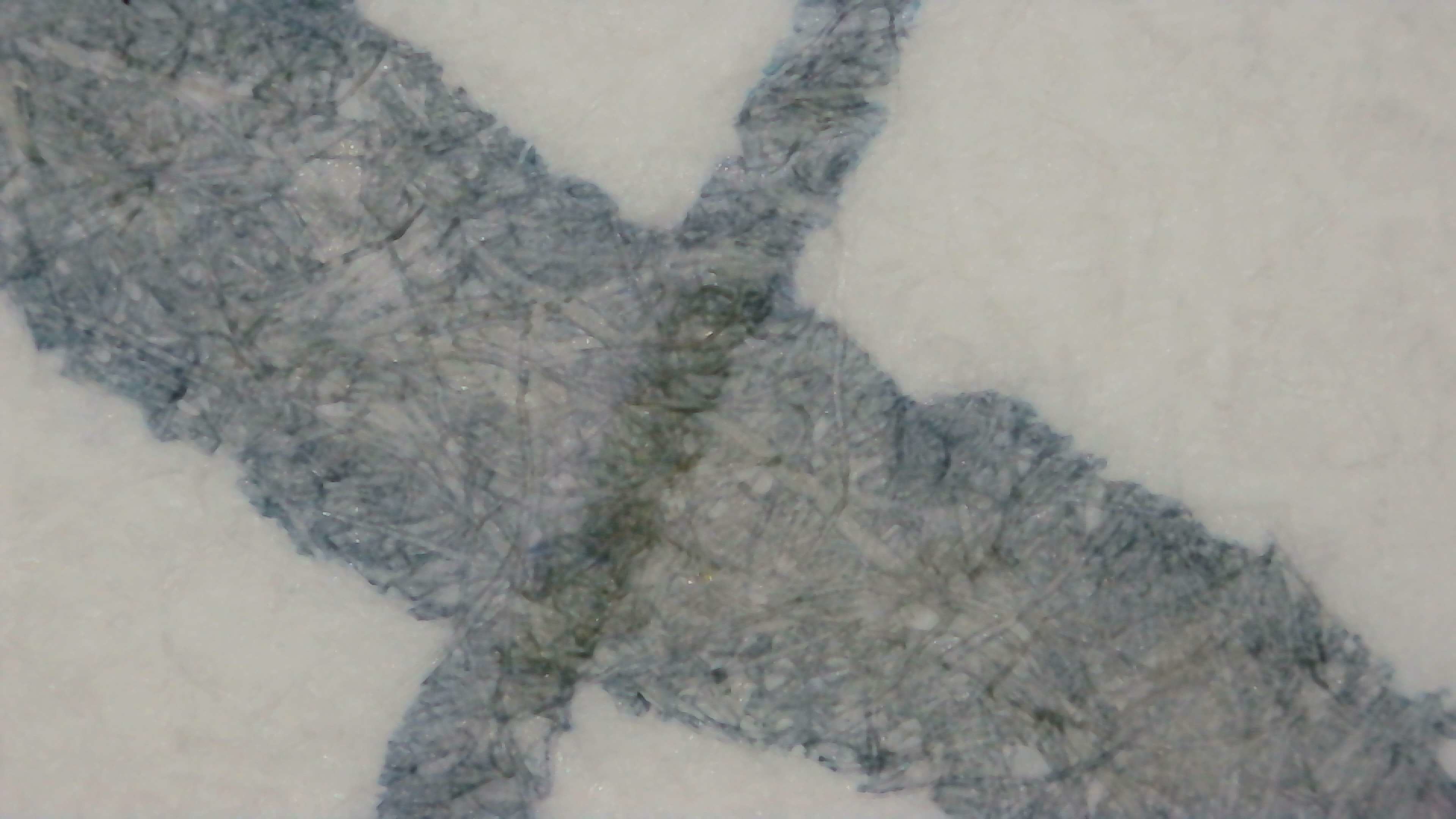
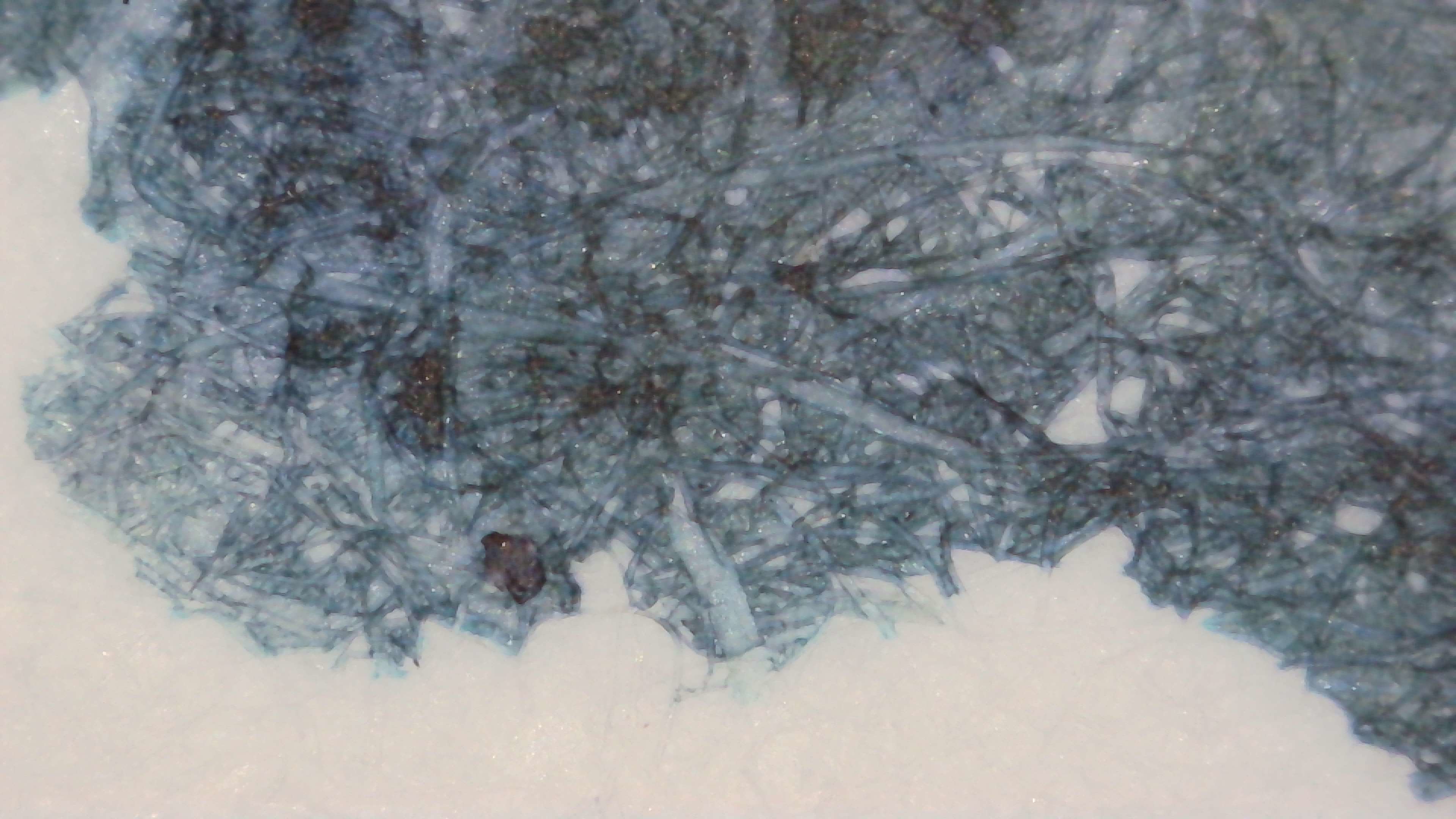
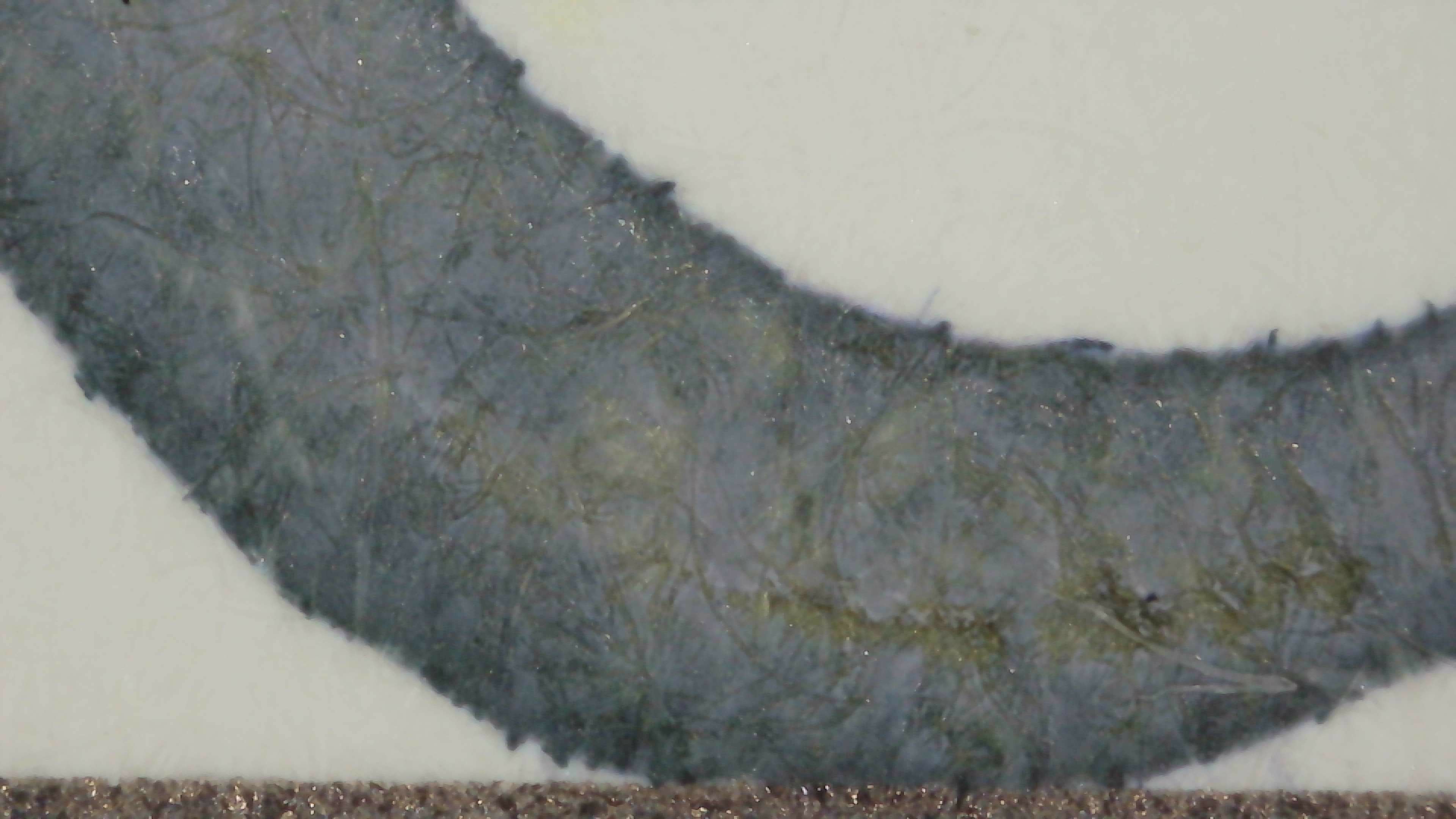
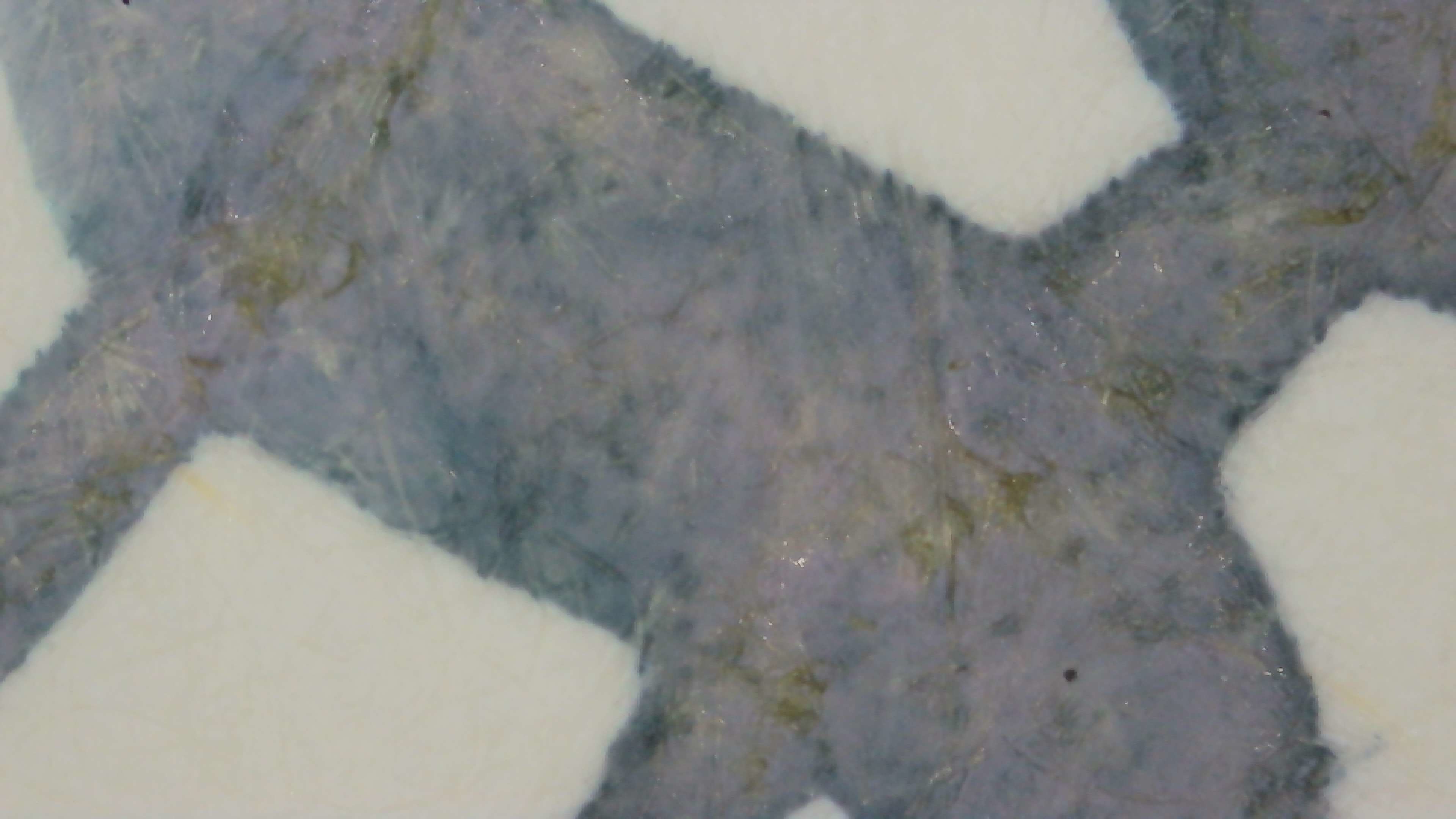
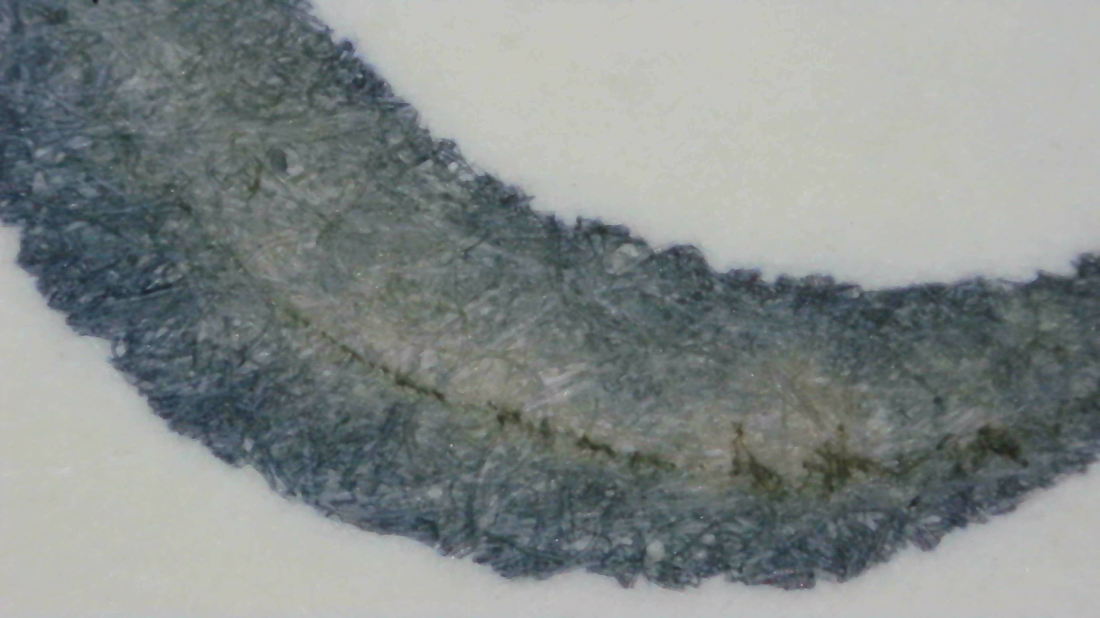
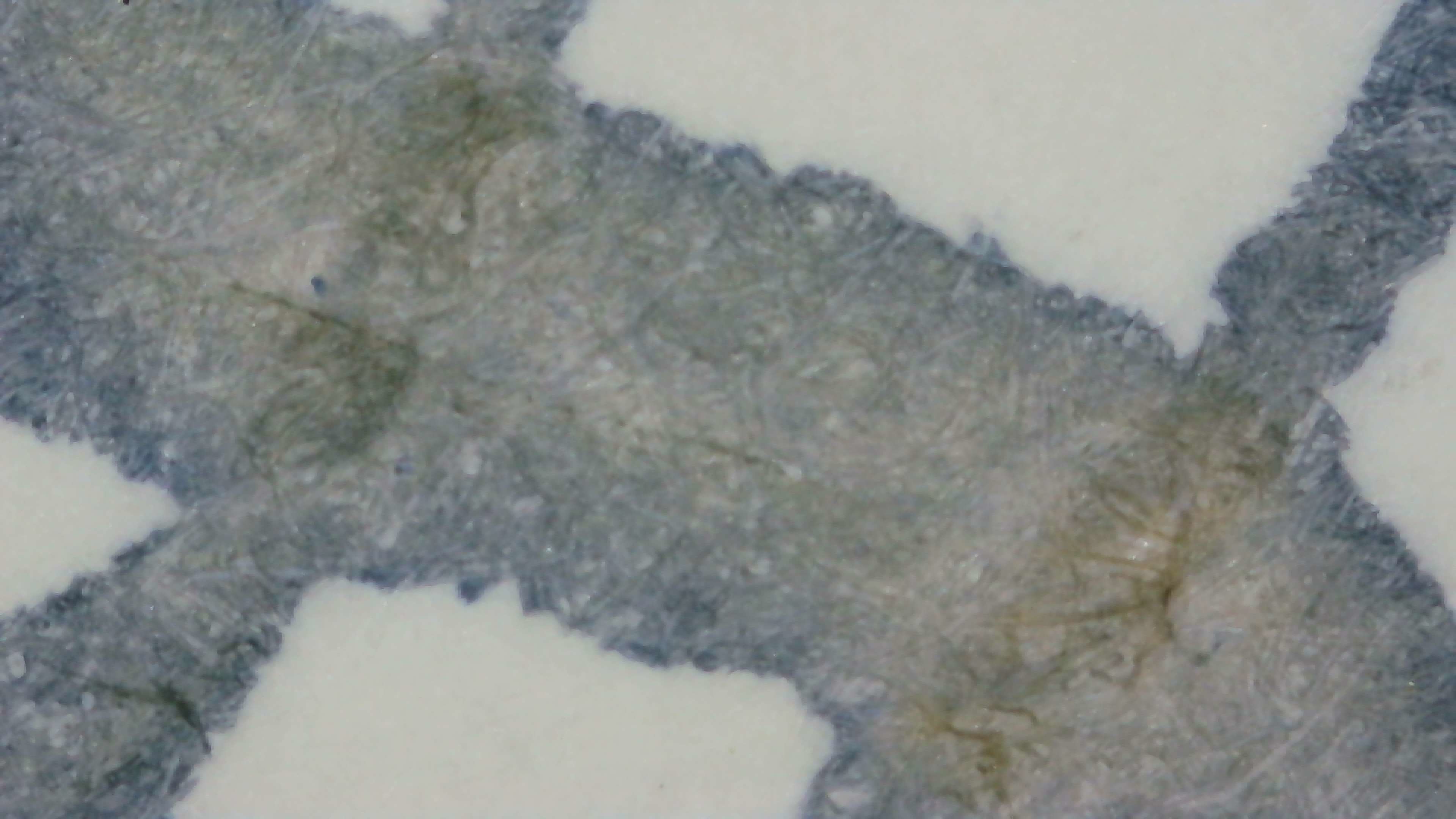
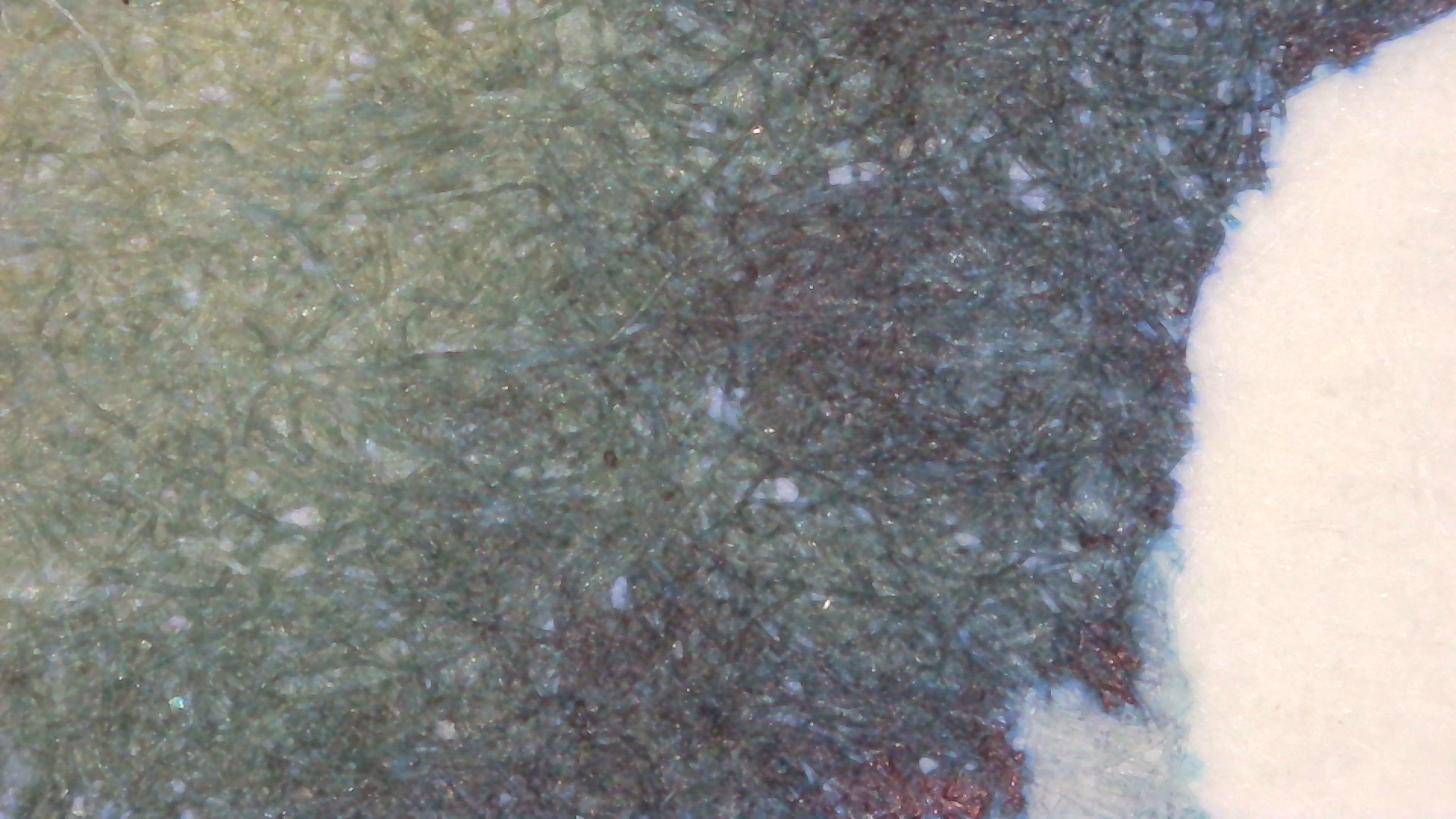
Each one brings out the colors differently, though IMO, Midori does it best.
This video moves around the large swatch area of the MD card and shows that there is even some red sheen that didn’t show on other paper.
Chromatography
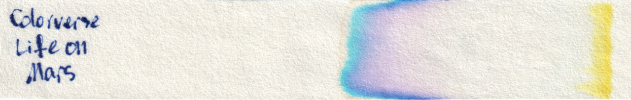
The chromatography separates out into Yellow, purple, and cyan
Group Photo
In the group photo it is much more blue, but the green/yellow is still there in places.
Questions or comments? Contact me on Mastodon