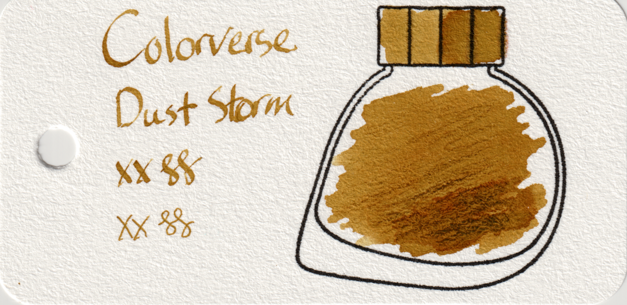
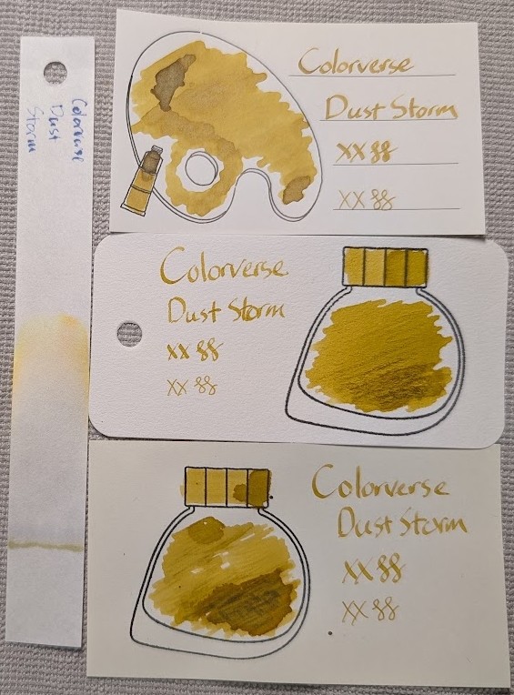
Colorverse Dust Storm is a miss for me, too mustardy, much like like Colorverse Sunbeam. I prefer more yellow-orange, and this is sort of a dark yellow-gray? It has some shading, but it’s just lighter/darker and not any different colors mixed in. Also not even a hint of sheen. It’s legible, though, and not too light.
The teeny tiny 5ml Colorverse glass sample bottles are fun, but not very useful. I had to pipette ink out into an inkwell just to swatch them because no dip pen I had would fit in the bottle opening.
Scans
The scans make it look more tan than it does in natural light.
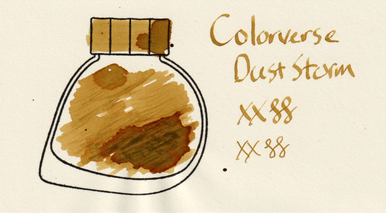
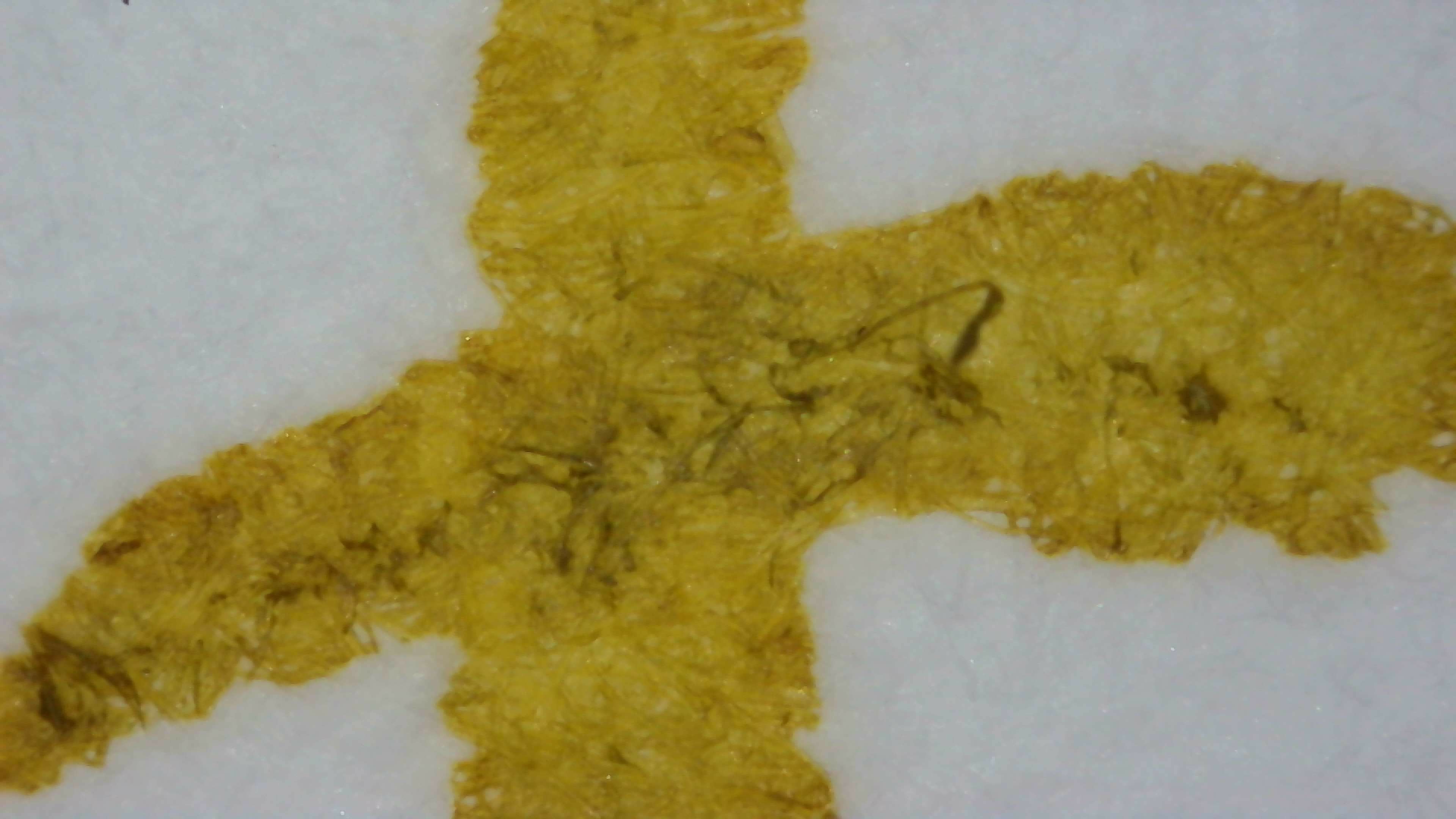
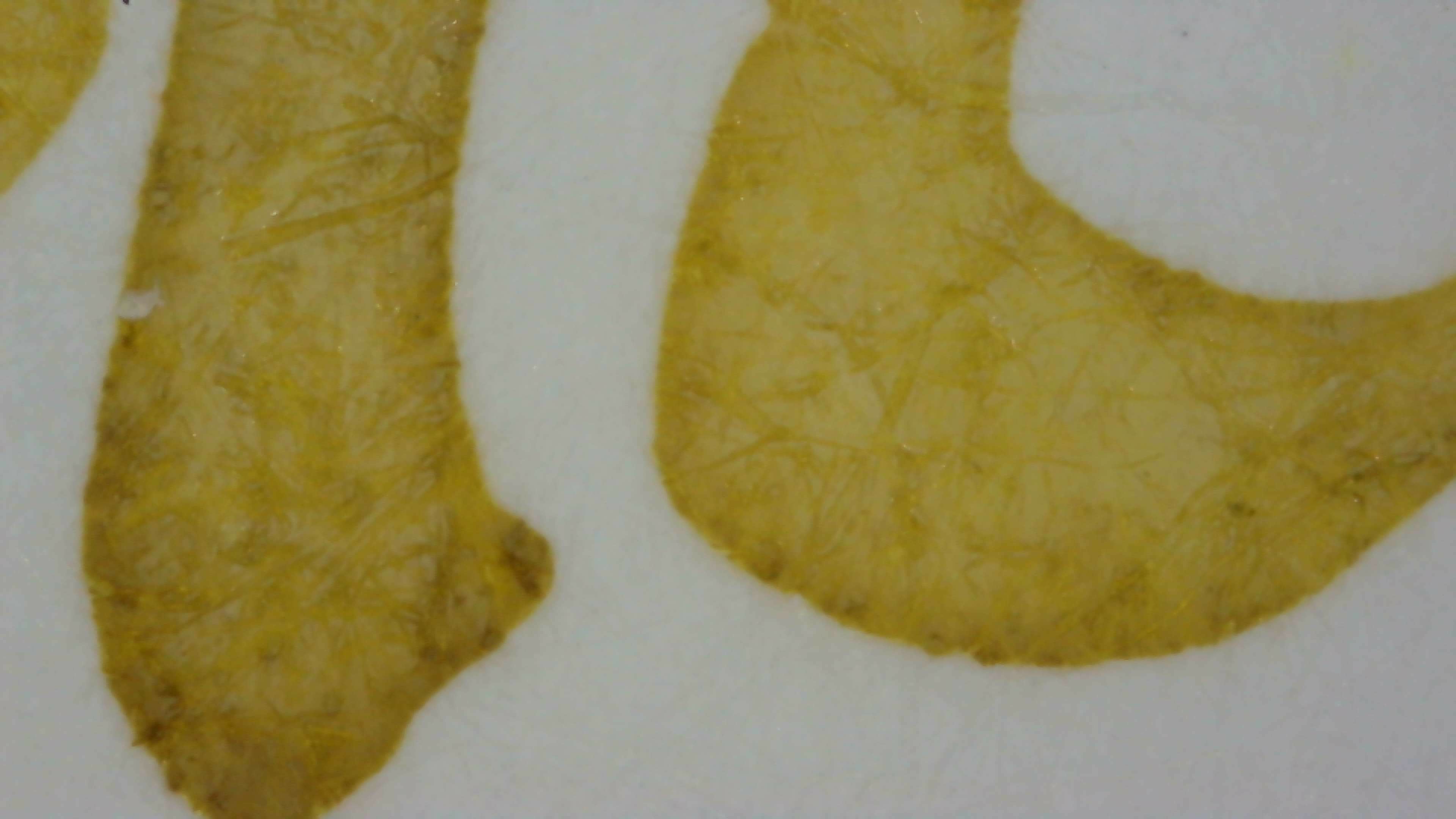
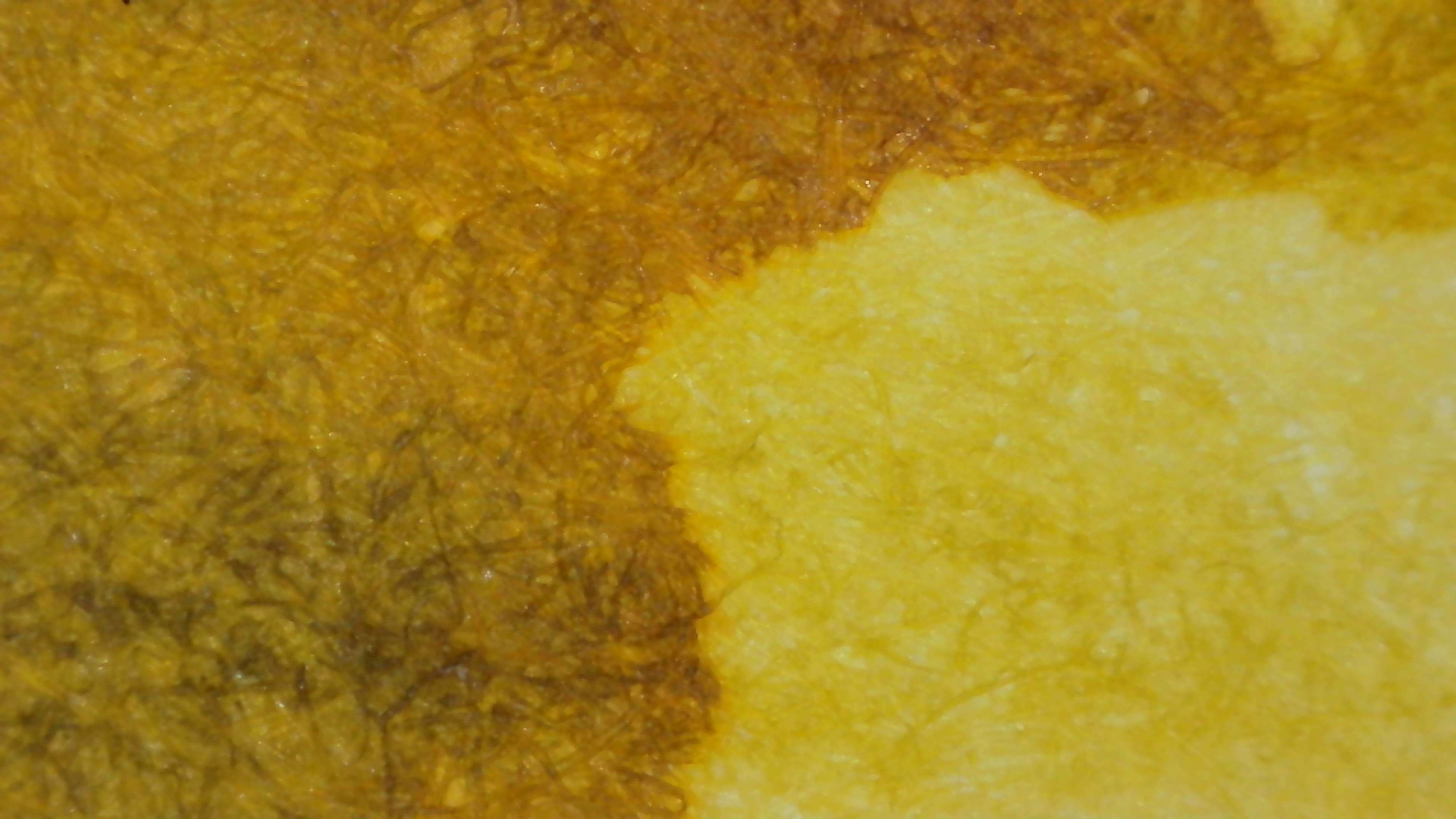
Microscope
Doesn’t look any better to me up close!
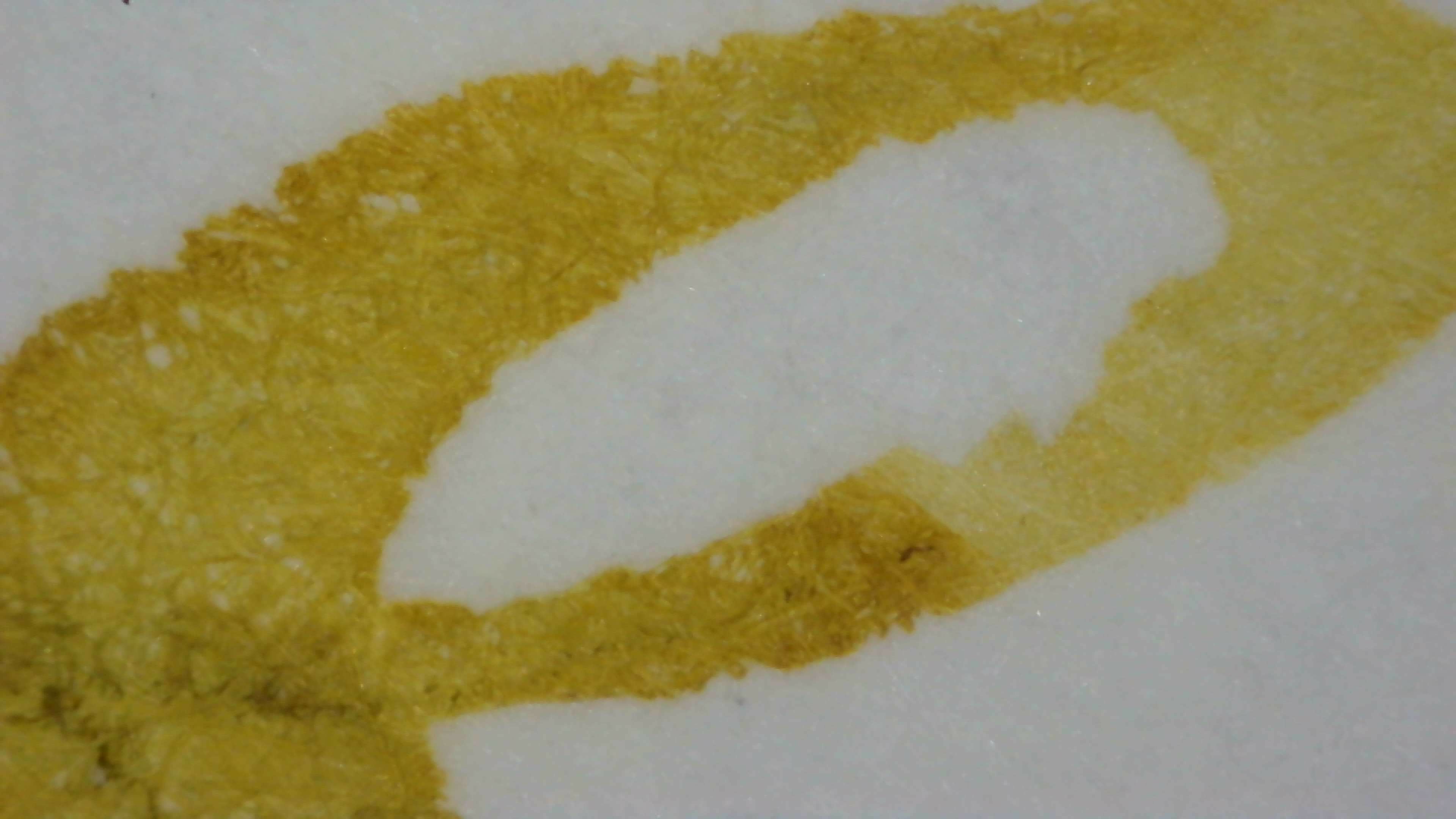
Chromatography
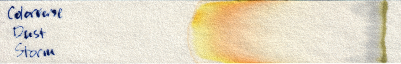
Interestingly most of the color I didn’t like stayed right at the starting line, it separated out to much nicer orange and yellow.
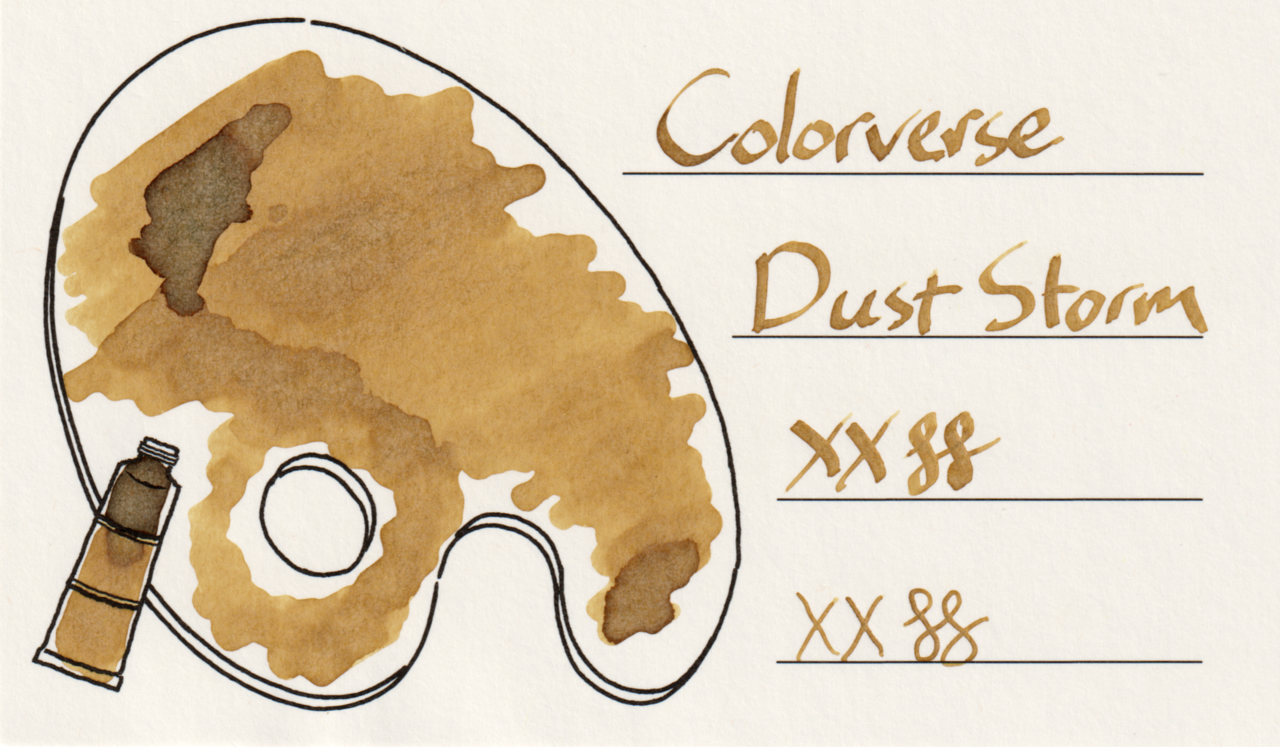
Group Photo
All together under natural light, again it leans too far toward mustard for my taste.
Questions or comments? Contact me on Mastodon