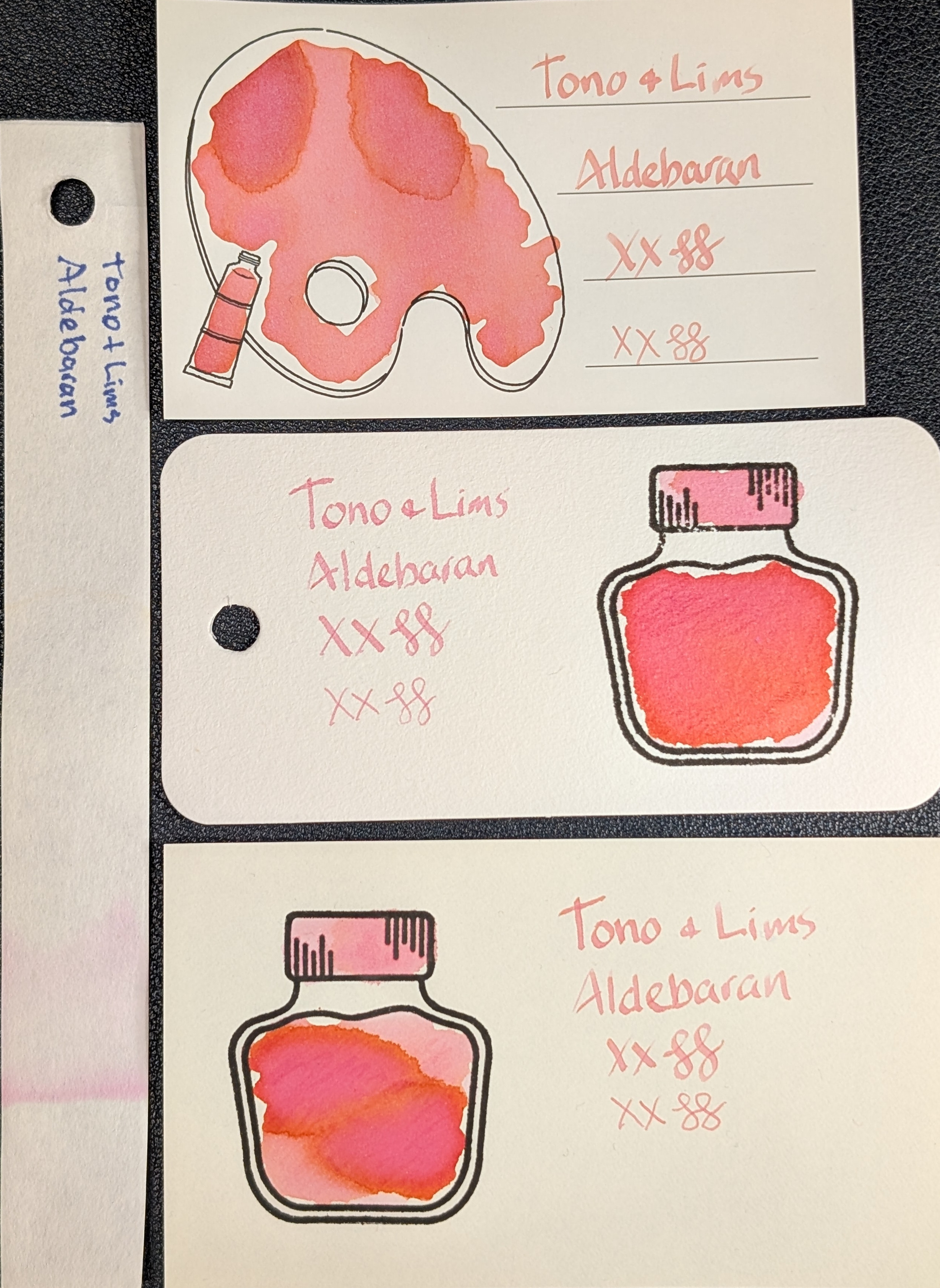
Last ink in the Tono & Lims Star Light Series: Aldebaran

There is a lot going on, and it's wild! Base is coral but it also chromashades closer to orange and pink. On Iroful & Midori the writing is coral and light, but legible. Col-o-ring is more pink.

The swatches have gradients and areas of coral, pink, & orange. Not sheen!

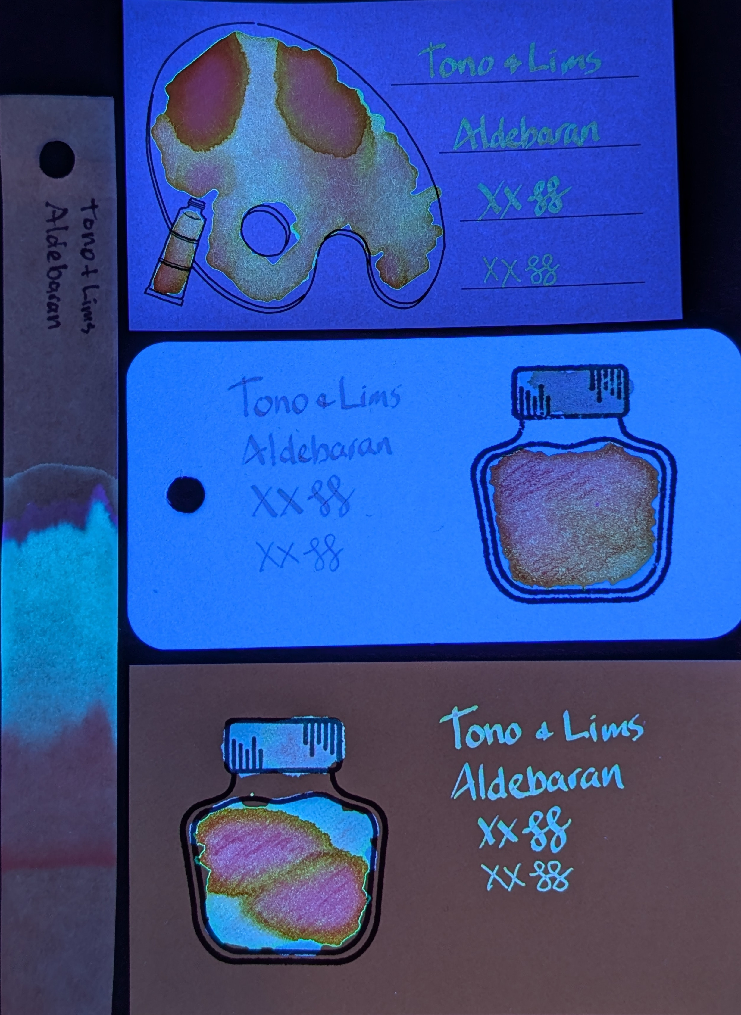
UV is even wilder. It glows differently on each paper depending on coverage, blue/orange/purple/green. It's so weird, I love it!
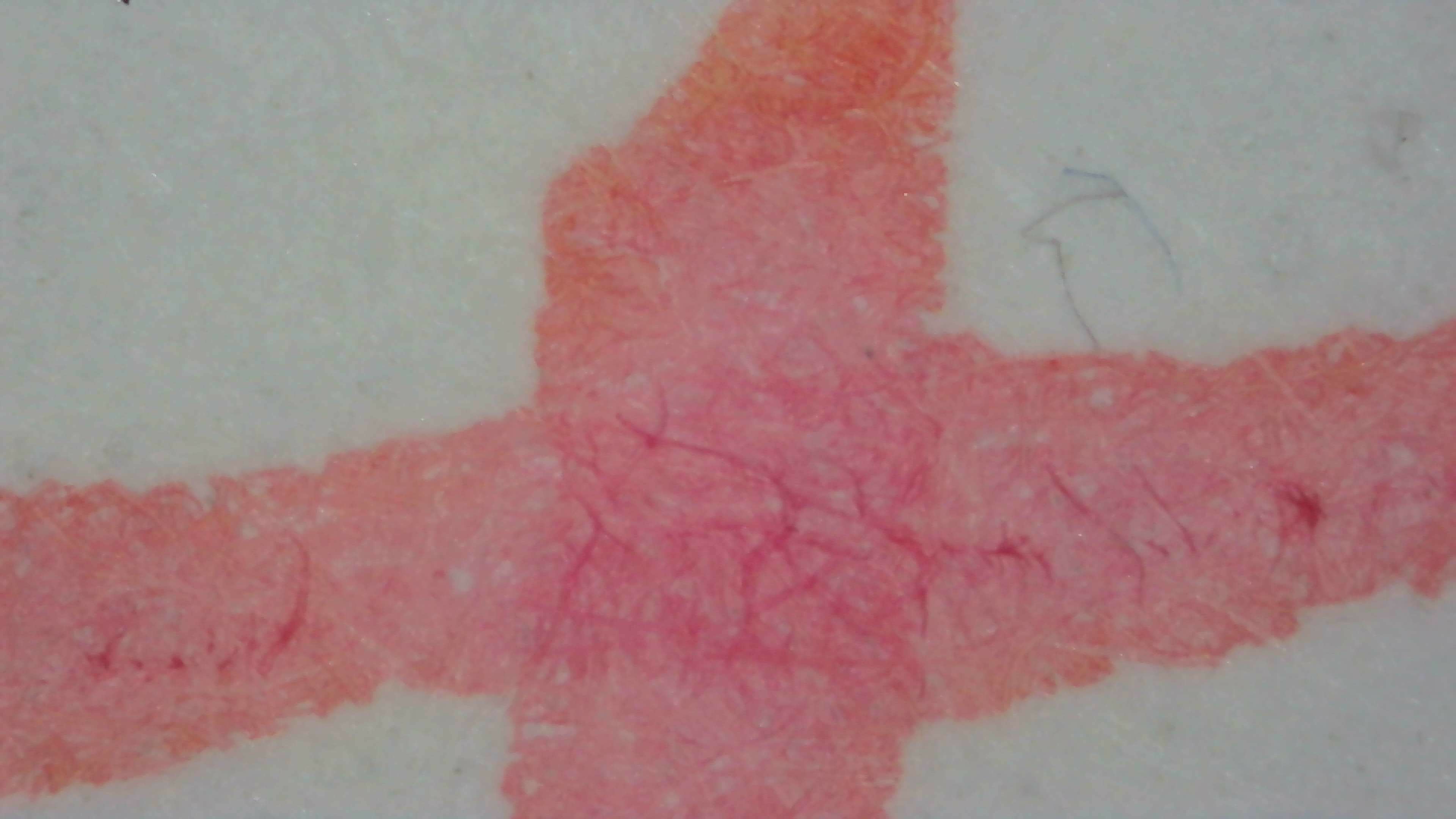
1/3

Photo of 3 ink swatches & chromatography strip for Tono + Lims Star Light Series: Aldebaran which is a coral colored ink with multi-shading/chromashading to pink and orange.  Each swatch contains the ink name followed by "XX" 2 curlicues in both stub and EF widths.  Swatch 1: Iroful swatch card with an outline of a paint palette and tube. The palette is mostly filled in with swirls of ink and a couple areas that are more pink but outlined in closer to orange. There is an outline of a paint tube which is swabbed and looks coral. The writing is coral and somewhat light but easily legible.  Swatch 2: Col-o-ring swatch card with a stamped outline of an ink bottle. The outlined area is mostly full of an ink blob which is a gradient going from a coral outline to more pink in the upper left and orangeish in the lower right. Swab across "cap" is more pink. The writing sample is pink and very light.  Swatch 3: Midori MD swatch card with a stamped outline of an ink bottle. The outlined area is mostly full of an ink blob which is coral on the upper right and lower left, but mostly a large area divided in two, outlined in orange but filled in with pink/magenta. Swab across "cap" is {describe cap}. Text is coral.  Chromatography is barely visible but looks pinkish and quickly fades.
Same as the first photo but under UV light.  The Iroful card itself is glowing dark blue. Text is glowing orange. The swatch is a mix of orange shades and magenta, with some green around the edges.  The col-o-ring card itself is glowing bright light blue. The text is dark blue, while the swatch is orange and magenta/pink.  The Midori MD card text is glowing light blue, so it the cap and the upper right/lower left areas of the swatch The main area of the swatch is glowing magenta outlined in orange.  The chromatography strip has a large area of glowing blue beyond what was visible in natural light, followed by a small area of darker blue/indigo, then a slight halo of green at the edge.

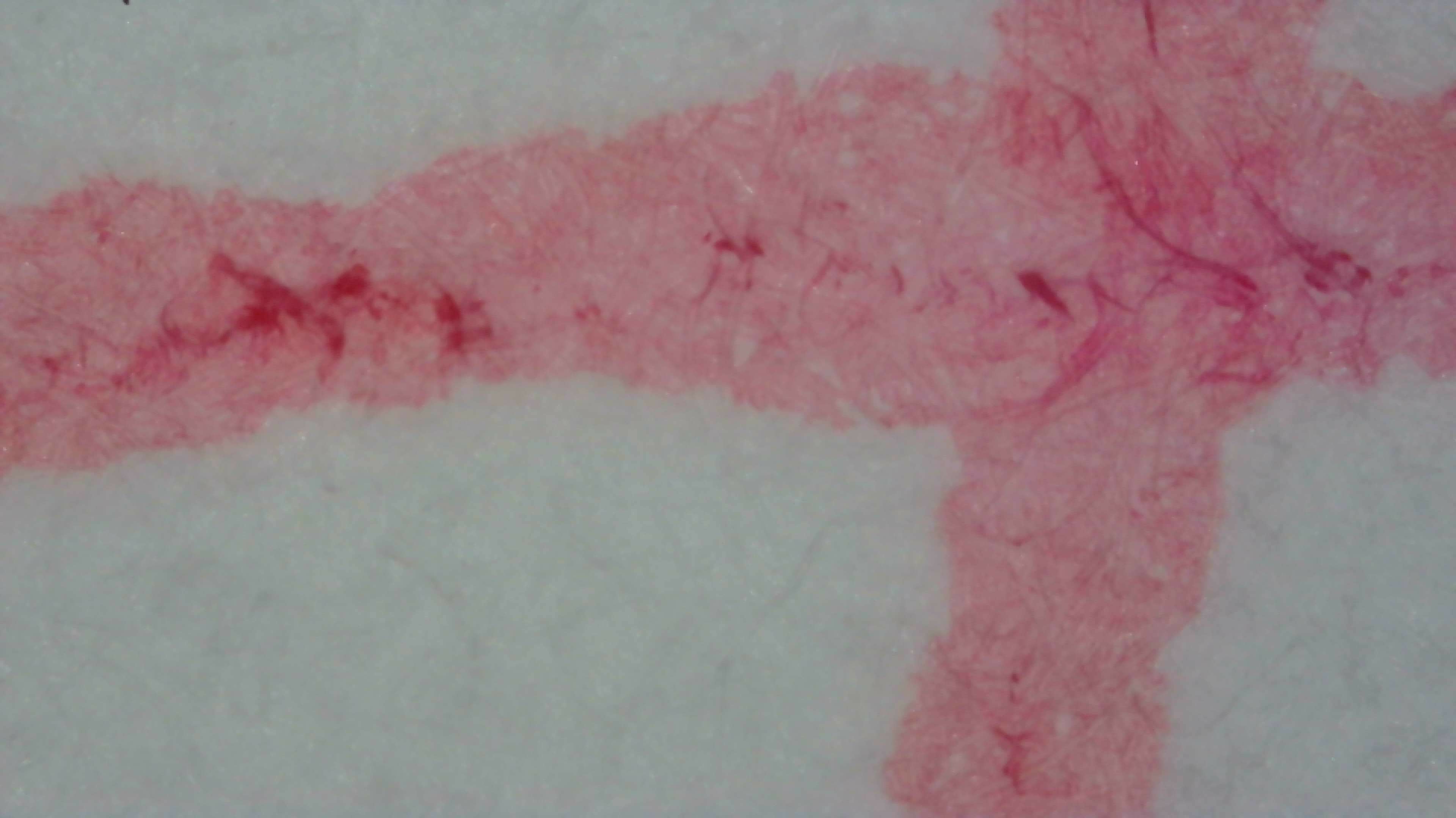
Under magnification on col-o-ring it still looks like a pinkish tone, with some areas much darker red.

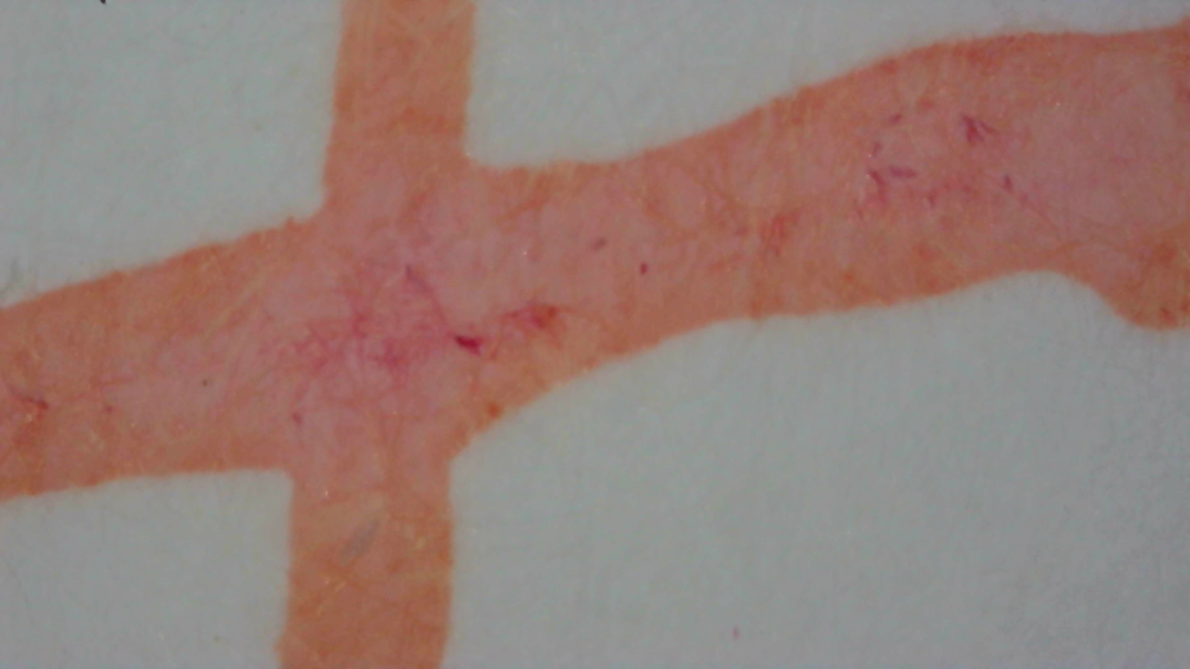
Iroful still looks coral, but you can see it's slightly more red in the center and orange toward the edges.

Midori MD has more pink toward the center and orange outside in places, but overall is still about the same base coral color.

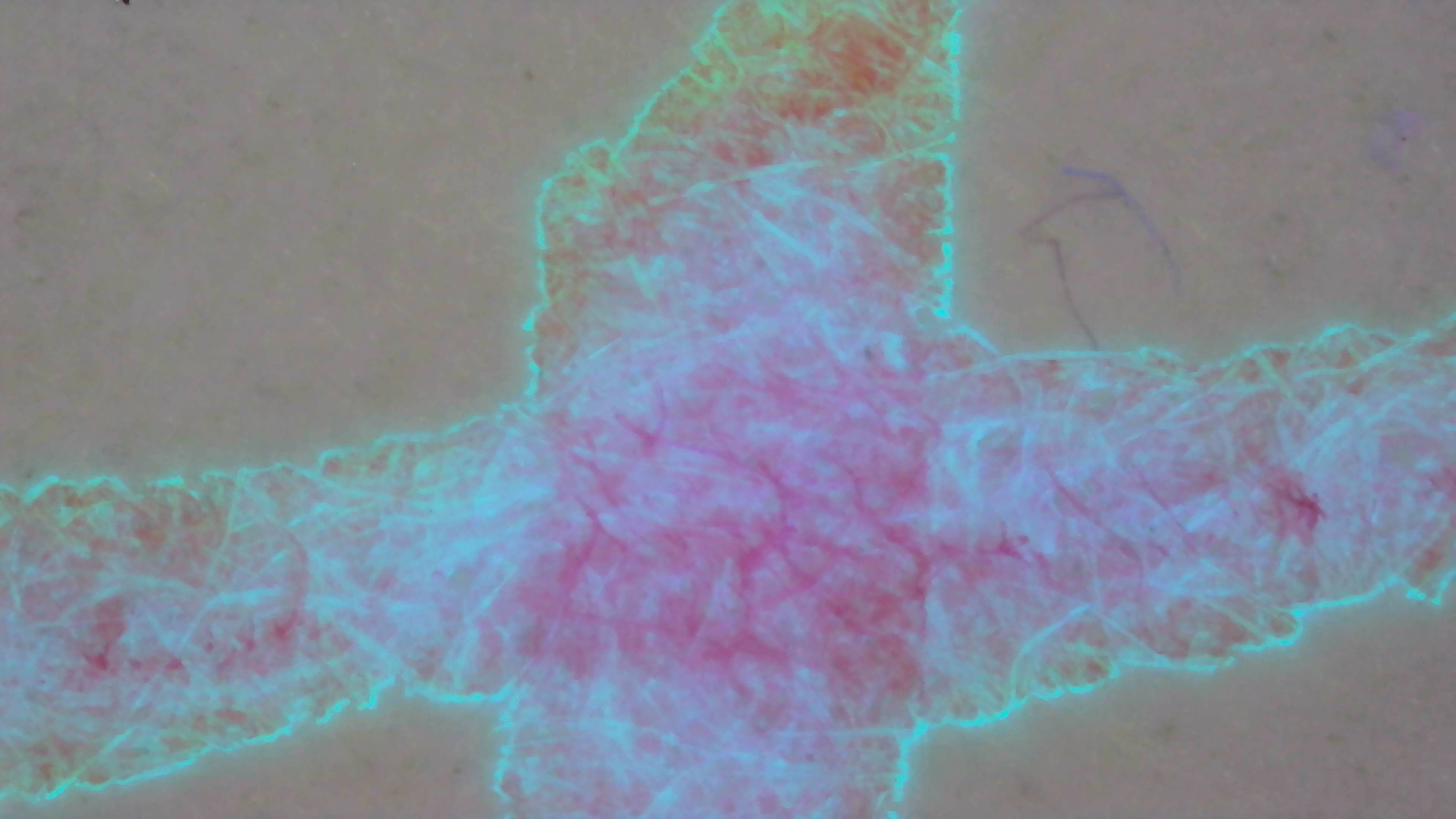
Under UV, the Midori writing shows a bit of everything. Areas of blue and purple, orange near the edge, and an outline of green.

2/3

Photo of ink lines on col-o-ring paper under magnification. The ink appears to be pink but has some paper fibers that are a much darker shade, almost red. The edges of the lines are very rough.
Photo of ink lines on Iroful paper under magnification. The ink appears to be coral overall, but has some paper fibers in the center that are a little darker and more reddish shade. The center of the lines where they cross is more pinkish, and it's more orangeish near the edges. The edges of the lines are very smooth.
Photo of ink lines on Midori MD paper under magnification and natural light. The ink is coral overall, but has a larger area that looks more pink near the center, and some paper fibers are darker pink/magenta. It is more orange near the edges, which are somewhat smooth.
Same as the previous photo, but under a mix of UV and natural light. The center is glowing purple darker fibers glowing more magenta. Some areas of the line are glowing blue with bright blue fibers. Near the edges is it glowing orange and at the very edge is an outline of bright green around everything.

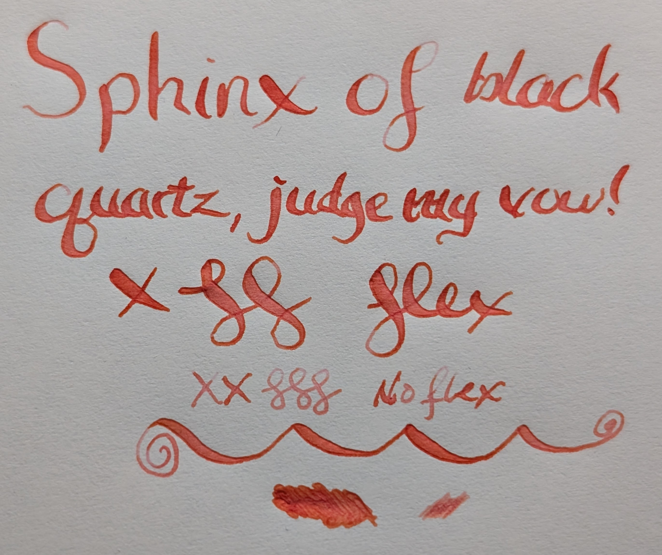
Because of the way it was behaving I thought I'd try a flex pen. It looks a lot more red-orange this way, but a darker shade of the same overall hue. Some of the larger parts of letters have some pink.

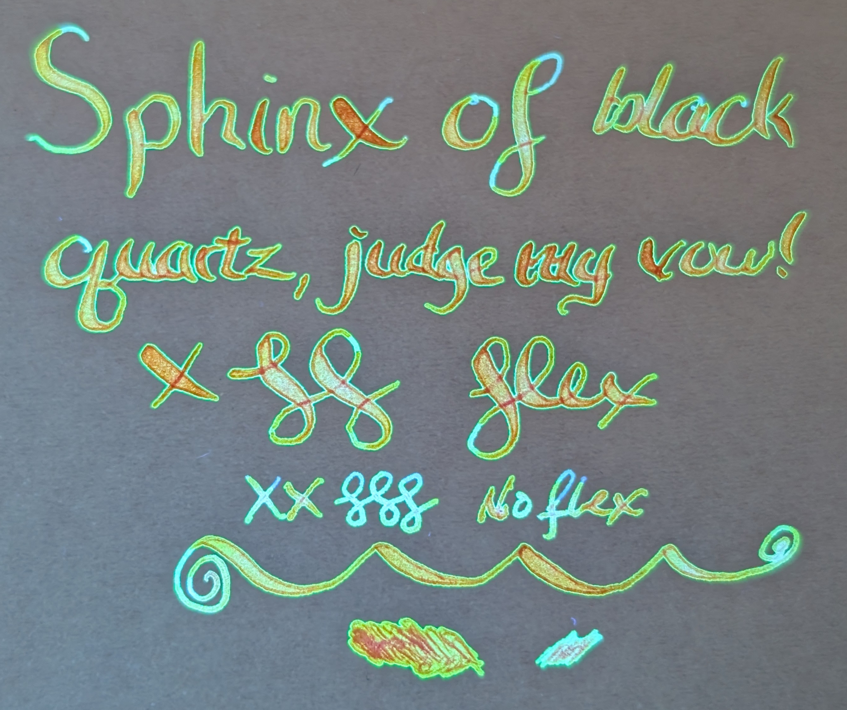
Under UV it's all over the place, but in a good way! Center is glowing orange, thin parts are blue, orange is outlined in green, some parts are even more pinkish again.

Overall, even though I don't like how pink it goes at times, it's better in a flex pen so it's still a winner for me.

3/3

Top-down photo of ink writing and scribbles on Midori MD paper. The ink is a dark coral shade, almost red-orange.  At the top large words were made with a flex nib and reads "Sphinx of black quartz, judge my vow!" followed by an "X" and curlicues and then the word "flex" in cursive. The widest parts of the curlicues and the flex letters have a little hint of pink in them.  Under that is "XX" and three curlicues in a much narrower line that says "no flex", which appears to be a lighter coral.  Under that are a large looping line and two different scribble puddles (flex, no flex)
Same as third photo but under a mix of natural and UV light. The text appears to be glowing orange with a green halo/outline around each letter. Some more narrow sections of letters are glowing light blue.  The "no flex" writing is mostly blue, but still has some orange parts.

Imported from Mastodon

Updated:


Questions or comments? Contact me on Mastodon