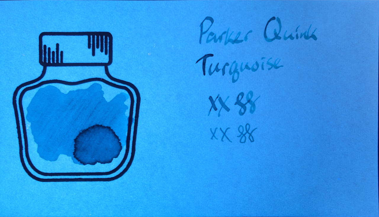
Parker Quink Turquoise is the last of a few Parker Quink mini cartridges I swatched, which was tricky.
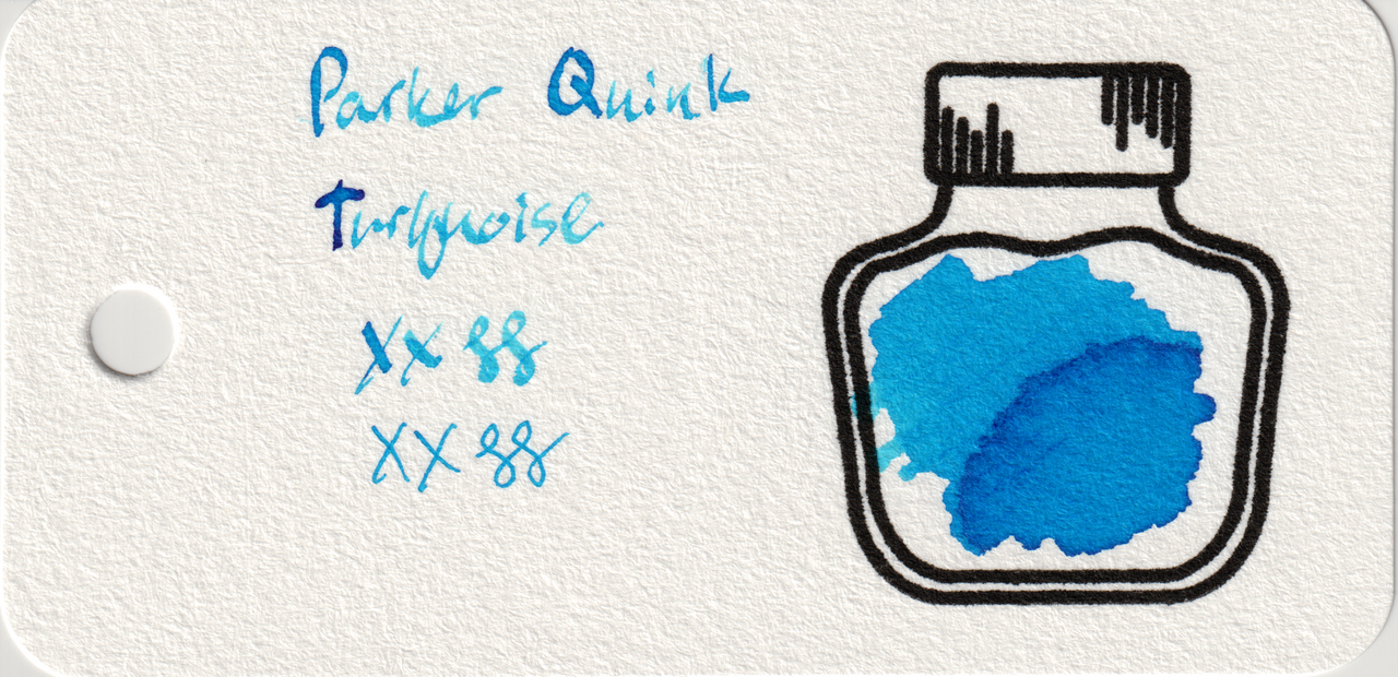
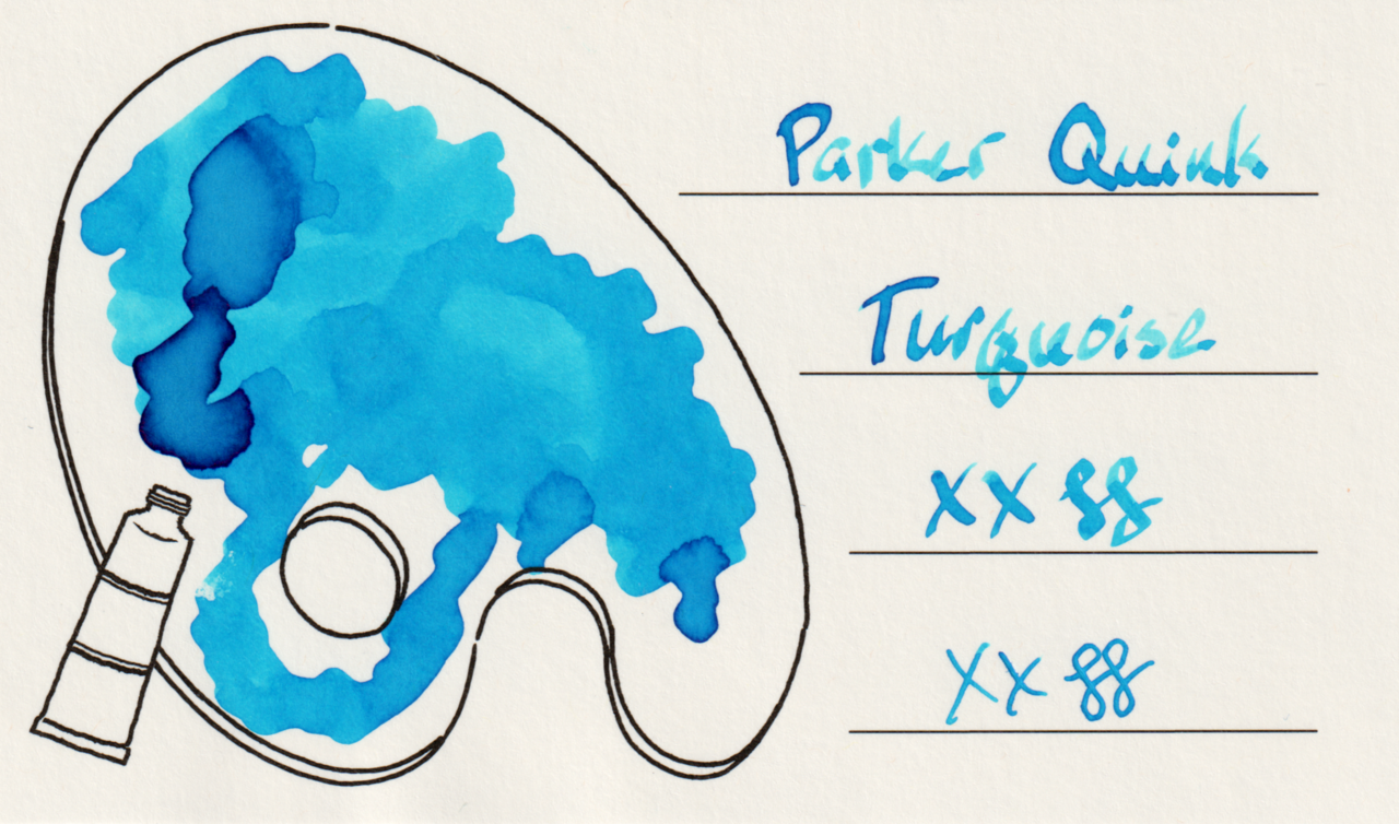
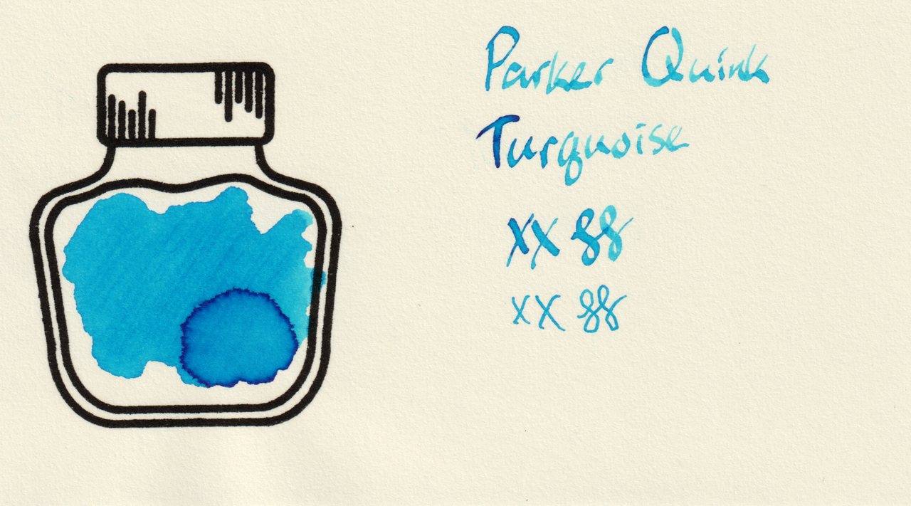
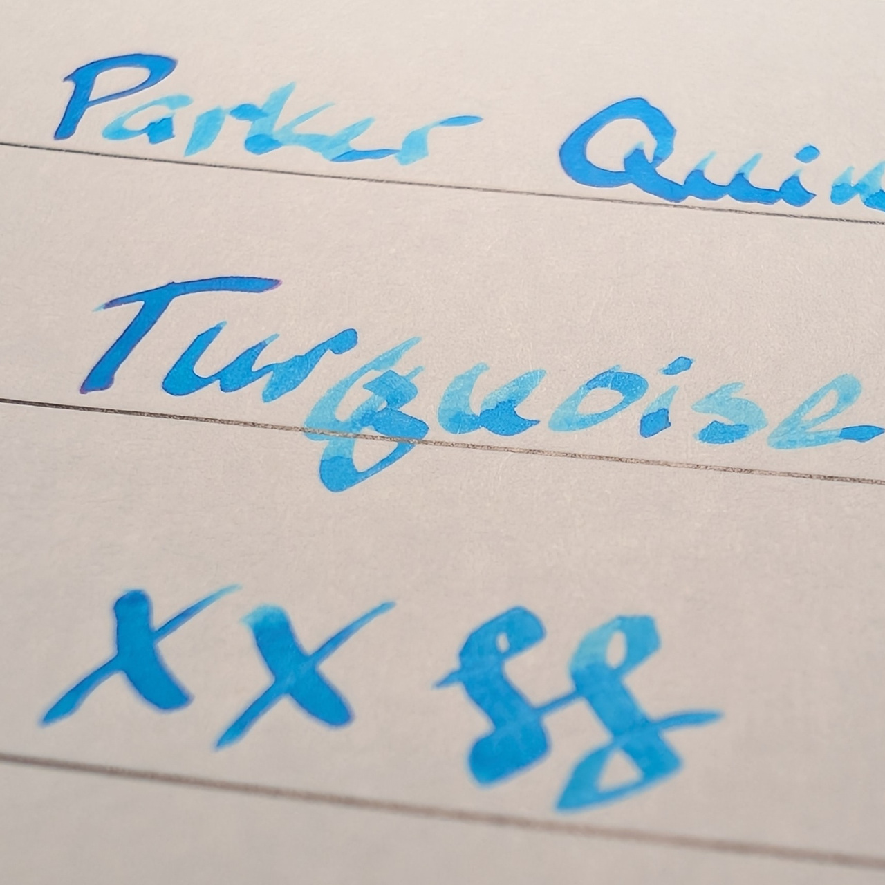
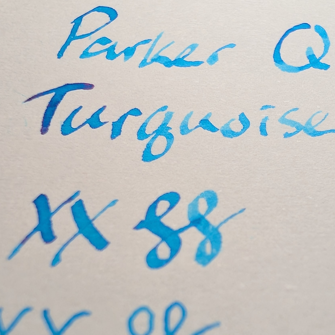
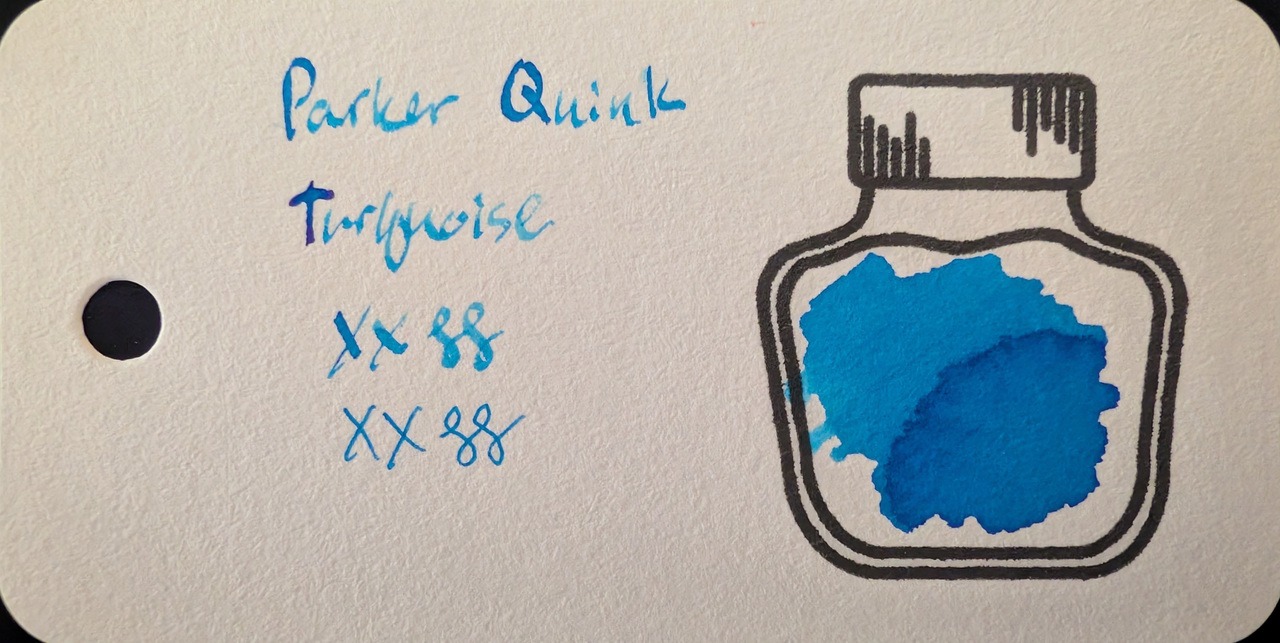
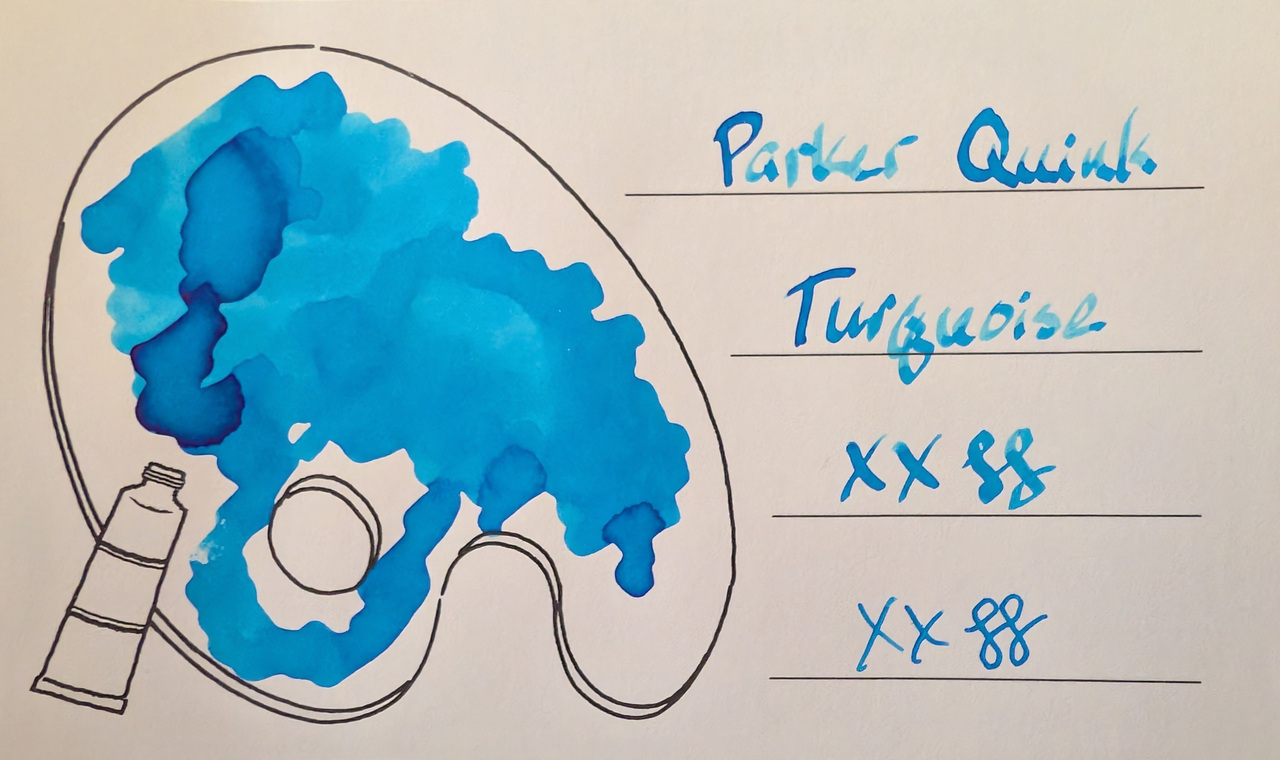
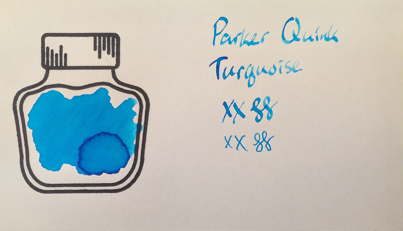
While the name is Turquoise there isn’t very much green in it, so it’s closer to sky blue, cyan, or aqua most of the time, except in the very light parts of shading where some green comes out and it can look more like turquoise or at least a little blue-green. The Pink ink in this line had a similar qualities where it looked most like its name when very little ink was present.
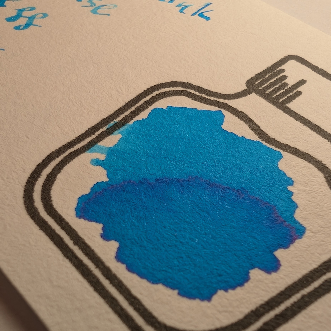
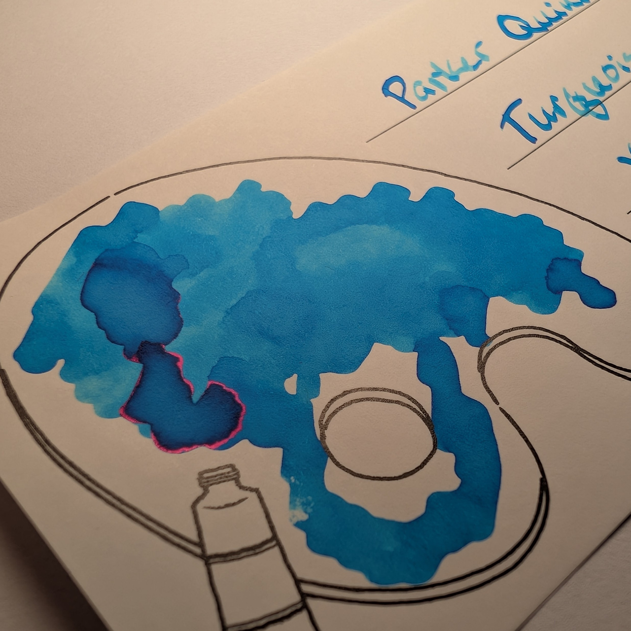
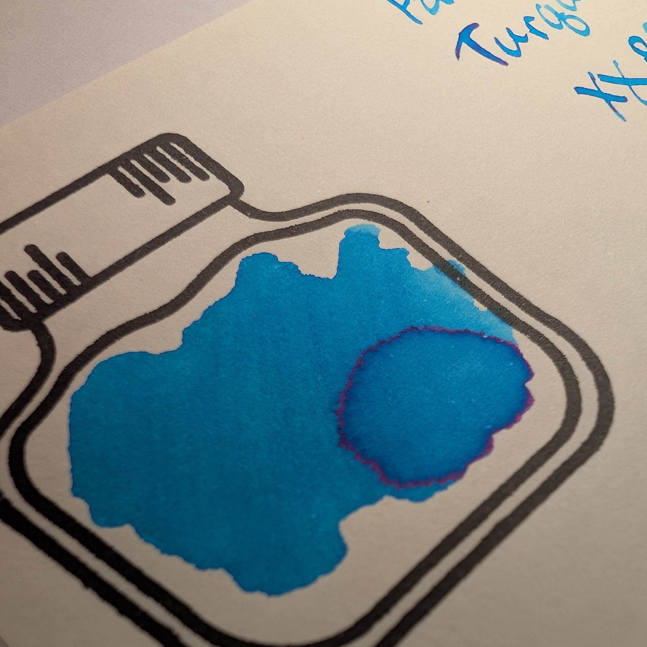
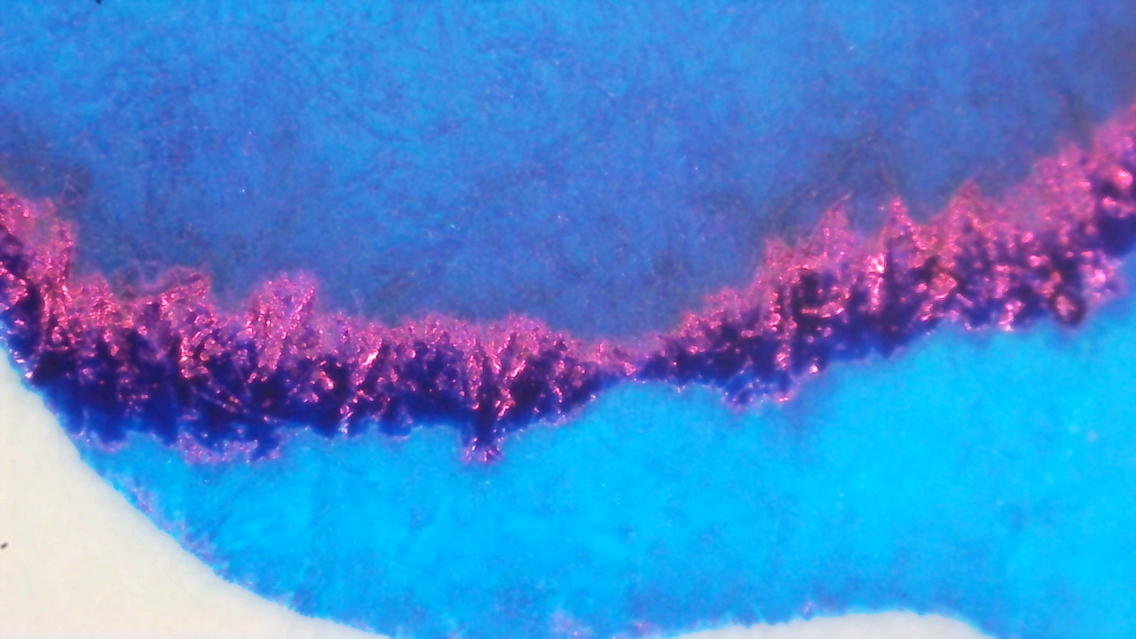
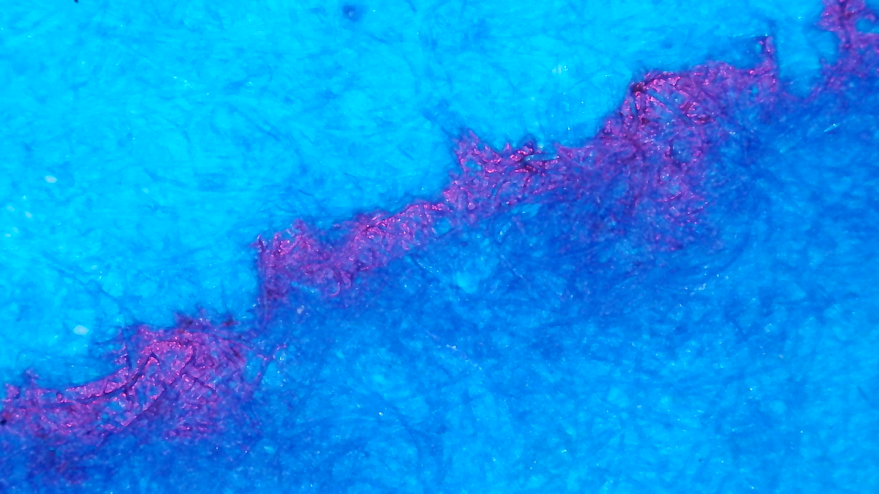
It has a lot of shading and a little red sheen.
Scans
The scans show off the shading well, and the differences in tone/shade with varying amounts of ink.
Photos
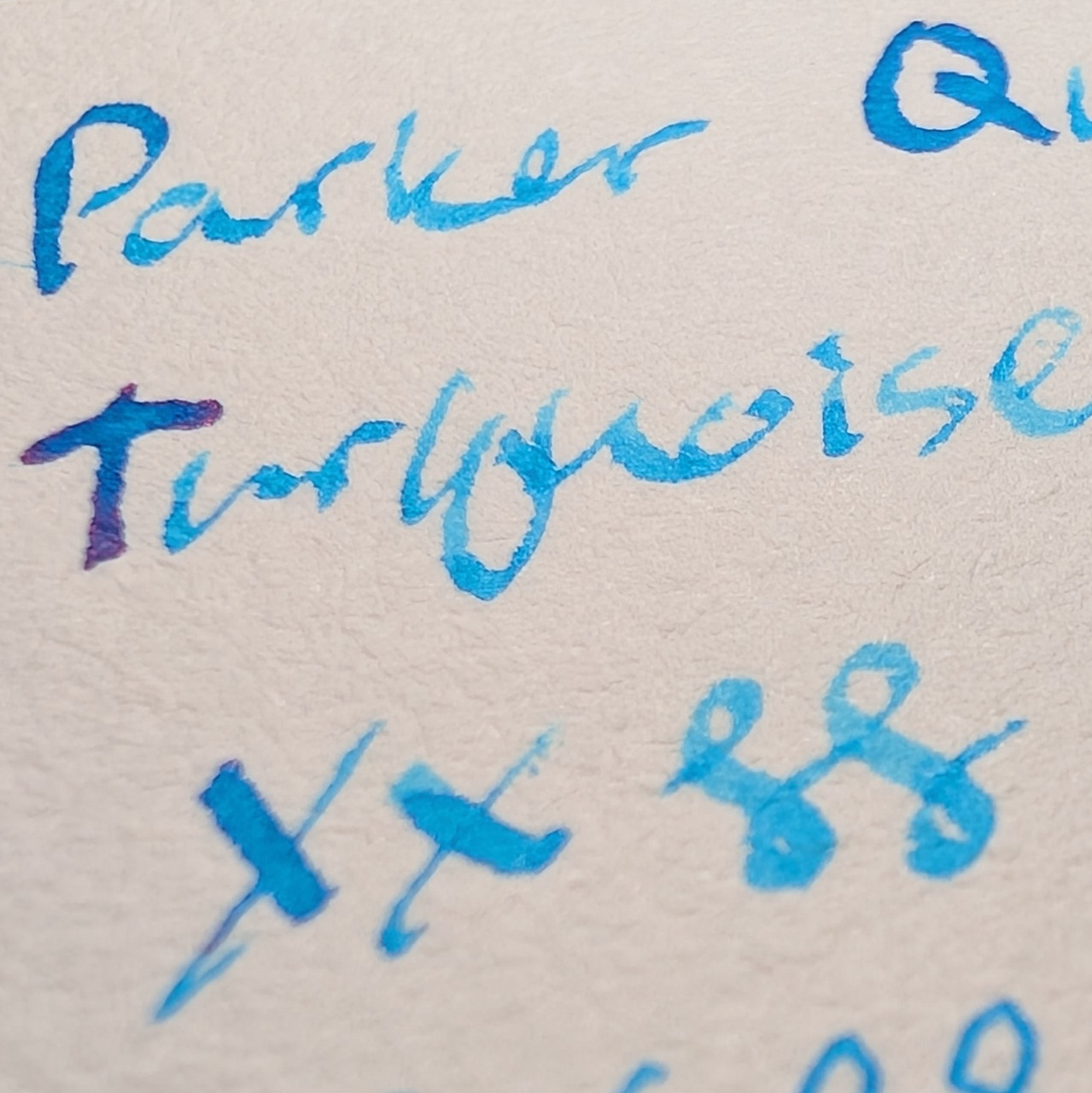
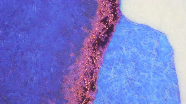
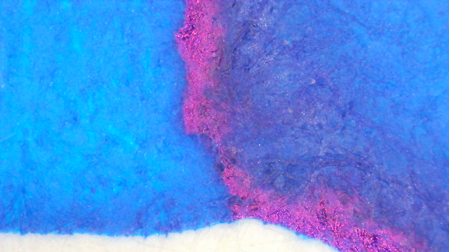
There is just a little red sheen, and it doesn’t show much in the writing, only in the large swatches.
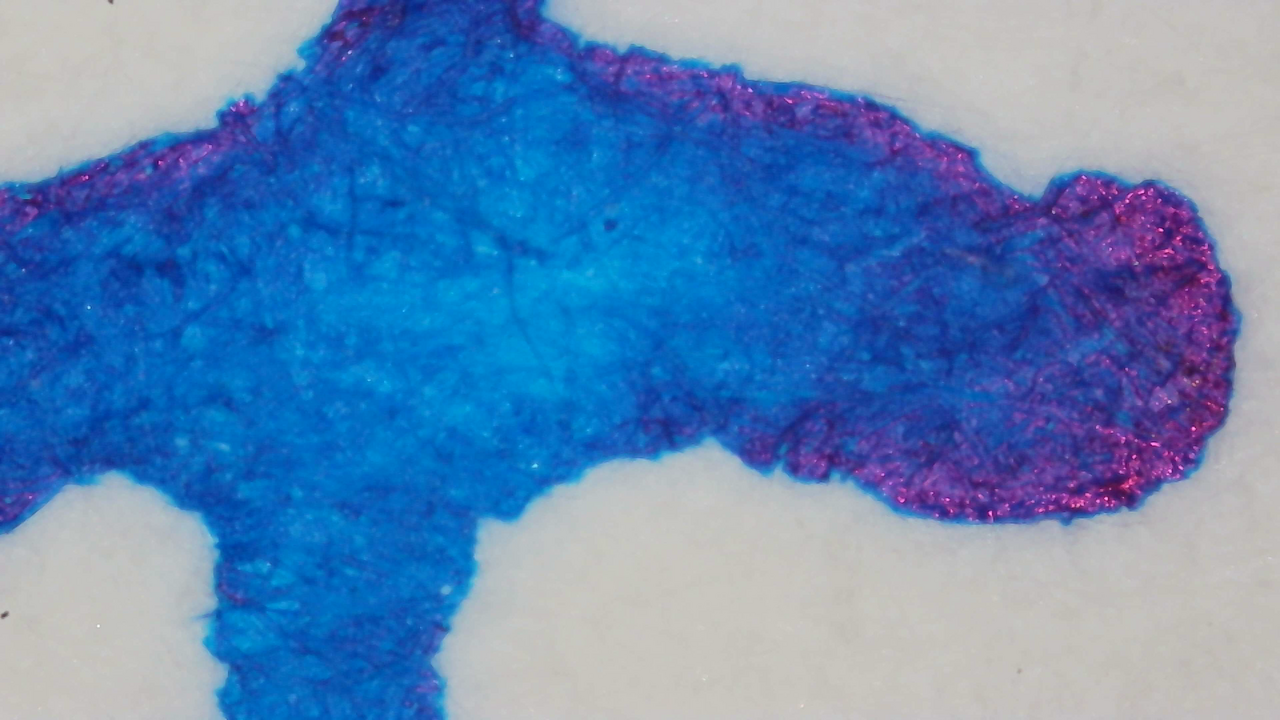
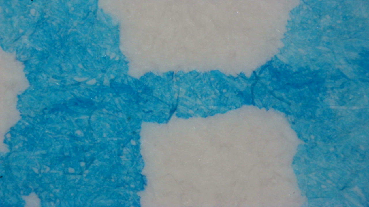
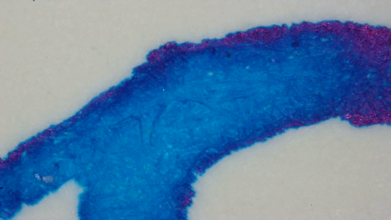
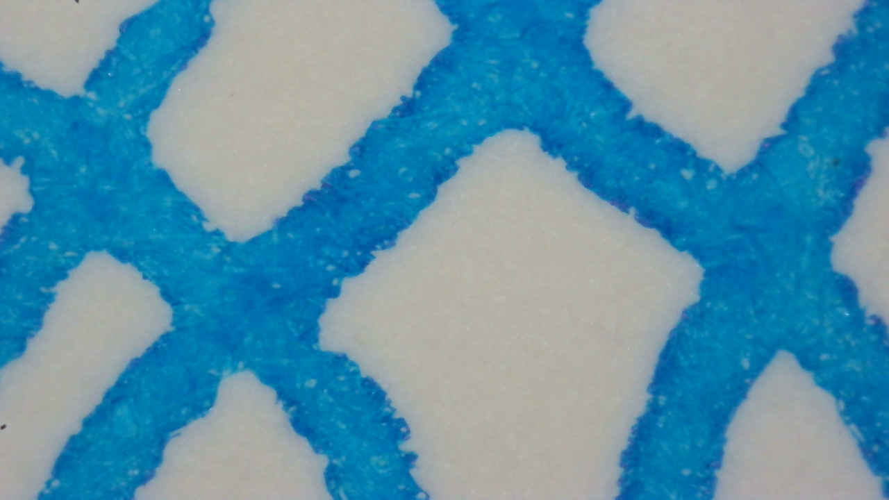
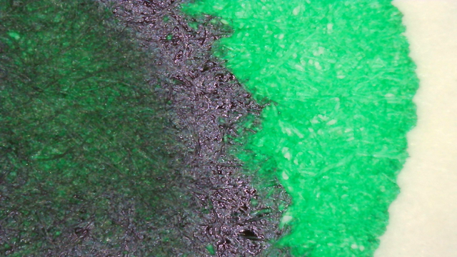
Microscope
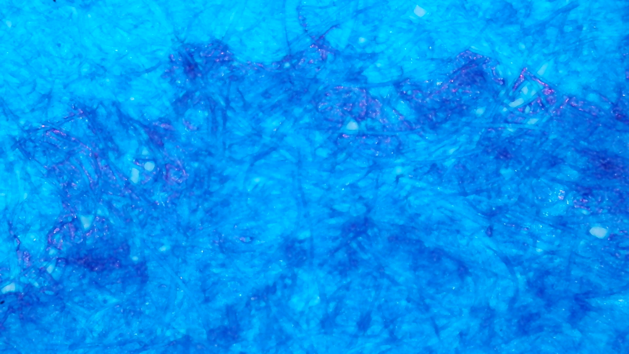
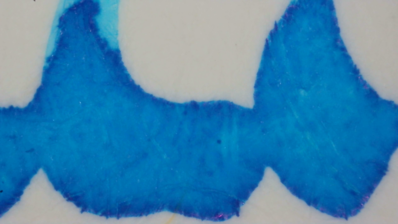
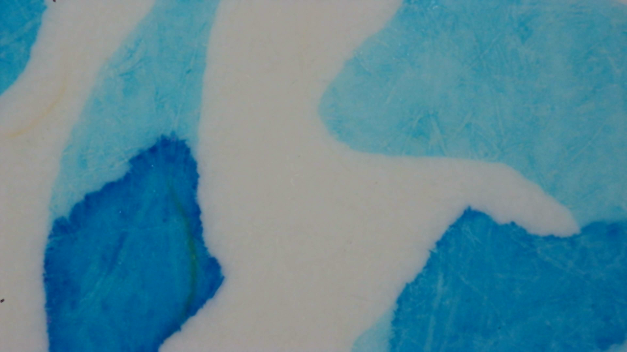
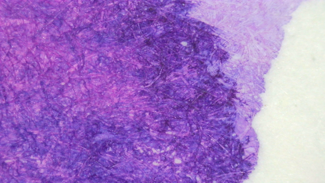
Up close there is an even larger contrast between the areas with different amounts of ink.
Chromatography

The chromatography has a very faint cyan area from the start to near the end, and then it fades from light cyan into a slightly darker shade.

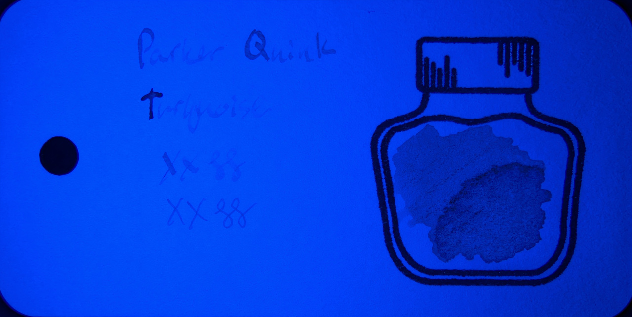
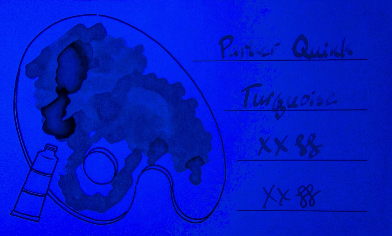
Under UV there is only a blue halo past the leading edge.
UV Check
There is a faint blue glow on all paper types, but not very bright. The effect is more pronounced where the ink is lightest, and on MD paper in general.
Verdict
It’s a very pleasant shade of light blue that is bright but not pastel. I like it, but I prefer Pilot Iroshizuku Ama-iro for a light, sky blue.
Questions or comments? Contact me on Mastodon