
Aurora Borealis was created via collaboration between Diamine and the members of r/fountainpens on Reddit in 2018.
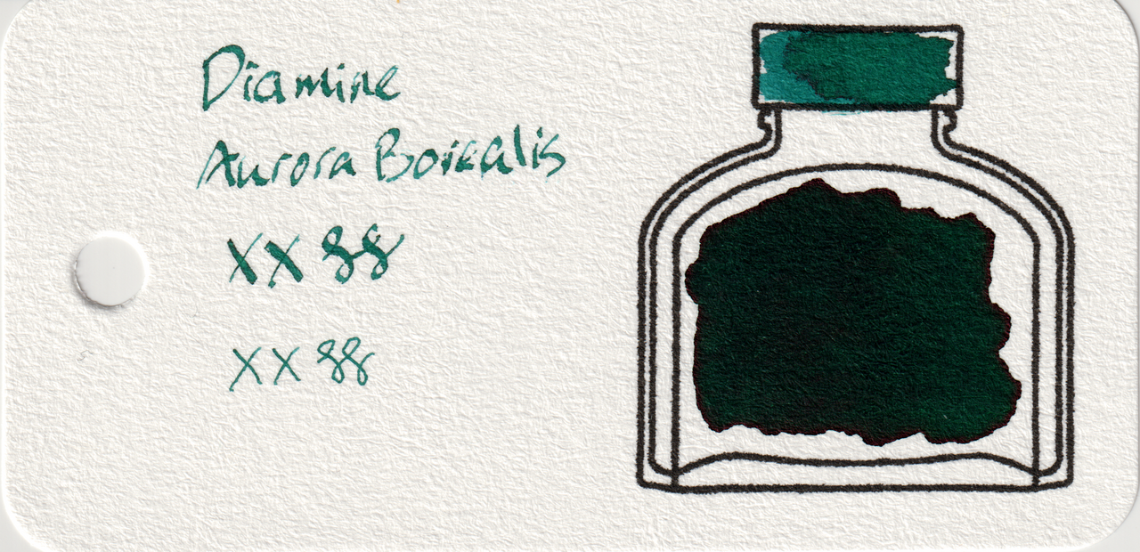
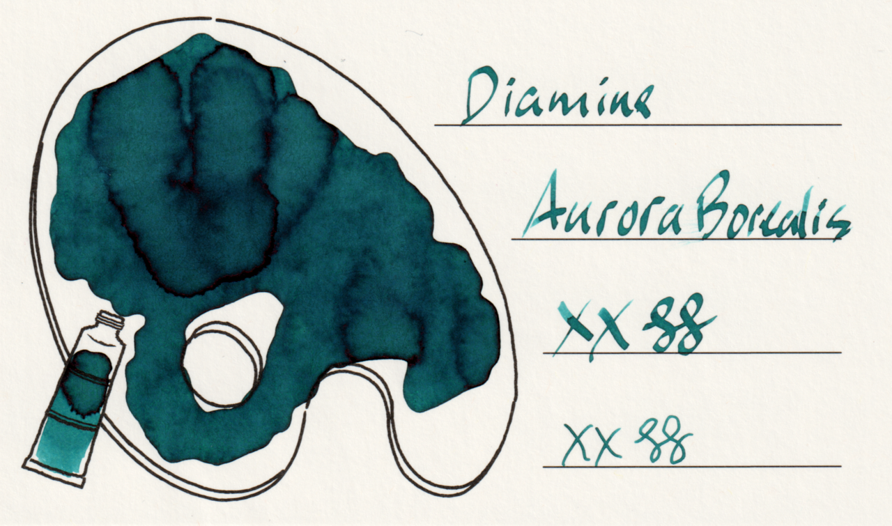
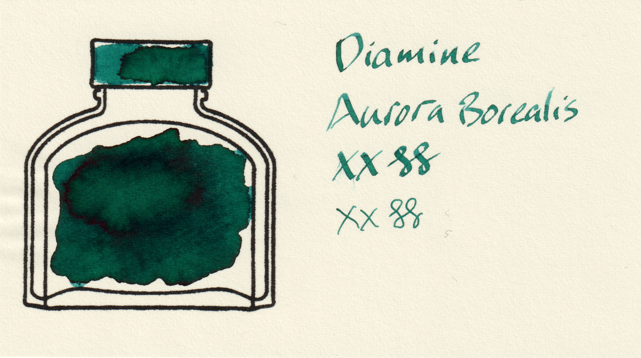
It’s a well-behaved teal ink with some red sheen and a little shading.
Scans
In the scans, the color leans a little more toward green on col-o-ring and MD.
Photos
There is a bit of red sheen in the large swatches, but it isn’t overpowering. It stays mostly on edges and boundaries. Also worth noting that in these photos the color looks more consistently like teal on all the papers.
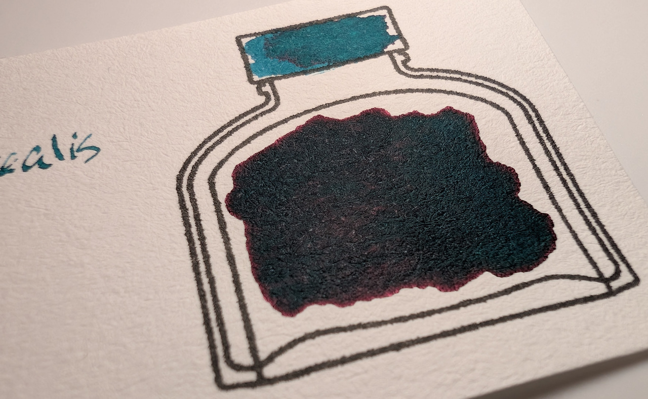
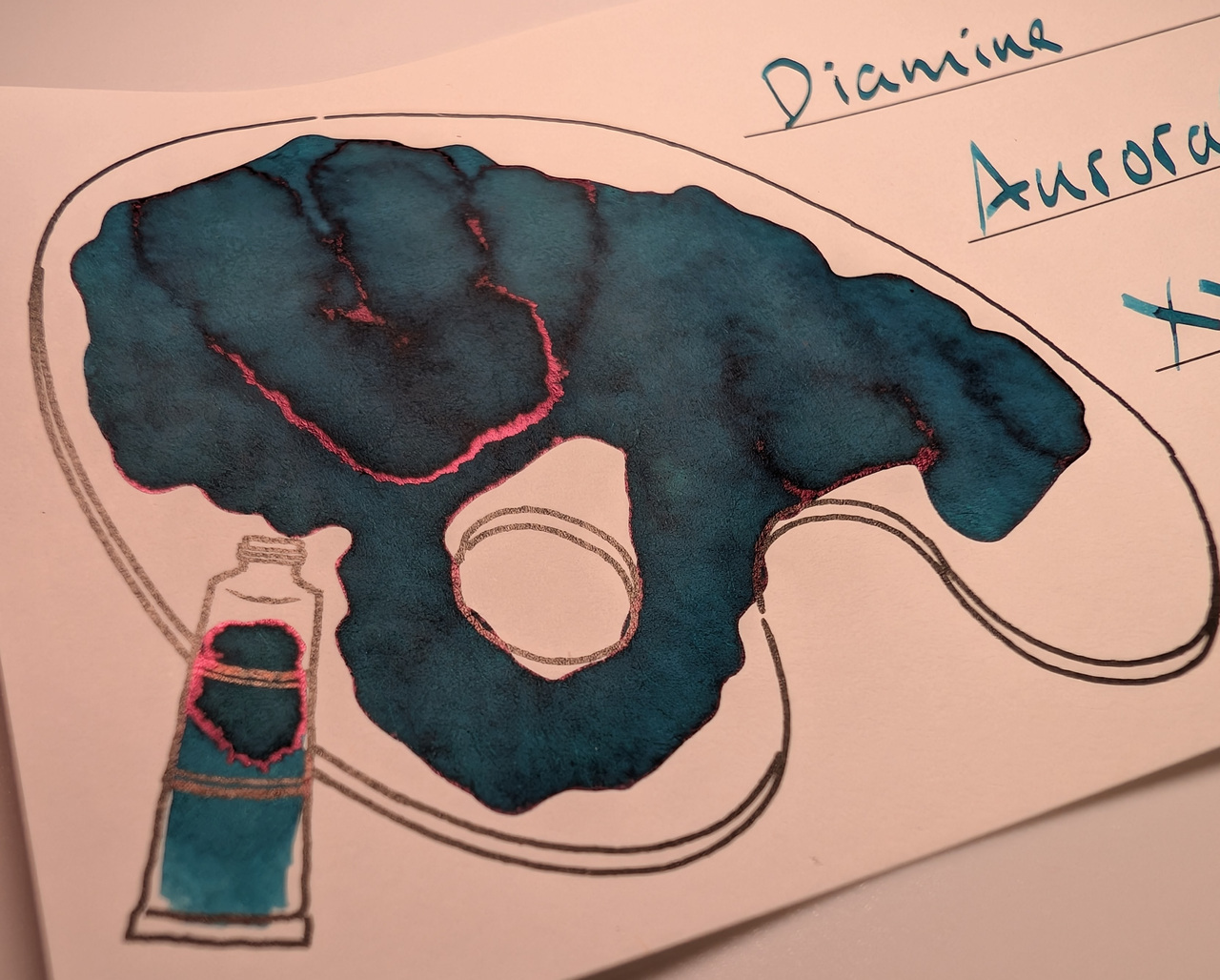
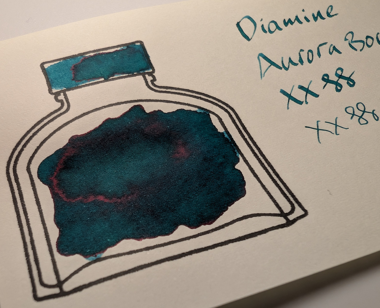
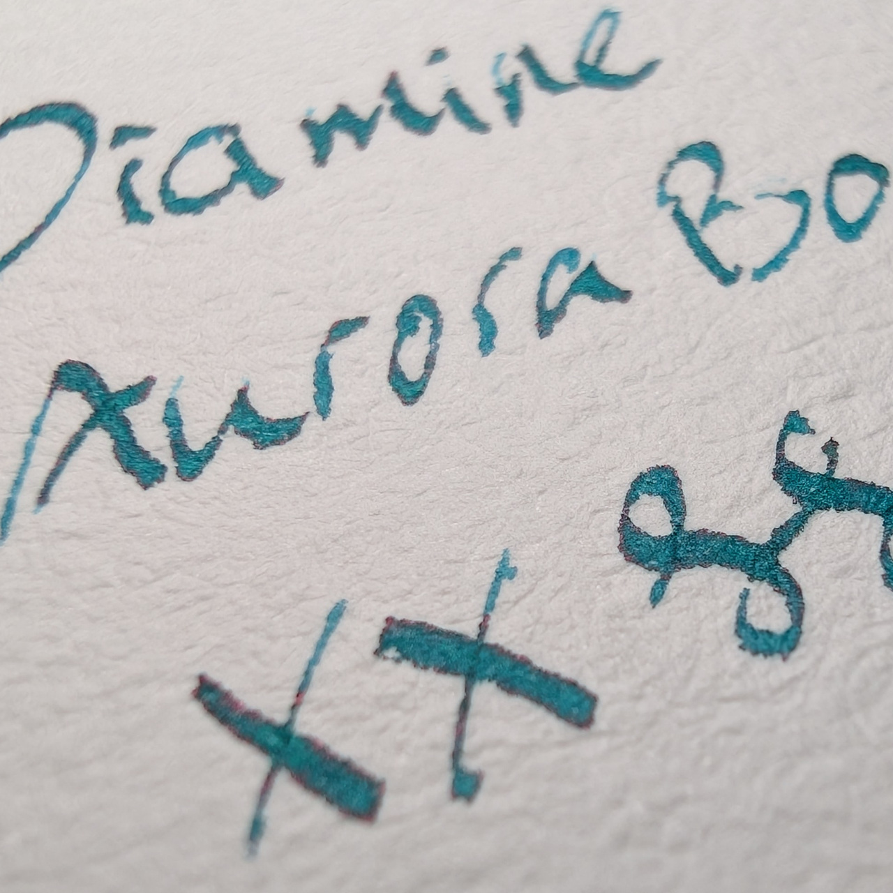
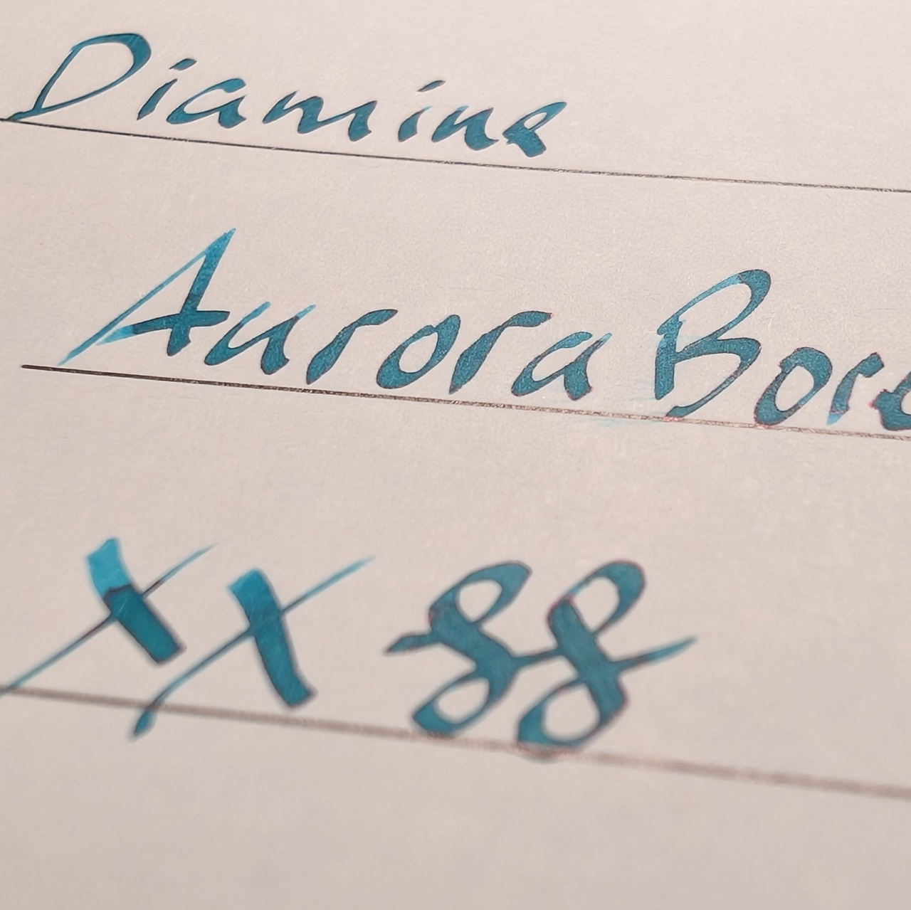
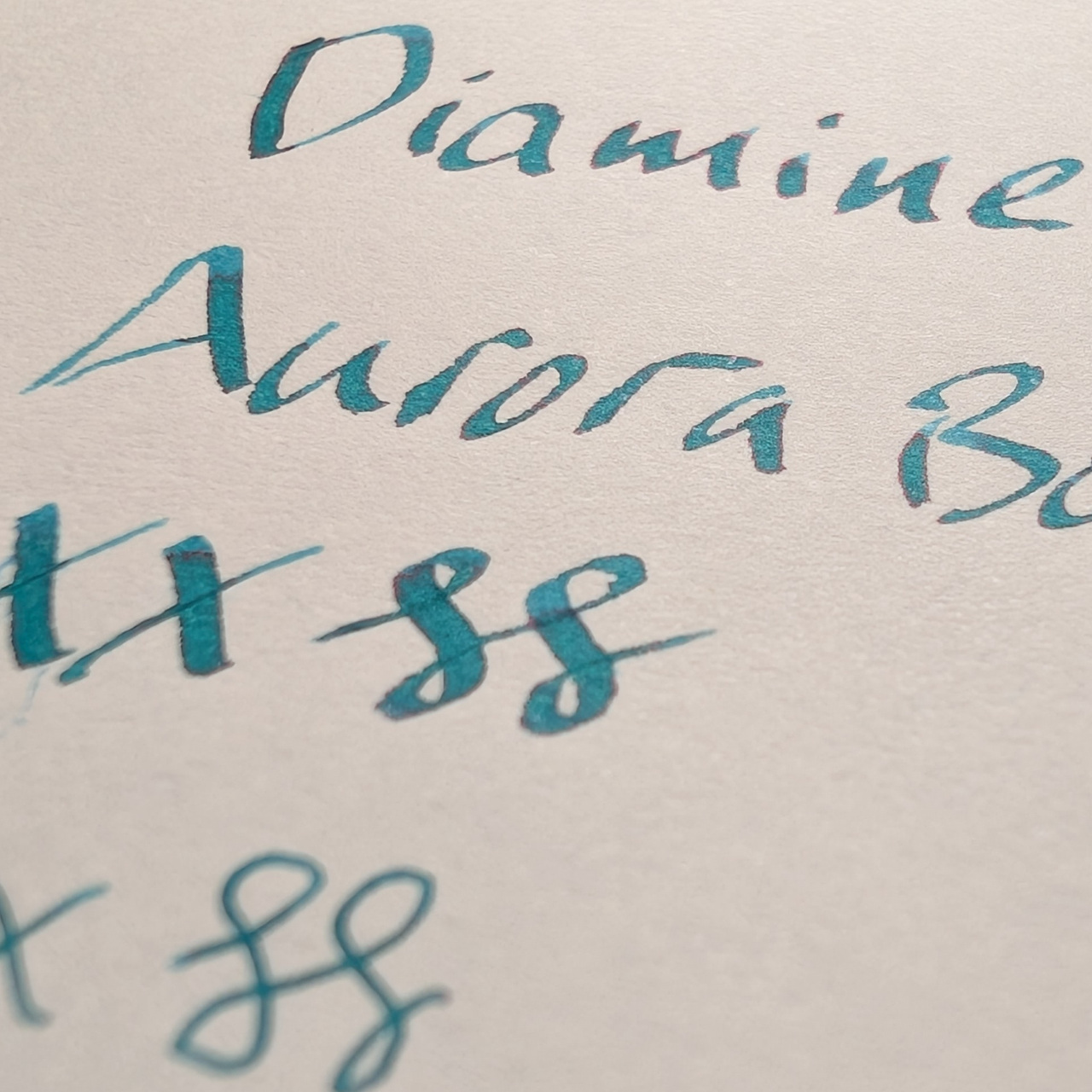
The sheen is noticeable in the writing as well, but primarily at the edges of the letters.
Microscope
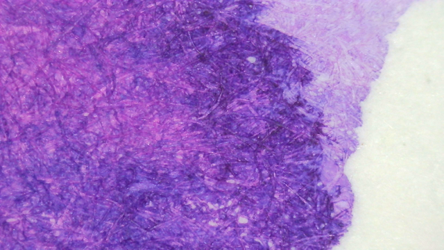
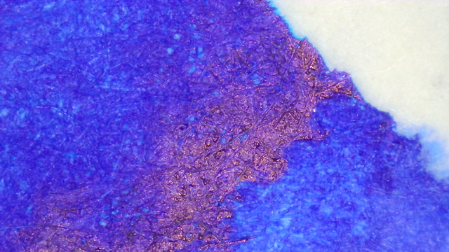
On Col-o-ring and MD there is a bit of separation where it’s more green (or turquoise) in the background while the fibers in the foreground are more green. On Iroful it looks like there are areas that looks more green scattered throughout, but the background is more even teal.
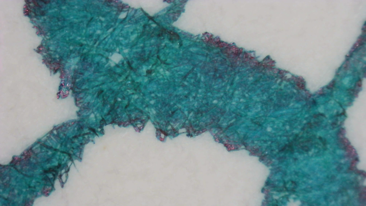
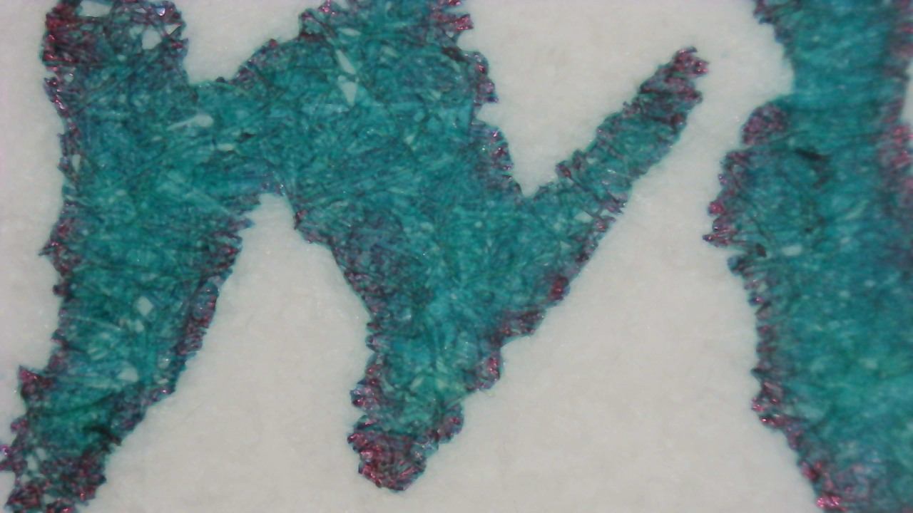
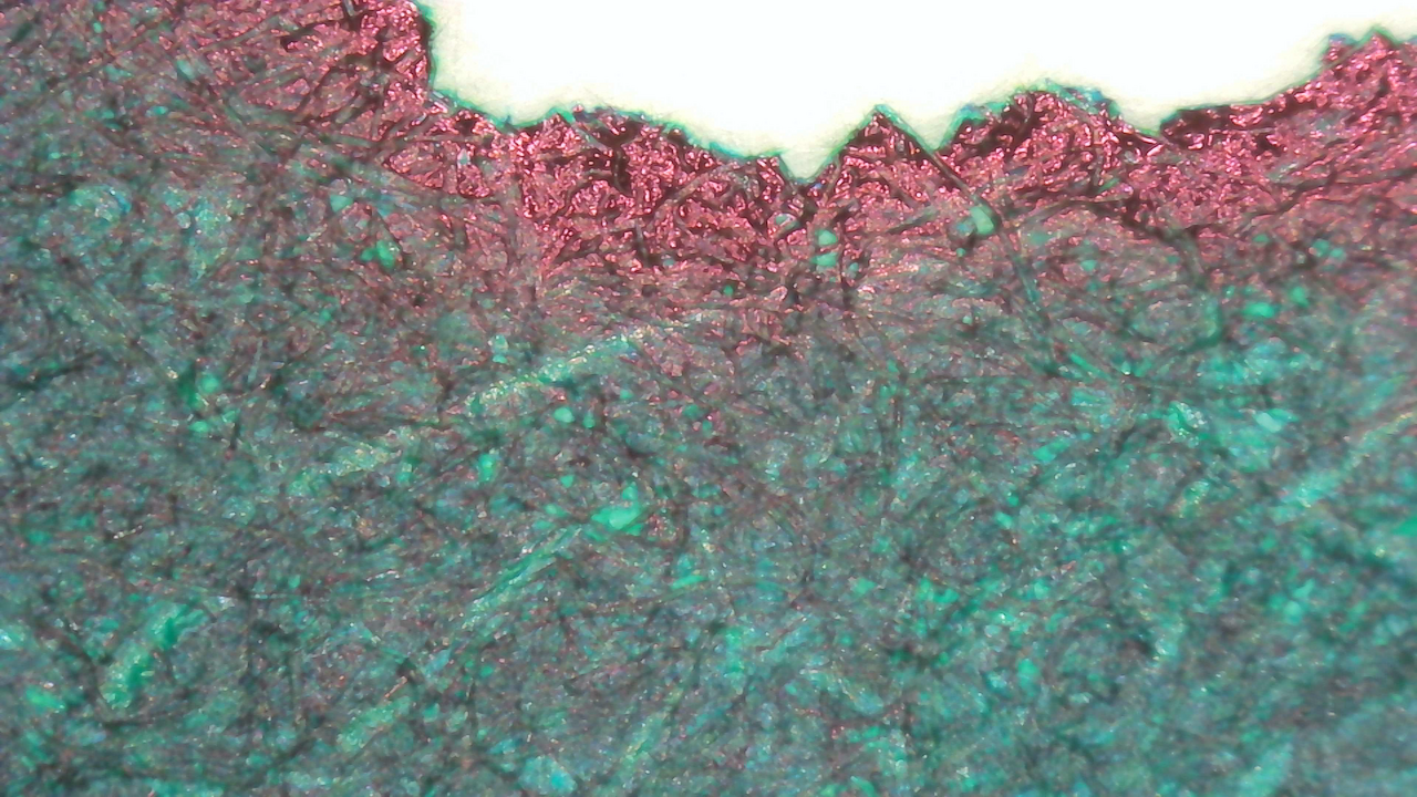
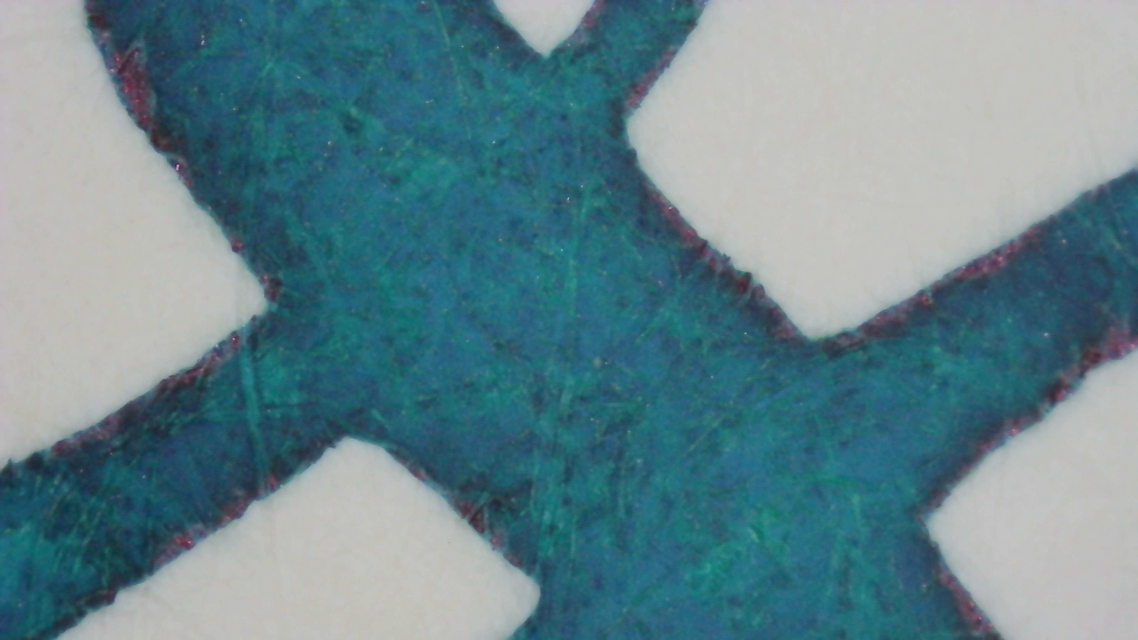
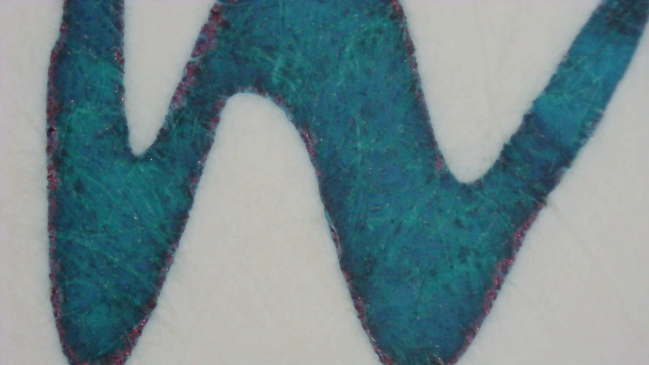
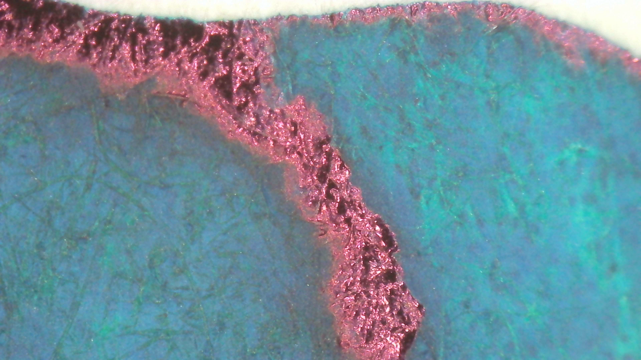
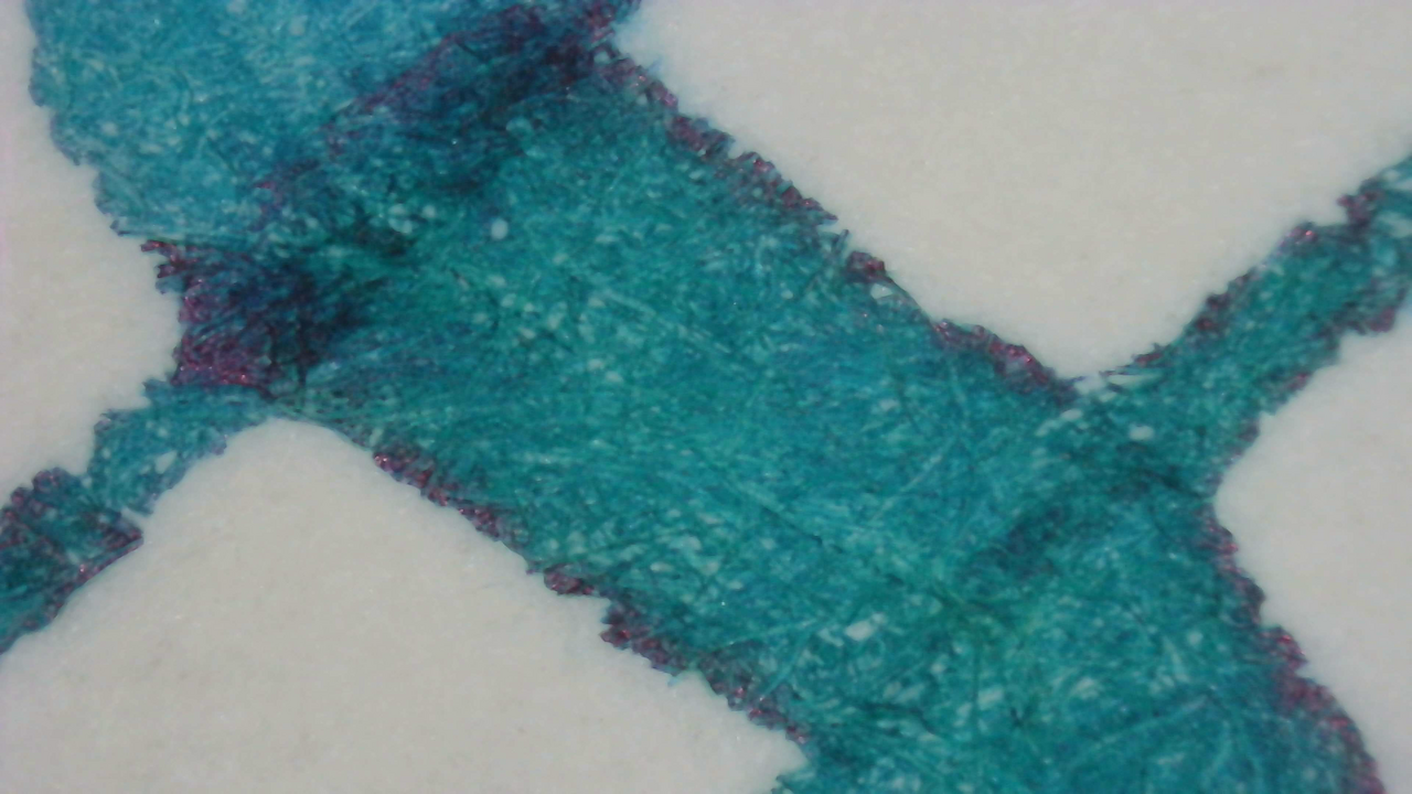
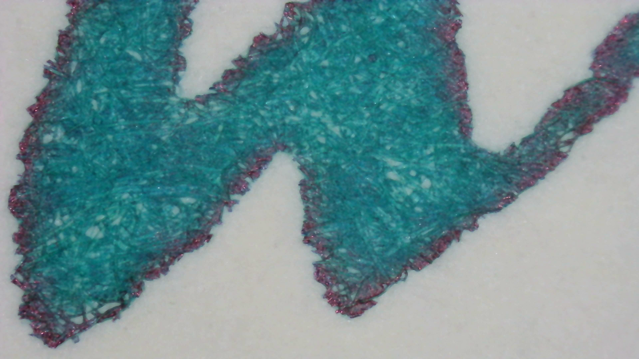
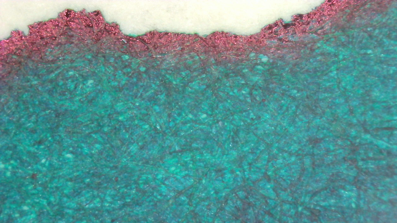
The sheen is present around the edges of lines here on every paper type as well.
Chromatography

The chromatography starts with a thick gray line, then fades out a while, then has bands of dark green and blue near the leading edge.

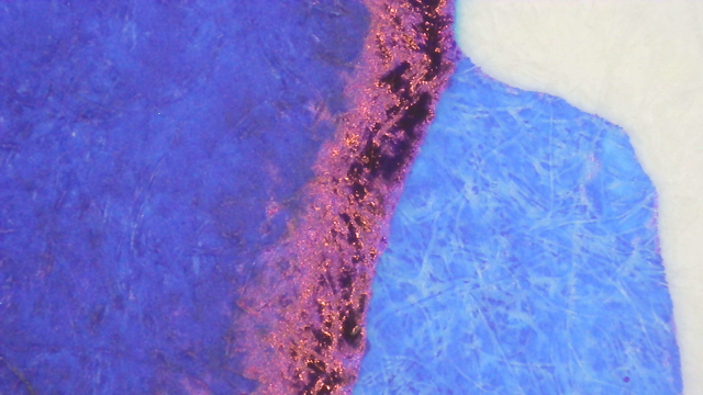
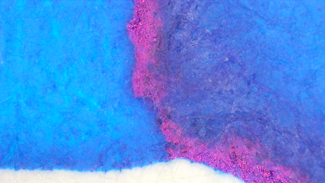
The small green band glows slightly orange under UV but it didn’t alter the appearance of the ink writing or swatches.
Verdict
This is another favorite of mine from Diamine. It looks great and the sheen comes through just enough to be pleasant without taking over. I’ve used it with a variety of pens and nibs, from EF to flex, and I haven’t had any problems with it.
Questions or comments? Contact me on Mastodon