
Sailor Ink Studio 750 is a dark purple ink with some shading and a lot of green sheen.
Like Sailor Yurameku Date Gokoro this ink also can change color significantly between different paper types.
Scans
On col-o-ring and MD it’s more “grape” purple and on Iroful it looks much closer to blue.
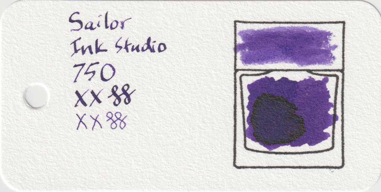
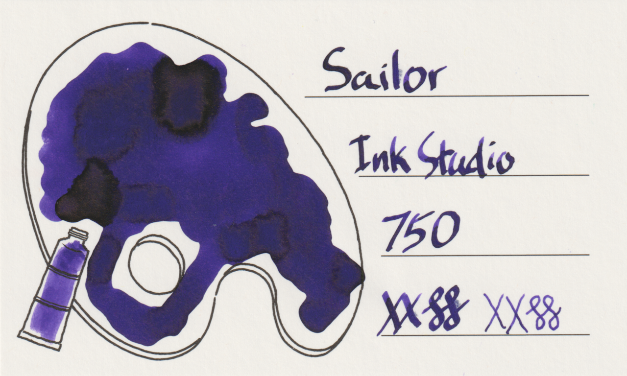
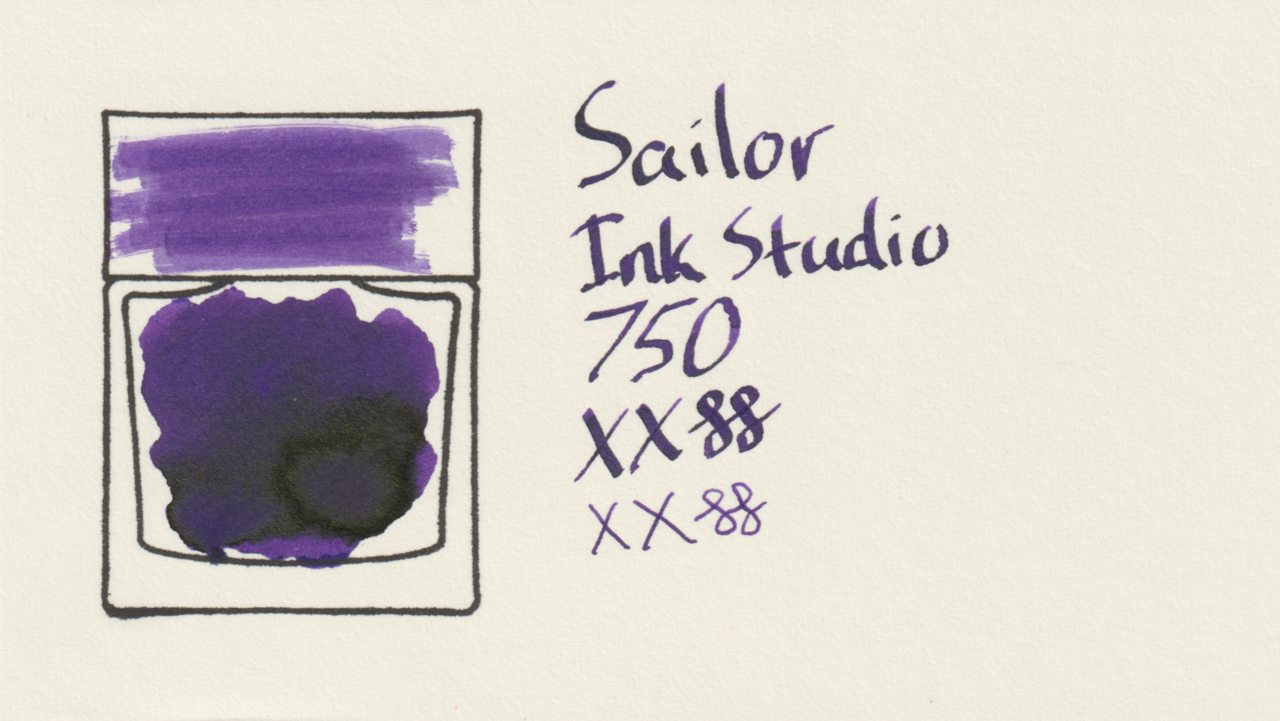
In addition to shading there is a little feathering and bleeding on Iroful.
Photos
The sheen is extraordinarily heavy and covers significant portions of the large swatches. The sheen appears very green on Col-o-ring and MD, but more gold on Iroful.
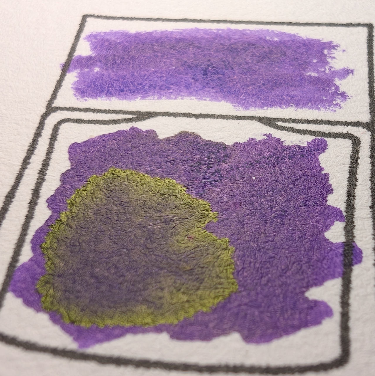
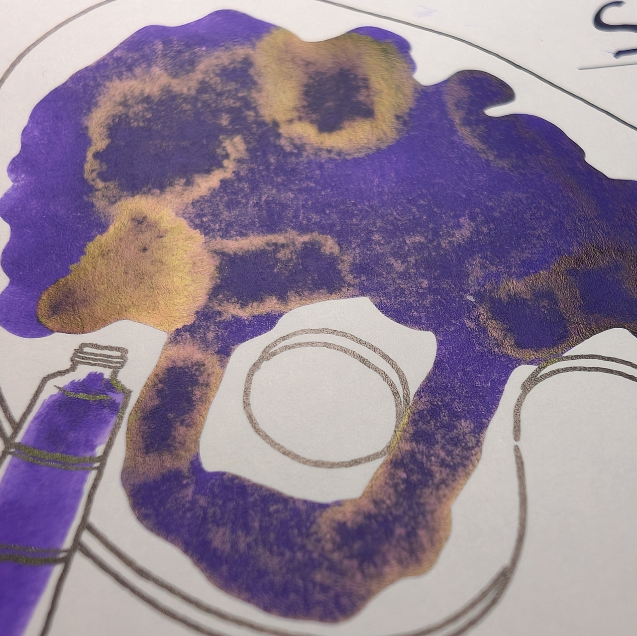
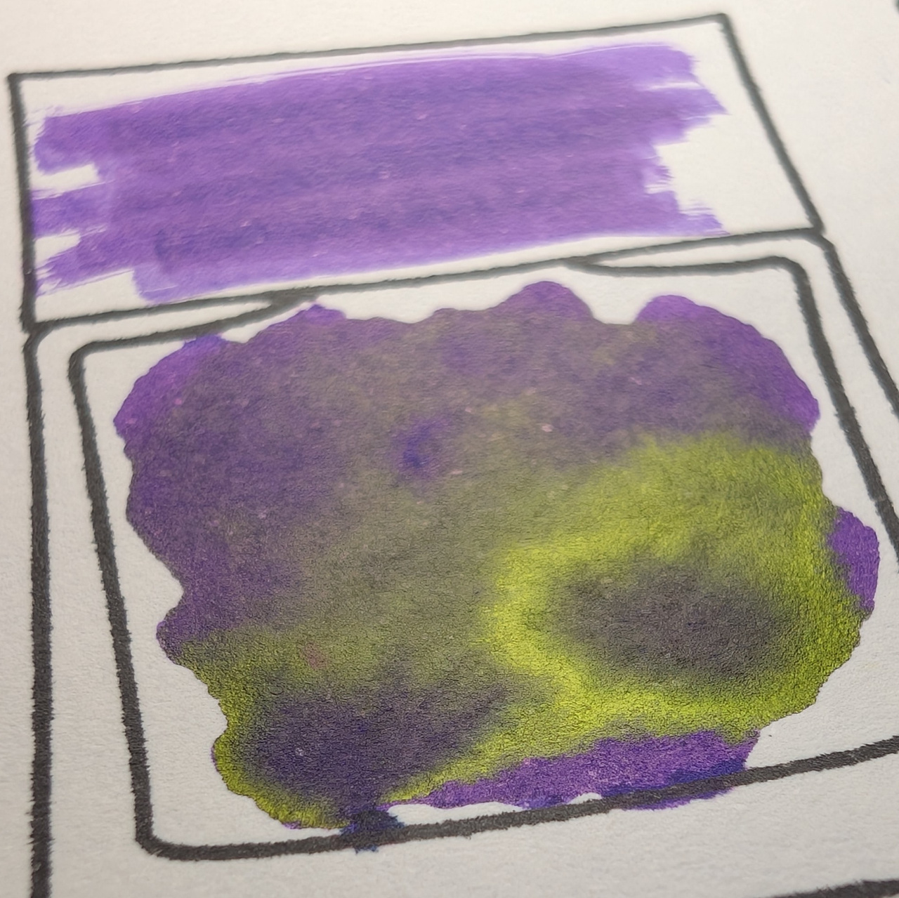
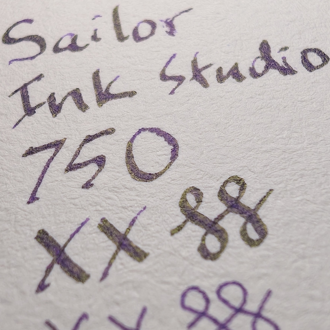
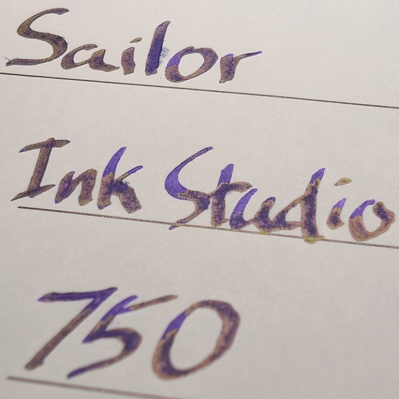
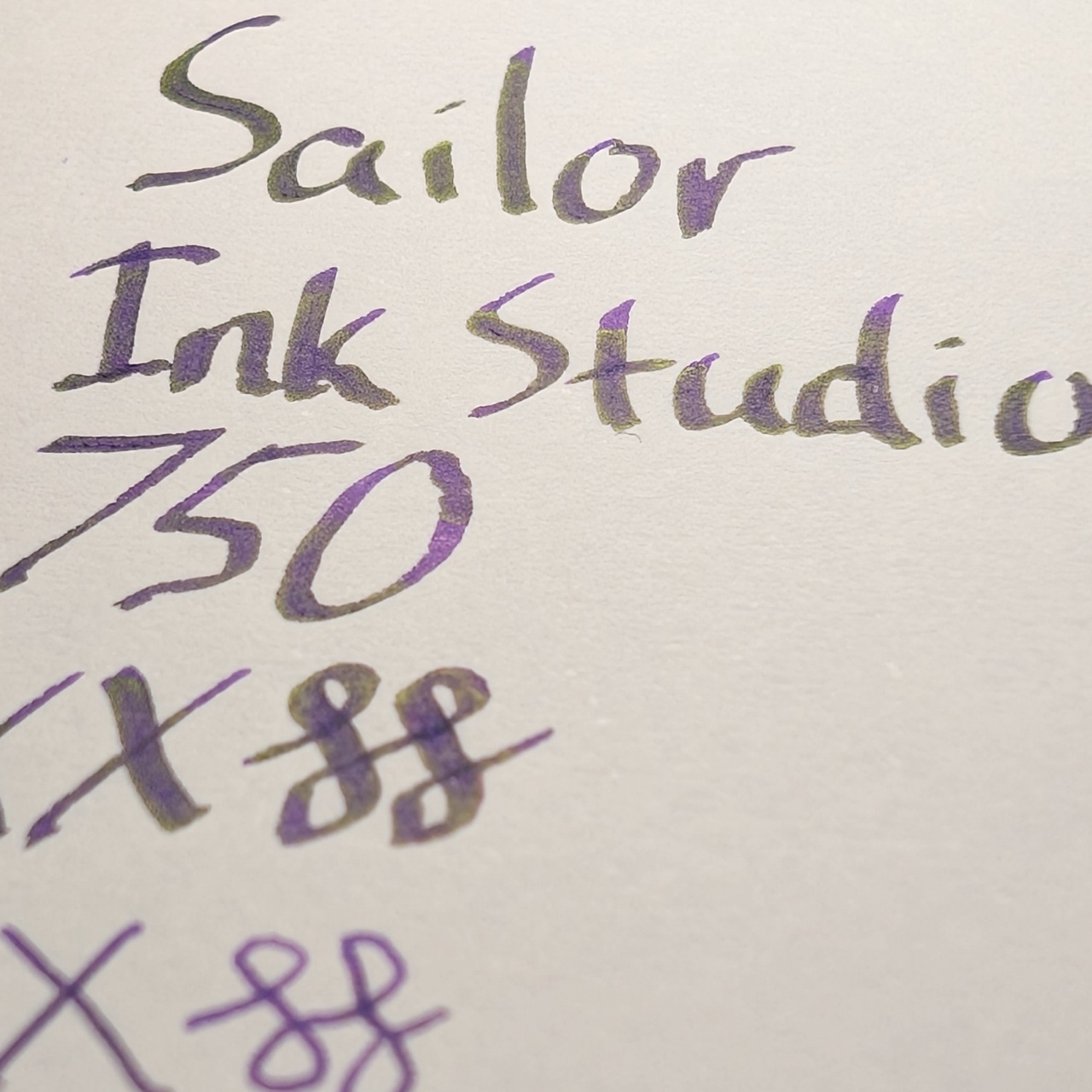
The sheen covers a lot of the writing as well on every paper type.
Microscope
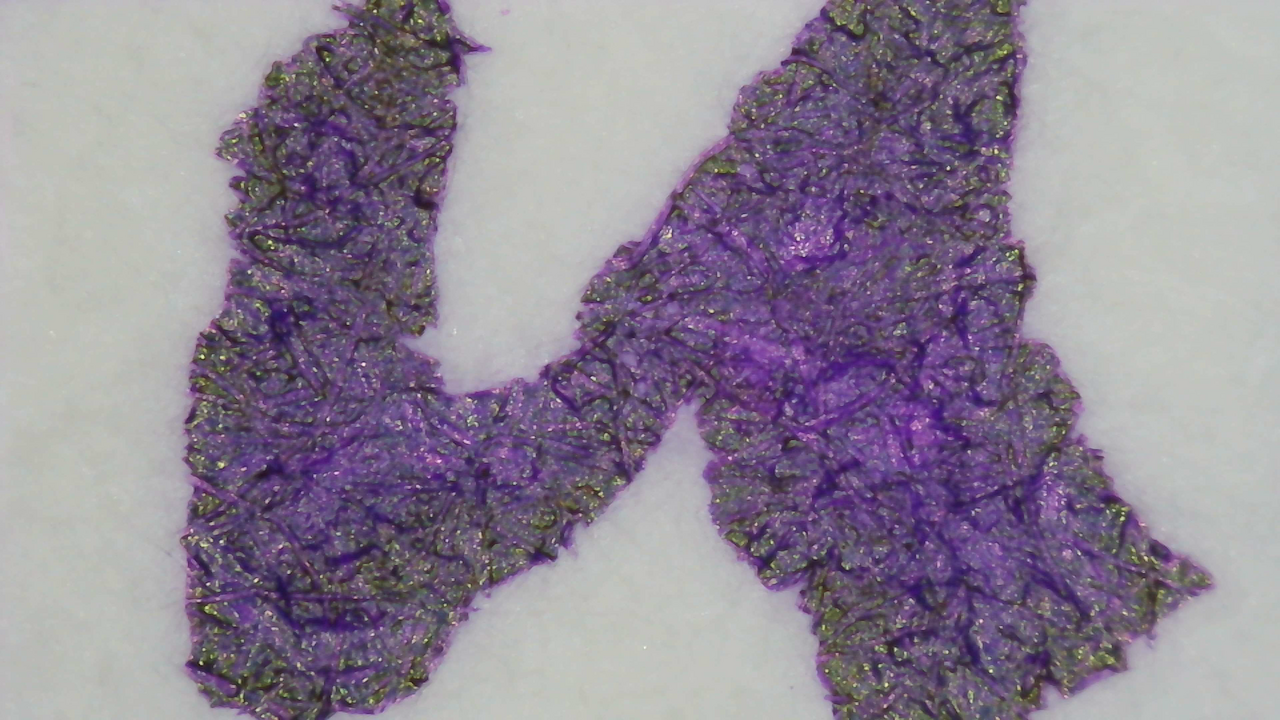
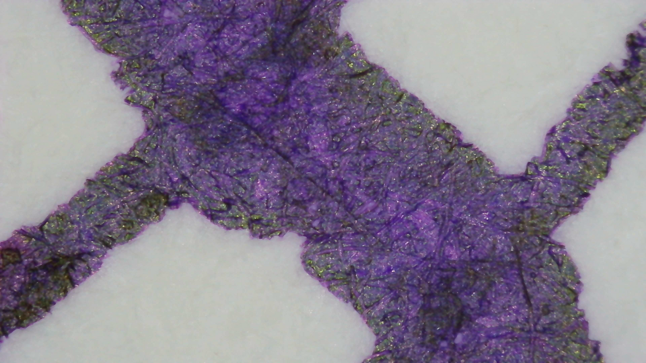
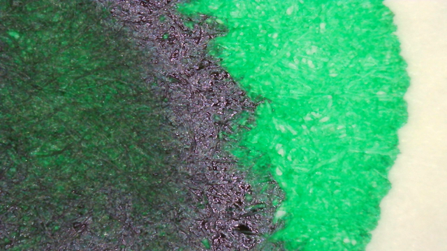
The sheen is still covering a lot at this level, and the sheen looks greener on Iroful when magnified this much.
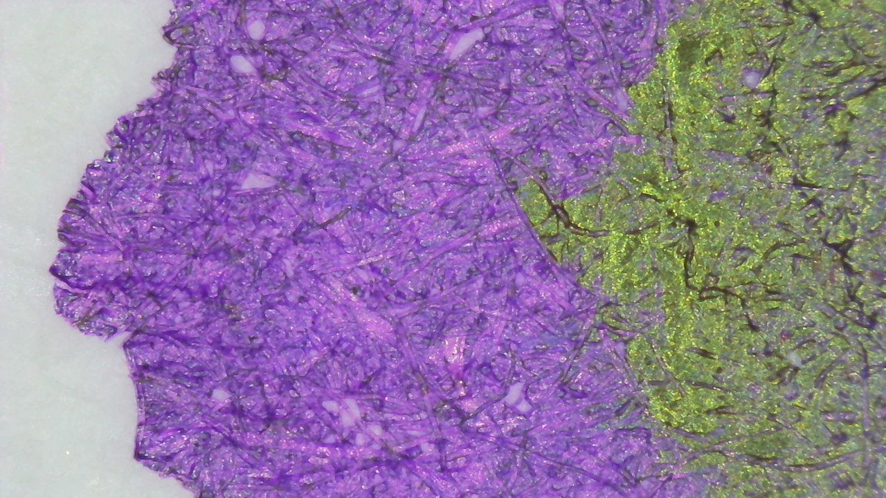
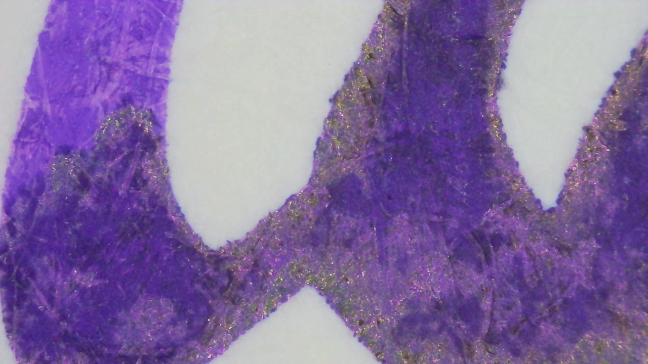
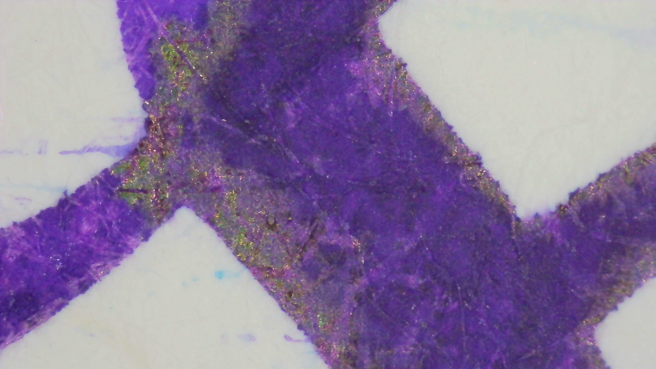
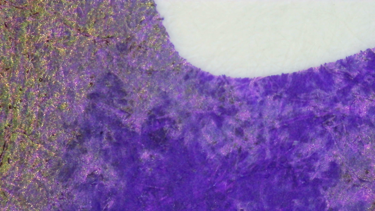
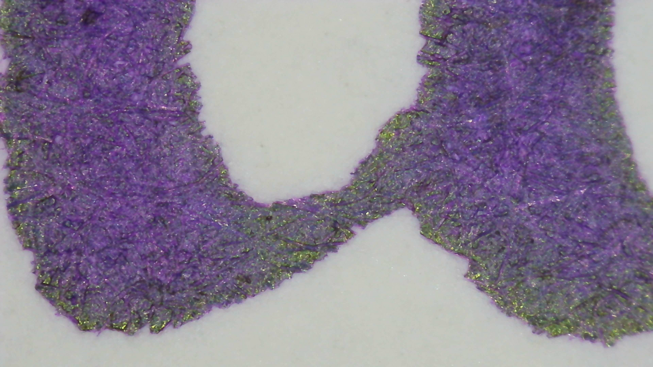
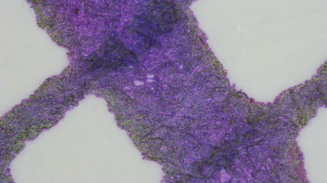
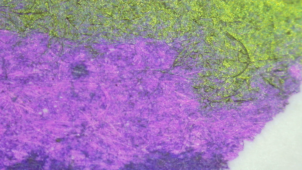
Speaking of iroful, the background looks blue-ish/blurple while the foreground is lighter purple.
Chromatography

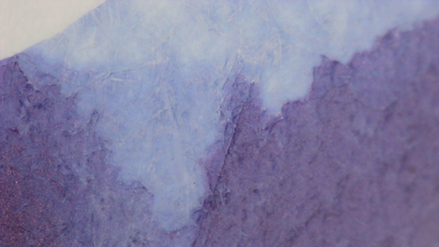
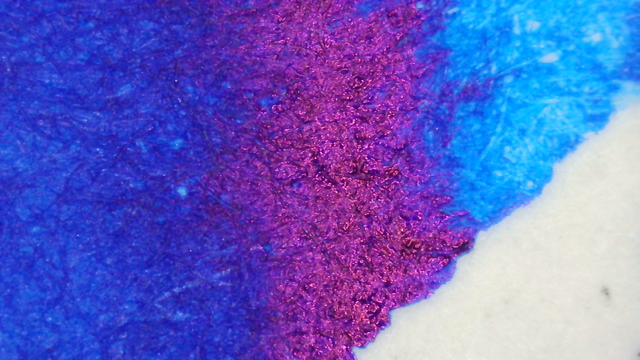
It starts dark cyan then fades into purple and then back into a lighter cyan.

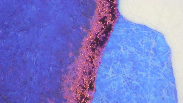
There is a dull glow from most of the strip, and a blue line past the leading edge, but there was no glow in the swatches.
Verdict
I’m not a huge fan of green sheen on purple ink, but this one is better than some others I’ve seen. For example, it’s more greenish-gold here compared to Parker Quink - Purple which was more lime green.
I only have a sample of this which I received during last year’s Fountain Pen Secret Santa gift exchange. I have been using this for a few months in a Kakuno that has a transplanted CM nib and it’s worked great there. It even behaved well on the Sunny Log Note paper that I didn’t like because it was very absorbent.
Questions or comments? Contact me on Mastodon