
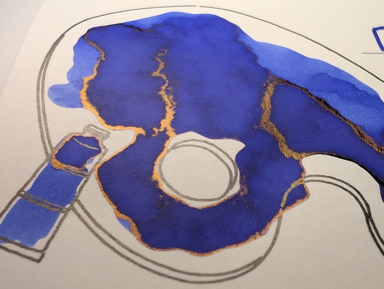
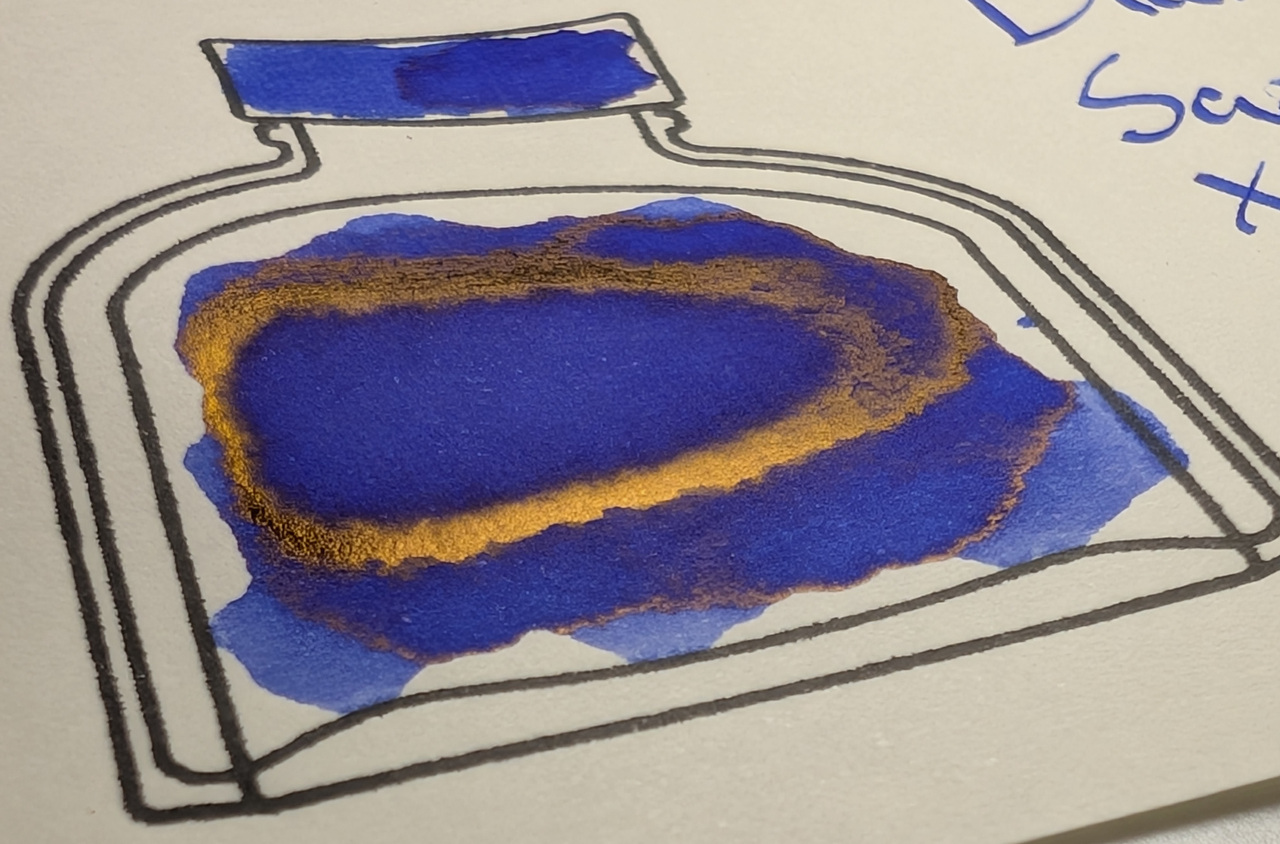
Diamine Sapphire Blue is a blue ink that leans toward the purple side, or blurple. It has gold sheen and some shading.
The gold sheen might suggest this is Sapphire in the Lapis lazuli sense instead of the Corundum variety.
Scans
Unlike a lot of other inks, this one gets darker on Iroful compared to col-o-ring and MD, and it shades more readily on Iroful as well.
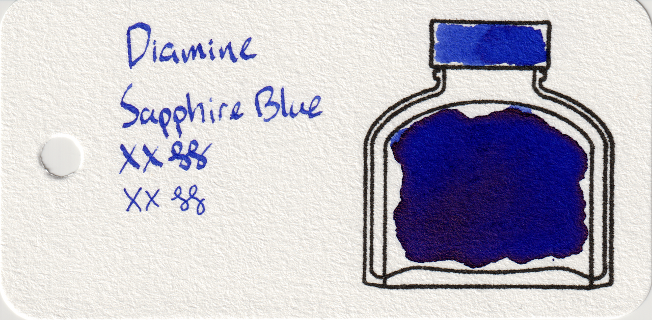
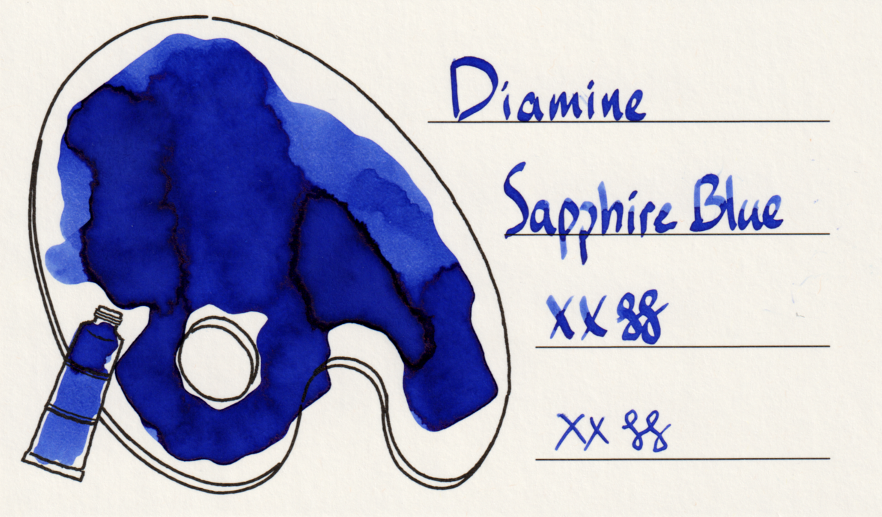
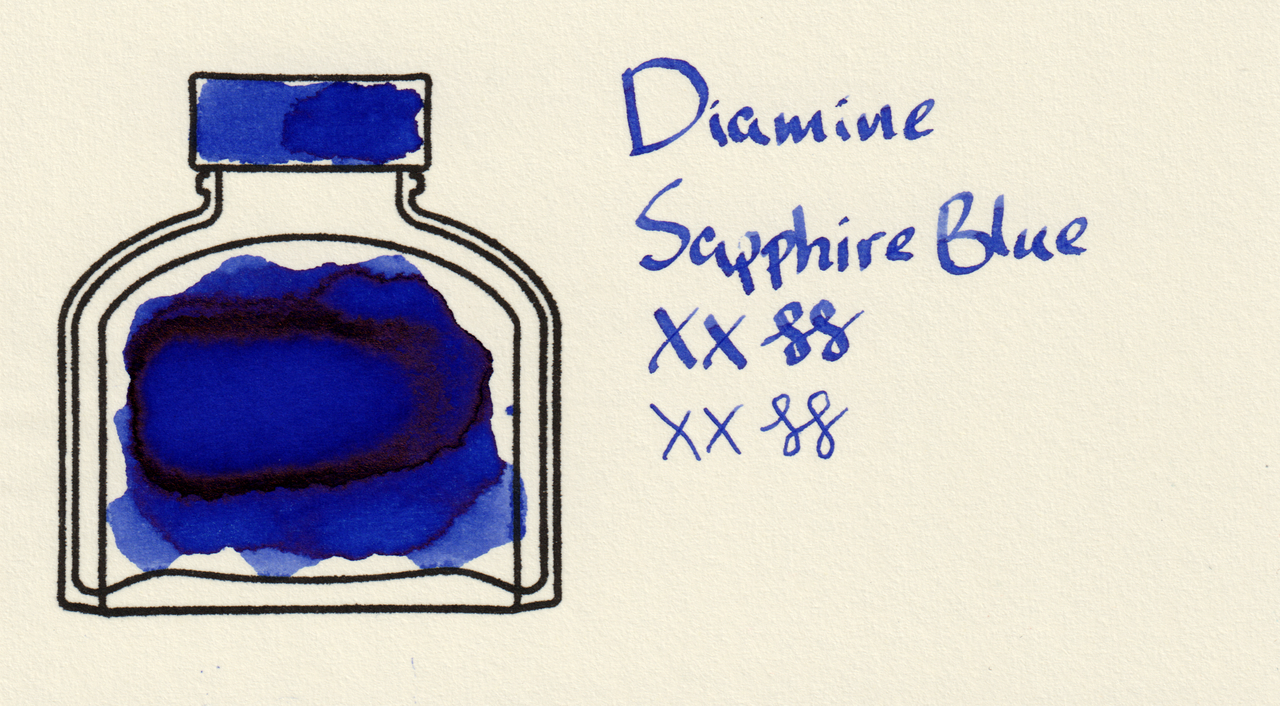
Photos
The gold sheen is quite prominent on all three cards in the large swatches.
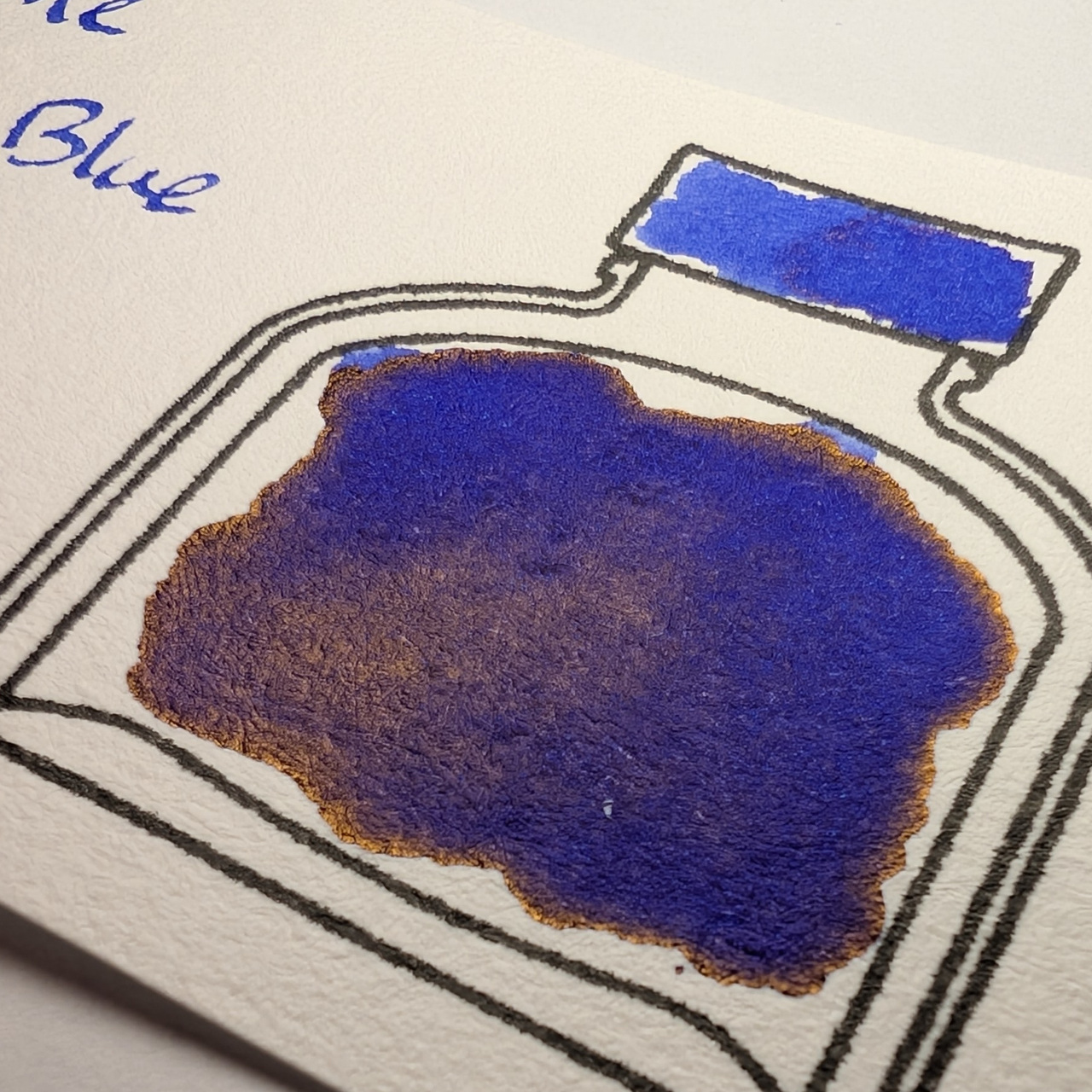
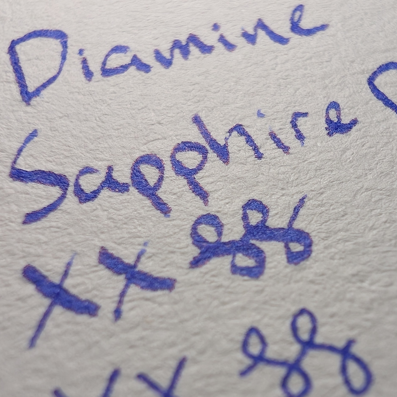
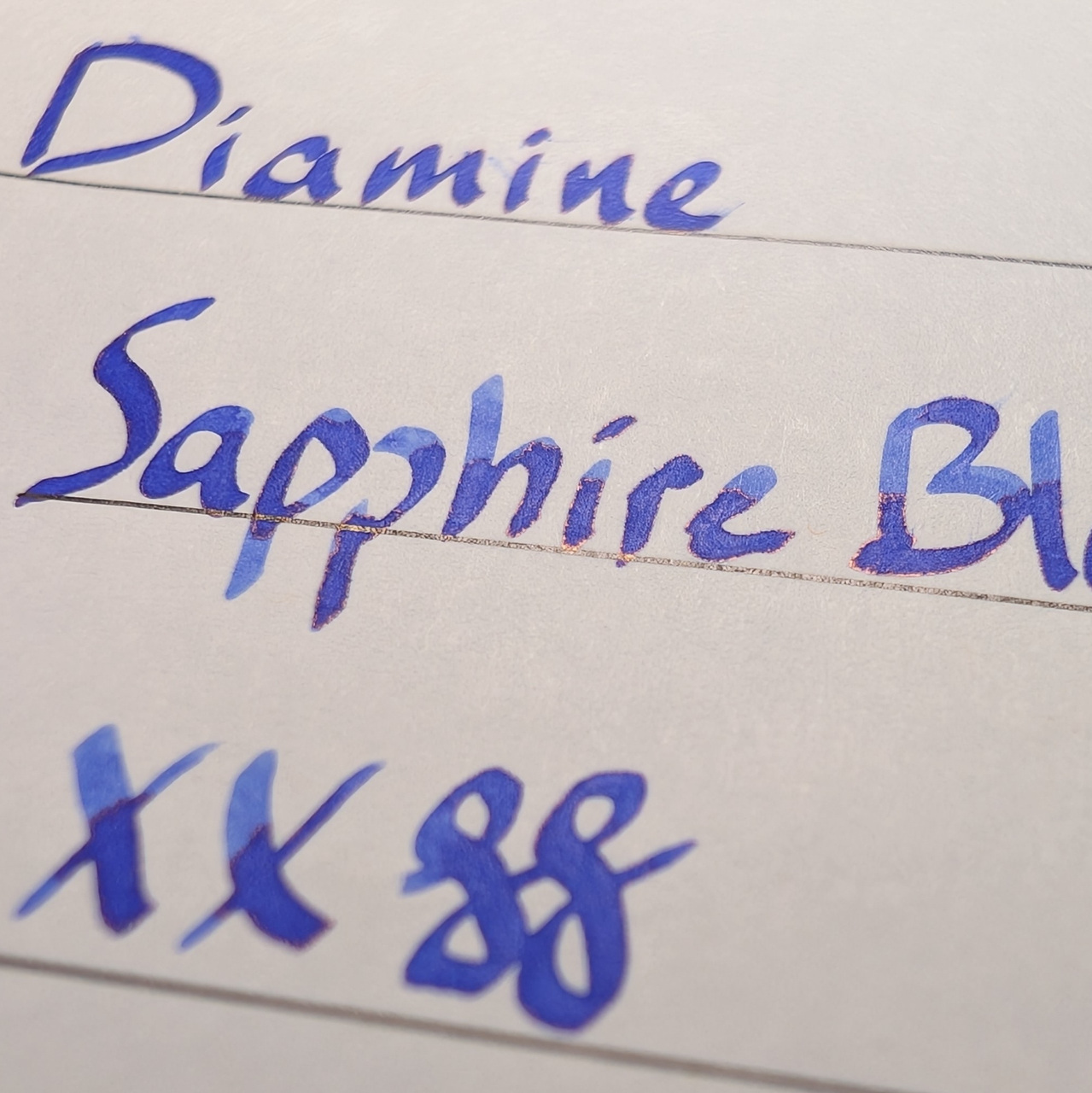
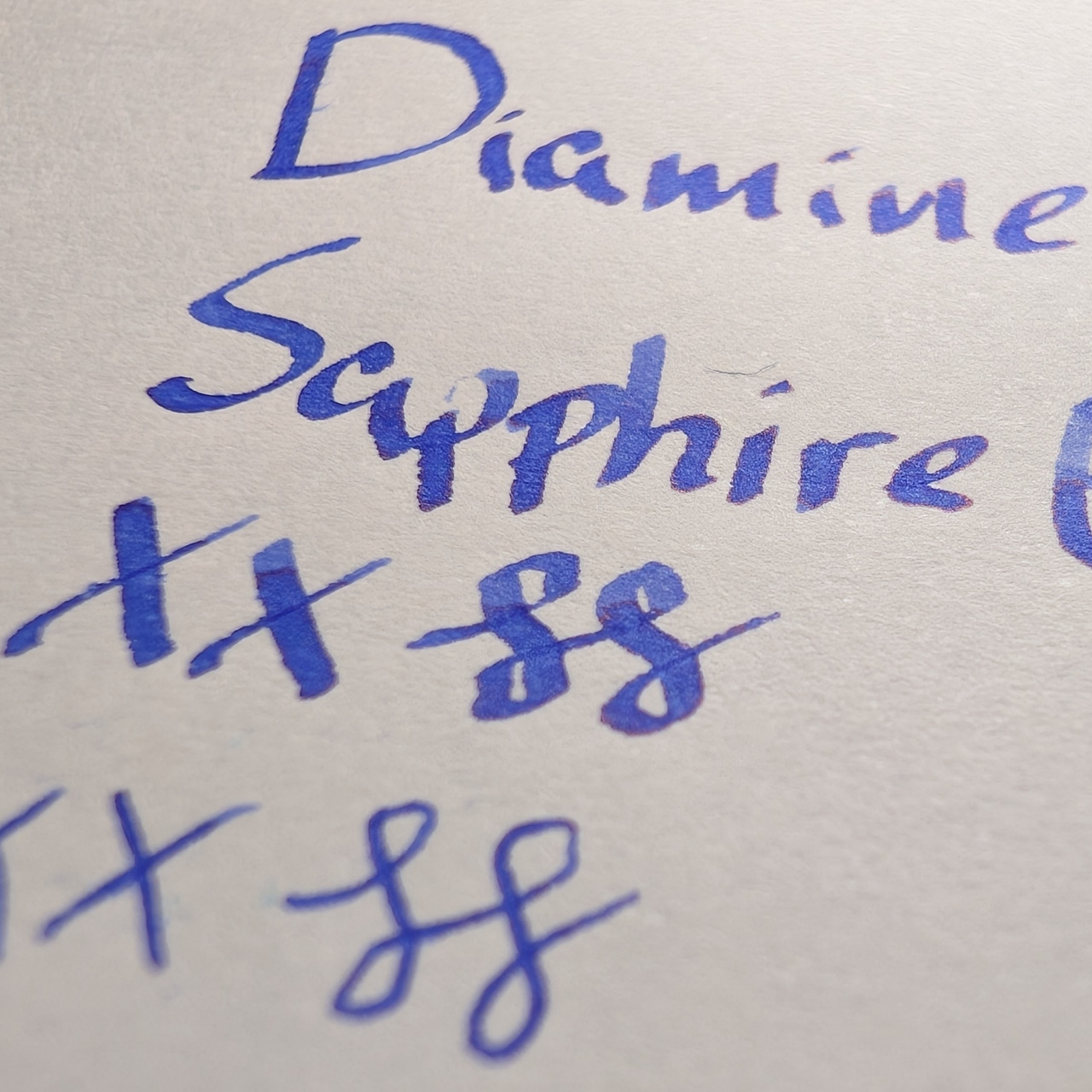
The sheen shows a little in the writing as well, mostly around the edges of lines and shading.
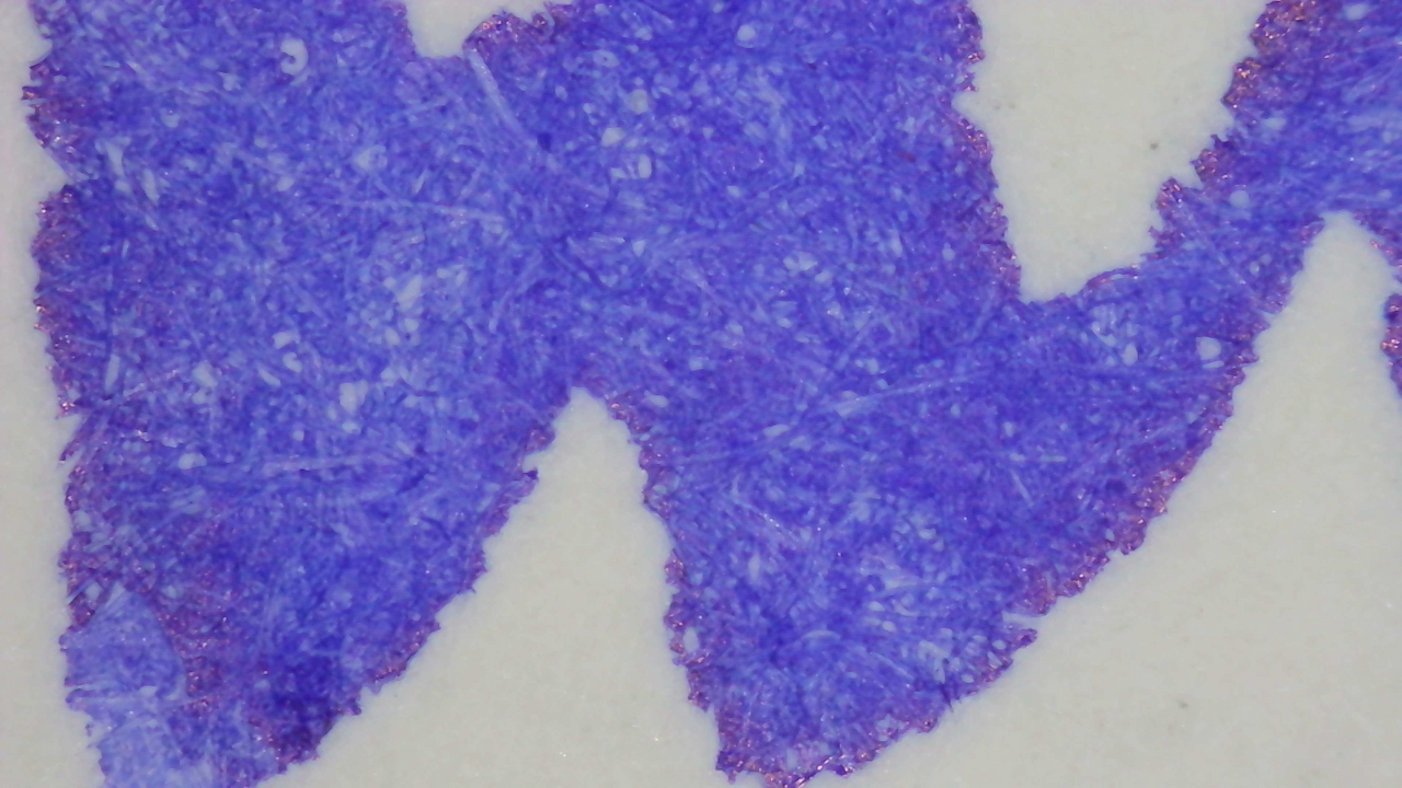
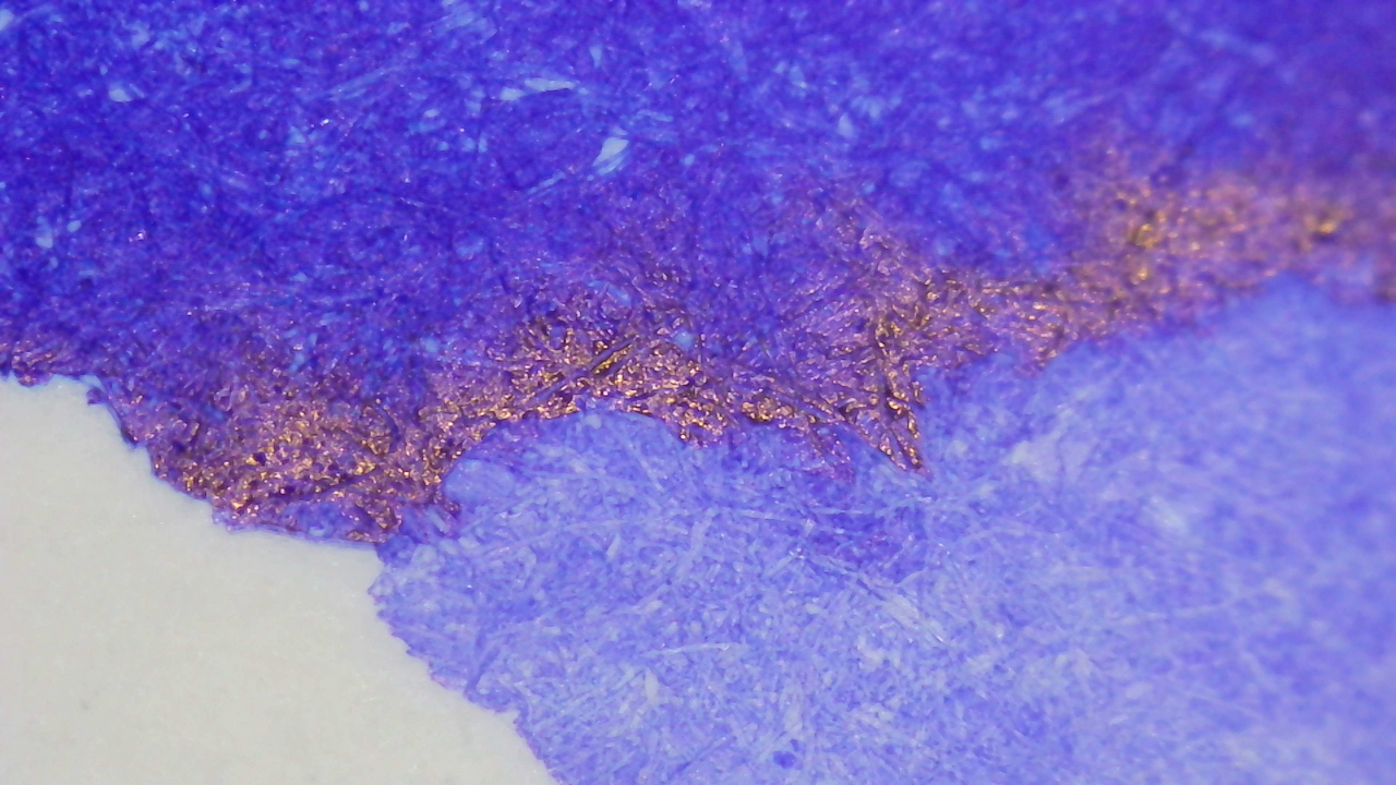
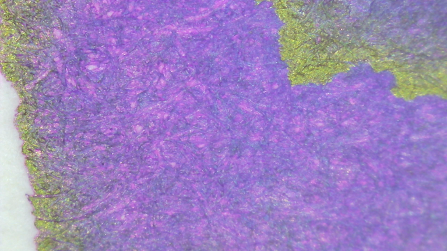
Microscope
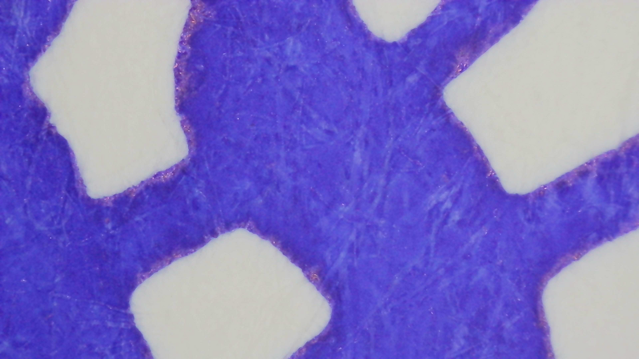
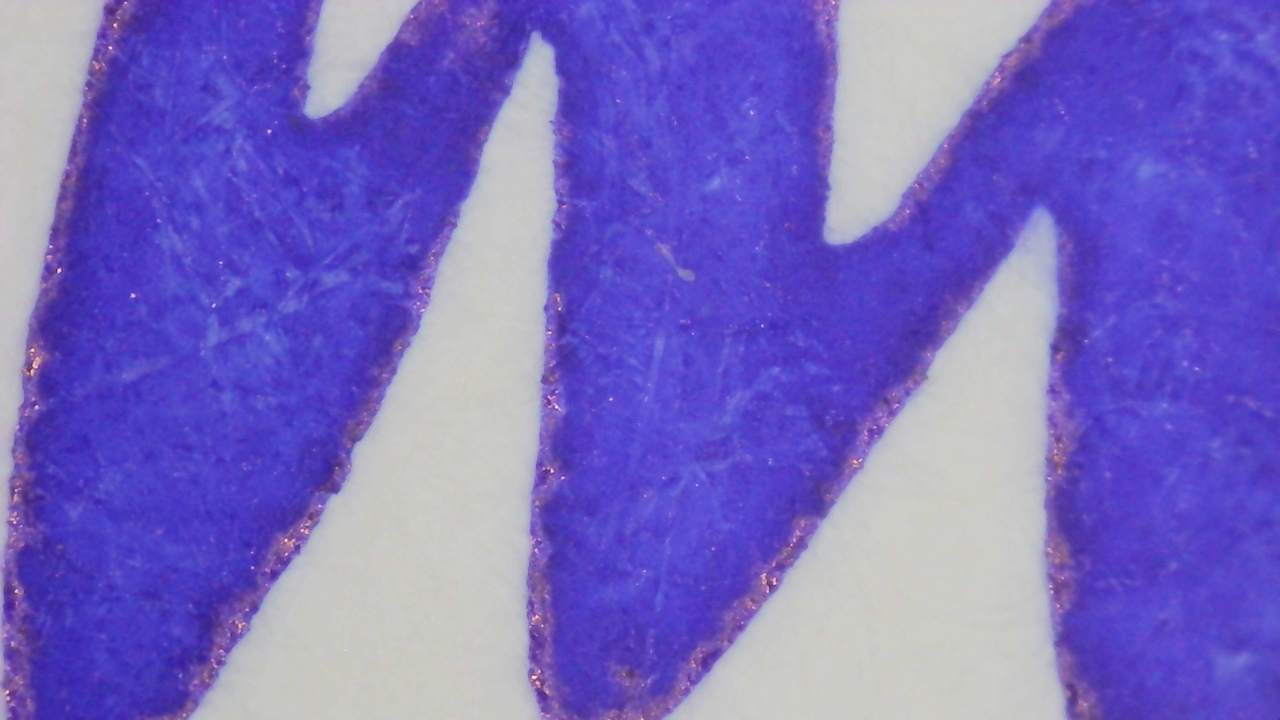
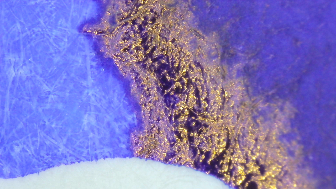
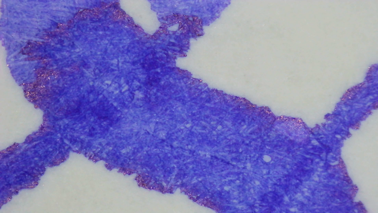
The sheen is only slightly visible in the writing along the edges. On Col-o-ring and MD it seems to be lighter in the background between fibers, while on Iroful it’s very even all over.
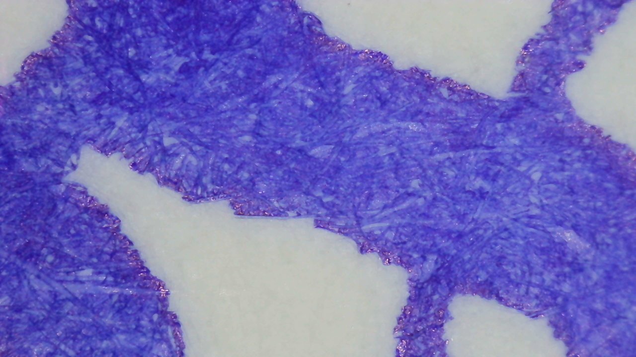
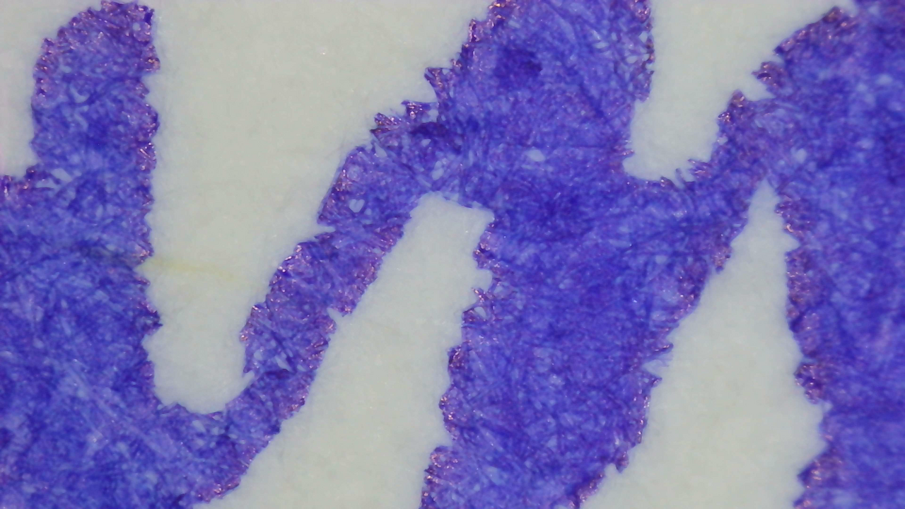
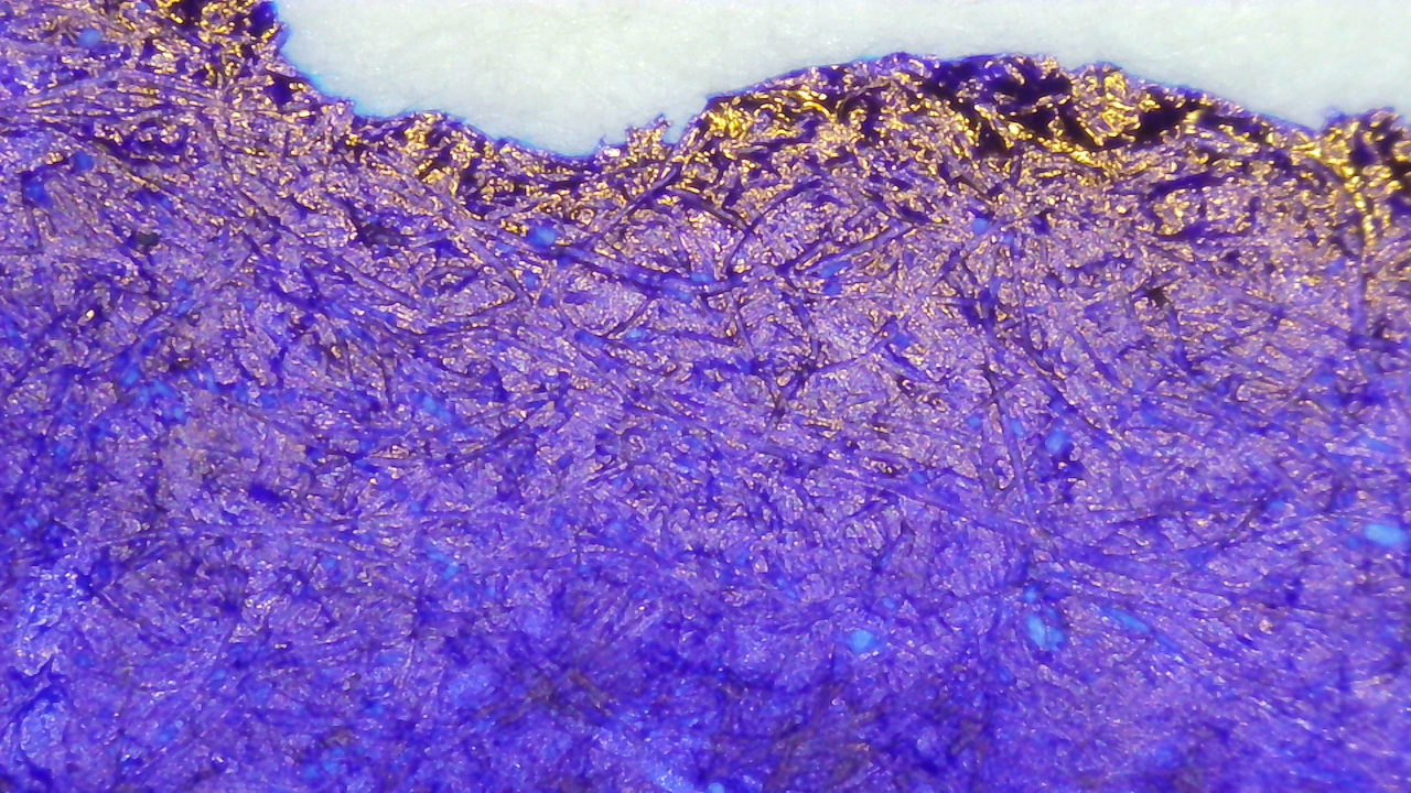
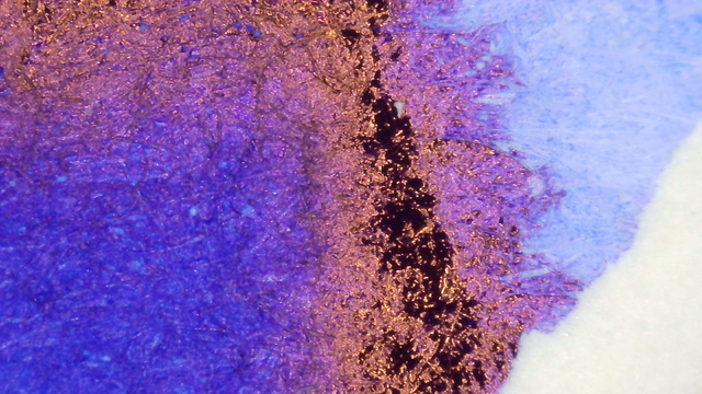
Chromatography

The chromatography starts purple then changes to cyan and then dark blue at the leading edge.

There is a very dull glow from the purple section and then a hint of bright blue just past the leading edge in one spot.
UV Check
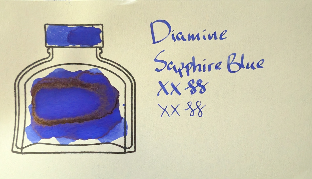
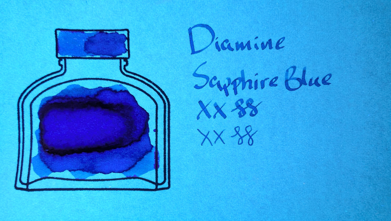
It doesn’t look like much, but it is glowing a small amount.
Verdict
This may be my favorite ink! It’s my favorite color, it is well-behaved in every way, and I’ve never had any problems with it in any pen. I keep this ink in multiple pens all the time.
It is a little on the dry side, so it also helps keep EF lines extra thin and crisp on many different types of paper.
I also like that it has gold sheen instead of red sheen like so many other blue inks.
Questions or comments? Contact me on Mastodon